<div>를 항상 전체 화면으로 만드는 방법은 무엇입니까?
답변:
이것은 항상 나를 위해 작동합니다 :
<head>
    <title></title>
    <meta http-equiv="Content-Type" content="text/html; charset=utf-8">
    <style type="text/css">
        html, body {
            height: 100%;
            margin: 0;
        }

        #wrapper {
            min-height: 100%;
        }
    </style>
    <!--[if lte IE 6]>
    <style type="text/css">
        #container {
            height: 100%;
        }
    </style>
    <![endif]-->
</head>

<body>
    <div id="wrapper">some content</div>
</body>
이것은 아마도이 문제에 대한 가장 간단한 해결책 일 것입니다. 네 가지 CSS 속성 만 설정하면됩니다 (하나는 IE를 행복하게하기위한 것이지만).
이것은 순수한 CSS를 사용하여 전체 화면 div를 만드는 내 솔루션입니다. 스크롤 할 때 지속되는 전체 화면 div를 표시합니다. 페이지 내용이 화면에 맞으면 페이지에 스크롤 막대가 표시되지 않습니다.
IE9 +, Firefox 13+, Chrome 21+에서 테스트
<!doctype html>
<html>
<head>
  <meta charset="utf-8" />
  <title> Fullscreen Div </title>
  <style>
  .overlay {
    position: fixed;
    width: 100%;
    height: 100%;
    left: 0;
    top: 0;
    background: rgba(51,51,51,0.7);
    z-index: 10;
  }
  </style>
</head>
<body>
  <div class='overlay'>Selectable text</div>
  <p> This paragraph is located below the overlay, and cannot be selected because of that :)</p>
</body>
</html>이것은 가장 안정적이고 쉬운 방법이며 모든 최신 브라우저에서 작동합니다.
.fullscreen {
  position: fixed;
  top: 0;
  left: 0;
  bottom: 0;
  right: 0;
  overflow: auto;
  background: lime; /* Just to visualize the extent */

}
<div class="fullscreen">
Suspendisse aliquam in ante a ornare. Pellentesque quis sapien sit amet dolor euismod congue. Donec non semper arcu. Sed tortor ante, cursus in dui vitae, interdum vestibulum massa. Suspendisse aliquam in ante a ornare. Pellentesque quis sapien sit amet dolor euismod congue. Donec non semper arcu. Sed tortor ante, cursus in dui vitae, interdum vestibulum massa. Suspendisse aliquam in ante a ornare. Pellentesque quis sapien sit amet dolor euismod congue. Donec non semper arcu. Sed tortor ante, cursus in dui vitae, interdum vestibulum massa. Suspendisse aliquam in ante a ornare. Pellentesque quis sapien sit amet dolor euismod congue. Donec non semper arcu. Sed tortor ante, cursus in dui vitae, interdum vestibulum massa.
</div>Firefox, Chrome, Opera, Vivaldi, IE7 + (IE11의 에뮬레이션 기반)에서 작동하도록 테스트되었습니다.
position: fixed; top: 0; left: 0;이제 다른 부분 : width: 100%; height: 100%;. 이것은 실제로 오래된 브라우저에서도 완벽하게 작동합니다.
최신 브라우저에서이 작업을 수행하는 가장 좋은 방법은 뷰포트 백분율 길이를 사용하여 해당 단위를 지원하지 않는 브라우저의 일반 백분율 길이로 돌아가는 것 입니다.
뷰포트 백분율 길이는 뷰포트 자체의 길이를 기준으로합니다. 여기서 사용할 두 단위는 vh(뷰포트 높이)와 vw(뷰포트 너비)입니다. 100vh뷰포트 높이의 100 %와 100vw같고 뷰포트 너비의 100 % 와 같습니다.
다음 HTML을 가정합니다.
<body>
    <div></div>
</body>
다음을 사용할 수 있습니다.
html, body, div {
    /* Height and width fallback for older browsers. */
    height: 100%;
    width: 100%;

    /* Set the height to match that of the viewport. */
    height: 100vh;

    /* Set the width to match that of the viewport. */
    width: 100vw;

    /* Remove any browser-default margins. */
    margin: 0;
}
다음은 결과 프레임의 높이와 너비를 채우는 요소 를 보여주는 JSFiddle 데모 입니다 div. 결과 프레임의 크기를 조정하면 div그에 따라 요소의 크기가 조정됩니다.
IE Josh가 없습니다. 테스트 해주세요. 감사.
<html>
<head>
    <title>Hellomoto</title>
    <style text="text/javascript">
        .hellomoto
        {
            background-color:#ccc;
            position:absolute;
            top:0px;
            left:0px;
            width:100%;
            height:100%;
            overflow:auto;
        }
        body
        {
            background-color:#ff00ff;
            padding:0px;
            margin:0px;
            width:100%;
            height:100%;
            overflow:hidden;
        }
        .text
        {
            background-color:#cc00cc;
            height:800px;
            width:500px;
        }
    </style>
</head>
<body>
<div class="hellomoto">
    <div class="text">hellomoto</div>
</div>
</body>
</html>
position: fixed페이지를 스크롤 할 수있는 경우 대신 사용할 수도 있지만 일부 모바일 브라우저에서는 작동하지 않습니다. caniuse.com/#feat=css-fixed
내가 가장 우아한 방법을 발견하면 다음과 같다, 여기에 대부분의 트릭은 만드는 것입니다 div'들 position: fixed.
.mask {
    background-color: rgba(0, 0, 0, 0.5);
    position: fixed;
    top: 0;
    left: 0;
    right: 0;
    bottom: 0;
    margin: 0;
    box-sizing: border-box;
    width: 100%;
    height: 100%;
    object-fit: contain;
}
<html>
<head>
<title>Test</title>
</head>
<body>
<h1>Whatever it takes</h1>
<h1>Whatever it takes</h1>
<h1>Whatever it takes</h1>
<h1>Whatever it takes</h1>
<h1>Whatever it takes</h1>
<h1>Whatever it takes</h1>
<h1>Whatever it takes</h1>
<h1>Whatever it takes</h1>
<h1>Whatever it takes</h1>
<h1>Whatever it takes</h1>
<h1>Whatever it takes</h1>
<h1>Whatever it takes</h1>
<h1>Whatever it takes</h1>
<h1>Whatever it takes</h1>
<h1>Whatever it takes</h1>
<h1>Whatever it takes</h1>
<h1>Whatever it takes</h1>
<h1>Whatever it takes</h1>
<h1>Whatever it takes</h1>
<h1>Whatever it takes</h1>
<div class="mask"></div>
</body>
</html>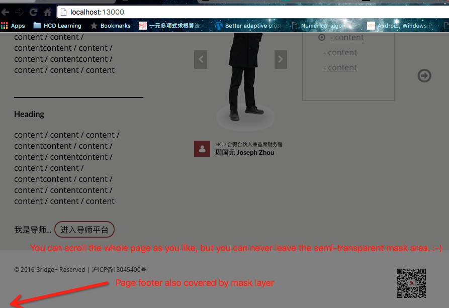
다음은 가장 짧은 솔루션입니다 vh. 참고 사항 vh에서 지원되지 않는 일부 오래된 브라우저를 .
CSS :
div {
    width: 100%;
    height: 100vh;
}
HTML :
<div>This div is fullscreen :)</div>이것이 내가 사용하는 트릭입니다. 반응 형 디자인에 적합합니다. 사용자가 브라우저 크기 조정을 망칠 때 완벽하게 작동합니다.
<head>
    <title></title>
    <meta http-equiv="Content-Type" content="text/html; charset=utf-8">
    <style type="text/css">
        #container {
            position: absolute;
            width: 100%;
            min-height: 100%;
            left: 0;
            top: 0;
        }
    </style>
</head>

<body>
    <div id="container">some content</div>
</body>불행히도 heightCSS 의 속성은 예상만큼 안정적이지 않습니다. 따라서 해당 요소의 높이 스타일을 사용자 뷰포트의 높이로 설정하려면 Javascript를 사용해야합니다. 그리고 네, 이것은 절대 위치 지정없이 수행 할 수 있습니다 ...
<!DOCTYPE html>

<html>
  <head>
    <title>Test by Josh</title>
    <style type="text/css">
      * { padding:0; margin:0; }
      #test { background:#aaa; height:100%; width:100%; }
    </style>
    <script type="text/javascript">
      window.onload = function() {
        var height = getViewportHeight();

        alert("This is what it looks like before the Javascript. Click OK to set the height.");

        if(height > 0)
          document.getElementById("test").style.height = height + "px";
      }

      function getViewportHeight() {
        var h = 0;

        if(self.innerHeight)
          h = window.innerHeight;
        else if(document.documentElement && document.documentElement.clientHeight)
          h = document.documentElement.clientHeight;
        else if(document.body)
          h = document.body.clientHeight;

        return h;
      }
    </script>
  </head>
  <body>
    <div id="test">
      <h1>Test</h1>
    </div>
  </body>
</html>$(window).height();가장 좋습니다.