AlertDialog의 테마를 변경하는 방법


242

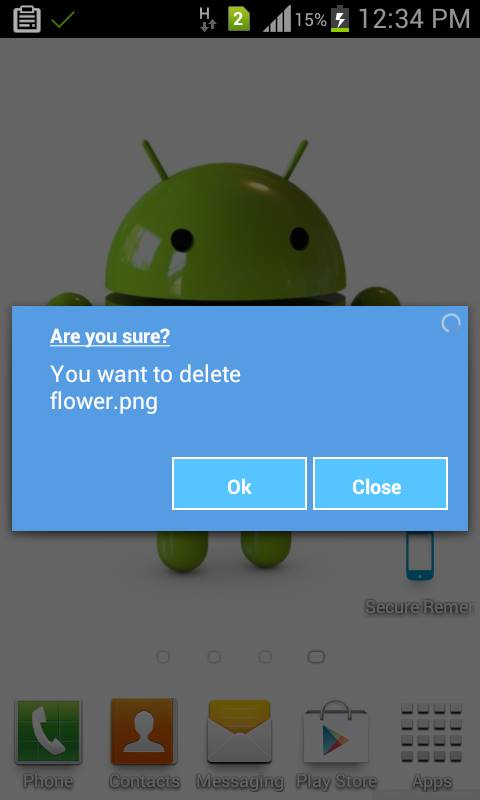
누군가 나를 도울 수 있는지 궁금합니다. 사용자 정의 AlertDialog를 만들려고합니다. 이를 위해 styles.xml에 다음 코드 줄을 추가했습니다.

<resources>
 <style name="CustomAlertDialog" parent="android:Theme.Dialog.Alert">
  <item name="android:windowBackground">@drawable/color_panel_background</item>
 </style>
</resources>
  • color_panel_background.9.png는 드로어 블 폴더에 있습니다. 이것은 Android SDK res 폴더에서도 사용할 수 있습니다.

주요 활동은 다음과 같습니다.

package com.customdialog;

import android.app.Activity;
import android.app.AlertDialog;
import android.app.Dialog;
import android.content.DialogInterface;
import android.os.Bundle;

public class CustomDialog extends Activity {
    /** Called when the activity is first created. */
    @Override
    public void onCreate(Bundle savedInstanceState) {
        super.onCreate(savedInstanceState);
        setContentView(R.layout.main);

        this.setTheme(R.style.CustomAlertDialog);
        AlertDialog.Builder builder = new AlertDialog.Builder(this);
        builder.setMessage("HELLO!");
        builder .setCancelable(false)
          .setPositiveButton("Yes", new DialogInterface.OnClickListener() {
           public void onClick(DialogInterface dialog, int id) {
               //MyActivity.this.finish();
           }
       })
       .setNegativeButton("No", new DialogInterface.OnClickListener() {
           public void onClick(DialogInterface dialog, int id) {
               //dialog.cancel();
           }
       });

        AlertDialog alertdialog = builder.create();
        alertdialog.show();
    }
}

테마를 AlertDialog에 적용하려면 테마를 현재 컨텍스트로 설정해야했습니다.

그러나 앱에 사용자 정의 된 AlertDialog를 표시하지 못하는 것 같습니다. 누구든지 이것을 도울 수 있습니까?


나는 매우 도움이 될 GitHub의에이 REPO를 발견 github.com/StylingAndroid/AlertDialog
esilver을

답변:


363

Dialog.java (Android src)에서는 ContextThemeWrapper가 사용됩니다. 따라서 아이디어를 복사하고 다음과 같은 작업을 수행 할 수 있습니다.

AlertDialog.Builder builder = new AlertDialog.Builder(new ContextThemeWrapper(this, R.style.AlertDialogCustom));

그런 다음 원하는대로 스타일을 지정하십시오.

<?xml version="1.0" encoding="utf-8"?>
<resources>
    <style name="AlertDialogCustom" parent="@android:style/Theme.Dialog">
        <item name="android:textColor">#00FF00</item>
        <item name="android:typeface">monospace</item>
        <item name="android:textSize">10sp</item>
    </style>
</resources>

62
@android : style / AlertDialog를 사용하지 마십시오. 공개 API에 없습니다. 결과적으로 Android 2.3.3에서는 빌더를 작성할 때 충돌이 발생합니다.
Catalin Morosan

18
@kaciula @android:style/Theme.Dialog공개입니까? 대신 사용할 수 있습니까?
HRJ

24
예. 공개입니다. 모든 공개 스타일 목록은 developer.android.com/reference/android/R.style.html 을 확인하십시오 . API의 이름은 코드에서 사용 된 이름과 다릅니다. "."대신 '_'가 있습니다. (Theme_Dialog)
카탈린 Morosan

2
위의 xml 파일을 어디에 배치해야합니까?
Chaitanya Chandurkar

3
호환성 테마의 일부인 최신 테마의 경우 해당 Theme.AppCompat.Light.Dialog.Alert스타일을 사용자 지정 스타일의 부모로 사용하는 것이 좋습니다 . 이 작업을 수행하지만, 있는지 확인하십시오 당신이 가져 오는 import android.support.v7.app.AlertDialog; 아니라import android.app.AlertDialog
w3bshark

93

AlertDialog여기에 설명 된 것처럼 SDK 1.6을 사용 하여이 테마 관련 문제가 발생했습니다 .http : //markmail.org/message/mj5ut56irkrkc4nr

다음을 수행하여 문제를 해결했습니다.

  new AlertDialog.Builder(
  new ContextThemeWrapper(context, android.R.style.Theme_Dialog))

도움이 되었기를 바랍니다.


2
몇 가지 관련 주제가 있습니다. 내 경우에는 android.R.style.Theme_Holo_Dialog가 더 적합했습니다. 좋은 팁.
Johnny O

78

XML 스타일 파일을 사용하여 AlertDialog의 레이아웃을 구성하는 방법에 대한 기사 를 블로그에 작성했습니다 . 주요 문제는 다른 레이아웃 매개 변수에 대해 다른 스타일 정의가 필요하다는 것입니다. 다음은 텍스트 크기 및 배경색과 같은 표준 레이아웃 측면을 모두 포함해야하는 스타일 파일에 대한 Holo Light Platform 버전 19의 AlertDialog 스타일을 기반으로 한 상용구입니다.

<style name="AppBaseTheme" parent="android:Theme.Holo.Light">
    ...
    <item name="android:alertDialogTheme">@style/MyAlertDialogTheme</item>
    <item name="android:alertDialogStyle">@style/MyAlertDialogStyle</item>
    ...
</style>

<style name="MyBorderlessButton">
    <!-- Set background drawable and text size of the buttons here -->
    <item name="android:background">...</item>
    <item name="android:textSize">...</item>
</style>

<style name="MyButtonBar">
    <!-- Define a background for the button bar and a divider between the buttons here -->
    <item name="android:divider">....</item>
    <item name="android:dividerPadding">...</item>
    <item name="android:showDividers">...</item>
    <item name="android:background">...</item>
</style>

<style name="MyAlertDialogTitle">
    <item name="android:maxLines">1</item>
    <item name="android:scrollHorizontally">true</item>
</style>

<style name="MyAlertTextAppearance">
    <!-- Set text size and color of title and message here -->
    <item name="android:textSize"> ... </item>
    <item name="android:textColor">...</item>
</style>

<style name="MyAlertDialogTheme">
    <item name="android:windowBackground">@android:color/transparent</item>
    <item name="android:windowTitleStyle">@style/MyAlertDialogTitle</item>
    <item name="android:windowContentOverlay">@null</item>
    <item name="android:windowMinWidthMajor">@android:dimen/dialog_min_width_major</item>
    <item name="android:windowMinWidthMinor">@android:dimen/dialog_min_width_minor</item>
    <item name="android:windowIsFloating">true</item>
    <item name="android:textAppearanceMedium">@style/MyAlertTextAppearance</item>
    <!-- If you don't want your own button bar style use
            @android:style/Holo.Light.ButtonBar.AlertDialog
            and
            ?android:attr/borderlessButtonStyle
         instead of @style/MyButtonBar and @style/MyBorderlessButton -->
    <item name="android:buttonBarStyle">@style/MyButtonBar</item>
    <item name="android:buttonBarButtonStyle">@style/MyBorderlessButton</item>
</style>

<style name="MyAlertDialogStyle">
    <!-- Define background colors of title, message, buttons, etc. here -->
    <item name="android:fullDark">...</item>
    <item name="android:topDark">...</item>
    <item name="android:centerDark">...</item>
    <item name="android:bottomDark">...</item>
    <item name="android:fullBright">...</item>
    <item name="android:topBright">...</item>
    <item name="android:centerBright">...</item>
    <item name="android:bottomBright">...</item>
    <item name="android:bottomMedium">...</item>
    <item name="android:centerMedium">...</item>
</style>

2
AlertDialog 사용자 정의에 스타일과 테마가 모두 필요한 이유를 물어볼 수 있습니까? 고마워요! @nantoka
brainvision

2
@brainvision 내 블로그 항목에 세부 사항이 있지만 AlertDialog의 레이아웃은 다른 레이아웃 매개 변수 파일을 사용하는 두 가지 클래스 (Dialog 및 AlertController)에서 제공됩니다.
Nantoka

46
 <style name="AlertDialogCustom" parent="Theme.AppCompat.Light.Dialog.Alert">
    <!-- Used for the buttons -->
    <item name="colorAccent">@color/colorAccent</item>
    <!-- Used for the title and text -->
    <item name="android:textColorPrimary">#FFFFFF</item>
    <!-- Used for the background -->
    <item name="android:background">@color/teal</item>
</style>


new AlertDialog.Builder(new ContextThemeWrapper(context,R.style.AlertDialogCustom))
            .setMessage(Html.fromHtml(Msg))
            .setPositiveButton(posBtn, okListener)
            .setNegativeButton(negBtn, null)
            .create()
            .show();

3
가장 단순하면서도 빠른 솔루션!
FonzTech

4
"AppTheme"에서 속성을 사용하여 전역 적으로 선언하는 것은 어떻습니까?
deadfish

2
이것은 대화 상자의 버튼 색상을 변경하는 데 도움이되었습니다.
icarovirtual

1
고마워 친구, 내 주를 구했어 !!
Clifton Steenkamp

31

나는 이것으로 고투하고 있었다-당신은 android:alertDialogStyle="@style/AlertDialog"당신의 테마에서 대화 상자의 배경을 스타일링 할 수 있지만, 당신이 가진 모든 텍스트 설정은 무시합니다. @rflexor가 위에서 말했듯이 Honeycomb 이전에는 SDK로 수행 할 수 없습니다 (잘 사용하십시오 Reflection).

간단히 말해서, 위의 방법을 사용하여 대화 상자의 배경을 스타일링 한 다음 SDK의 레이아웃과 동일한 레이아웃을 사용하여 사용자 정의 제목 및 내용보기를 설정했습니다.

내 포장지 :

import com.mypackage.R;

import android.app.AlertDialog;
import android.content.Context;
import android.graphics.drawable.Drawable;
import android.view.View;
import android.widget.ImageView;
import android.widget.TextView;

public class CustomAlertDialogBuilder extends AlertDialog.Builder {

    private final Context mContext;
    private TextView mTitle;
    private ImageView mIcon;
    private TextView mMessage;

    public CustomAlertDialogBuilder(Context context) {
        super(context);
        mContext = context; 

        View customTitle = View.inflate(mContext, R.layout.alert_dialog_title, null);
        mTitle = (TextView) customTitle.findViewById(R.id.alertTitle);
        mIcon = (ImageView) customTitle.findViewById(R.id.icon);
        setCustomTitle(customTitle);

        View customMessage = View.inflate(mContext, R.layout.alert_dialog_message, null);
        mMessage = (TextView) customMessage.findViewById(R.id.message);
        setView(customMessage);
    }

    @Override
    public CustomAlertDialogBuilder setTitle(int textResId) {
        mTitle.setText(textResId);
        return this;
    }
    @Override
    public CustomAlertDialogBuilder setTitle(CharSequence text) {
        mTitle.setText(text);
        return this;
    }

    @Override
    public CustomAlertDialogBuilder setMessage(int textResId) {
        mMessage.setText(textResId);
        return this;
    }

    @Override
    public CustomAlertDialogBuilder setMessage(CharSequence text) {
        mMessage.setText(text);
        return this;
    }

    @Override
    public CustomAlertDialogBuilder setIcon(int drawableResId) {
        mIcon.setImageResource(drawableResId);
        return this;
    }

    @Override
    public CustomAlertDialogBuilder setIcon(Drawable icon) {
        mIcon.setImageDrawable(icon);
        return this;
    }

}

alert_dialog_title.xml (SDK에서 가져옴)

<?xml version="1.0" encoding="utf-8"?>
<LinearLayout
    xmlns:android="http://schemas.android.com/apk/res/android"
    android:layout_width="fill_parent"
    android:layout_height="wrap_content"
    android:orientation="vertical"
    >
    <LinearLayout
            android:id="@+id/title_template"
            android:layout_width="fill_parent"
            android:layout_height="wrap_content"
            android:orientation="horizontal"
            android:gravity="center_vertical"
            android:layout_marginTop="6dip"
            android:layout_marginBottom="9dip"
            android:layout_marginLeft="10dip"
            android:layout_marginRight="10dip">

            <ImageView android:id="@+id/icon"
                android:layout_width="wrap_content"
                android:layout_height="wrap_content"
                android:layout_gravity="top"
                android:paddingTop="6dip"
                android:paddingRight="10dip"
                android:src="@drawable/ic_dialog_alert" />
            <TextView android:id="@+id/alertTitle"
                style="@style/?android:attr/textAppearanceLarge"
                android:singleLine="true"
                android:ellipsize="end"
                android:layout_width="fill_parent"
                android:layout_height="wrap_content" />
        </LinearLayout>
        <ImageView android:id="@+id/titleDivider"
            android:layout_width="fill_parent"
            android:layout_height="1dip"
            android:scaleType="fitXY"
            android:gravity="fill_horizontal"
            android:src="@drawable/divider_horizontal_bright" />
</LinearLayout>

alert_dialog_message.xml

<?xml version="1.0" encoding="utf-8"?>
<ScrollView xmlns:android="http://schemas.android.com/apk/res/android"
            android:id="@+id/scrollView"
            android:layout_width="fill_parent"
            android:layout_height="wrap_content"
            android:paddingTop="2dip"
            android:paddingBottom="12dip"
            android:paddingLeft="14dip"
            android:paddingRight="10dip">
    <TextView android:id="@+id/message"
                style="?android:attr/textAppearanceMedium"
                android:textColor="@color/dark_grey"
                android:layout_width="fill_parent"
                android:layout_height="wrap_content"
                android:padding="5dip" />
</ScrollView>

그런 다음 대화 상자를 만드는 CustomAlertDialogBuilder대신 대신 사용 하고 평소 와 같이 AlertDialog.Builder전화하십시오 .setTitlesetMessage


3
android.R.internal.id.alerttitle에 어떻게 액세스 했습니까?
Gilbert

2
나는하지 않았다, 나는 R.id.alertTitle에 접근했다
Joseph Earl

28

빌더를 시작할 때 테마를 직접 지정할 수 있습니다.

AlertDialog.Builder builder = new AlertDialog.Builder(
                    getActivity(), R.style.MyAlertDialogTheme);

그런 다음 테마를 values/styles.xml

<!-- Alert Dialog -->
<style name="MyAlertDialogTheme" parent="Theme.AppCompat.Dialog.Alert">
    <item name="colorAccent">@color/colorAccent</item>
    <item name="android:colorBackground">@color/alertDialogBackground</item>
    <item name="android:windowBackground">@color/alertDialogBackground</item>
</style>

1
완전한. 유일한 것은 내가 사용Theme.AppCompat.Light.Dialog.Alert
ekashking

11

사용자 정의 대화 상자의 경우 :

대화 상자 생성자 super(context,R.style.<dialog style>)대신 호출하십시오.super(context)

public class MyDialog extends Dialog
{
    public MyDialog(Context context)
    {
       super(context, R.style.Theme_AppCompat_Light_Dialog_Alert)
    }
}


AlertDialog의 경우 :

이 생성자로 alertDialog를 만드십시오.

 new AlertDialog.Builder(
 new ContextThemeWrapper(context, android.R.style.Theme_Dialog))

1
테마 스타일을 취하는 생성자 버전이 이미 있으므로 비어있는 새 클래스로 Dialog를 확장 할 필요가 없습니다.
FindOut_Quran

@FindOut_Quran 요점은 사용자 정의 Dialog 클래스에서 스타일을 재정의하는 방법을 보여주는 것입니다. 이것은 단지 예일뿐입니다. 실제 Dialog 클래스에는 다른 코드도 있습니다.
Niall

8

나는 그것을 할 수없는 것 같아요. 최소한 빌더에서는 그렇지 않습니다. 1.6으로 작업하고 있으며 Builder.create ()의 구현은 다음과 같습니다.

public AlertDialog create() {
    final AlertDialog dialog = new AlertDialog(P.mContext);
    P.apply(dialog.mAlert);
    [...]
}

AlertDialog의 "테마를 인식하지 못하는"생성자를 호출합니다.

protected AlertDialog(Context context) {
    this(context, com.android.internal.R.style.Theme_Dialog_Alert);
}

AlertDialog에는 테마를 변경하는 두 번째 생성자가 있습니다.

protected AlertDialog(Context context, int theme) {
    super(context, theme);
    [...]
}

빌더가 호출하지 않습니다.

어쨌든 Dialog가 꽤 일반적이라면 AlertDialog의 하위 클래스를 작성하여 두 번째 생성자를 호출하고 Builder-mechanism 대신 해당 클래스를 사용하려고합니다.


4

이 작업을 수행하는 더 좋은 방법은 사용자 정의 대화 상자를 사용하고 필요에 따라 사용자 정의 대화 상자 예제입니다 .....

여기에 이미지 설명을 입력하십시오

public class CustomDialogUI {
Dialog dialog;
Vibrator vib;
RelativeLayout rl;

@SuppressWarnings("static-access")
public void dialog(final Context context, String title, String message,
        final Runnable task) {
    dialog = new Dialog(context);
    dialog.requestWindowFeature(Window.FEATURE_NO_TITLE);
    dialog.setContentView(R.layout.custom);
    dialog.setCancelable(false);
    TextView m = (TextView) dialog.findViewById(R.id.message);
    TextView t = (TextView) dialog.findViewById(R.id.title);
    final Button n = (Button) dialog.findViewById(R.id.button2);
    final Button p = (Button) dialog.findViewById(R.id.next_button);
    rl = (RelativeLayout) dialog.findViewById(R.id.rlmain);
    t.setText(bold(title));
    m.setText(message);
    dialog.show();
    n.setText(bold("Close"));
    p.setText(bold("Ok"));
    // color(context,rl);
    vib = (Vibrator) context.getSystemService(context.VIBRATOR_SERVICE);
    n.setOnClickListener(new OnClickListener() {
        @Override
        public void onClick(View arg0) {
            vib.vibrate(15);
            dialog.dismiss();
        }
    });
    p.setOnClickListener(new OnClickListener() {
        @Override
        public void onClick(View arg0) {
            vib.vibrate(20);
            dialog.dismiss();
            task.run();
        }
    });
}
 //customize text style bold italic....
public SpannableString bold(String s) {
    SpannableString spanString = new SpannableString(s);
    spanString.setSpan(new StyleSpan(Typeface.BOLD), 0,
            spanString.length(), 0);
    spanString.setSpan(new UnderlineSpan(), 0, spanString.length(), 0);
    // spanString.setSpan(new StyleSpan(Typeface.ITALIC), 0,
    // spanString.length(), 0);
    return spanString;
}

}

여기 XML 레이아웃이 있습니다

<?xml version="1.0" encoding="utf-8"?>
<RelativeLayout xmlns:android="http://schemas.android.com/apk/res/android"
android:layout_width="match_parent"
android:layout_height="match_parent"
android:background="#00000000"
>

<RelativeLayout
    android:id="@+id/rlmain"
    android:layout_width="fill_parent"
    android:layout_height="150dip"
    android:layout_alignParentLeft="true"
    android:layout_centerVertical="true"
    android:background="#569CE3" >

    <RelativeLayout
        android:id="@+id/relativeLayout1"
        android:layout_width="wrap_content"
        android:layout_height="wrap_content"
        android:layout_alignParentLeft="true"
        android:layout_alignParentTop="true"
        android:layout_centerHorizontal="true"
        android:layout_marginLeft="25dip"
        android:layout_marginTop="10dip" >

        <TextView
            android:id="@+id/title"
            android:layout_width="wrap_content"
            android:layout_height="wrap_content"
            android:layout_alignParentLeft="true"
            android:layout_alignParentTop="true"
            android:text="Are you Sure?"
            android:textAppearance="?android:attr/textAppearanceMedium"
            android:textColor="#ffffff"
            android:textSize="13dip" />
    </RelativeLayout>

    <RelativeLayout
        android:id="@+id/relativeLayout2"
        android:layout_width="wrap_content"
        android:layout_height="wrap_content"
        android:layout_alignLeft="@+id/relativeLayout1"
        android:layout_alignRight="@+id/relativeLayout1"
        android:layout_below="@+id/relativeLayout1"
        android:layout_marginTop="5dip" >
    </RelativeLayout>

    <ProgressBar
        android:id="@+id/process"
        style="?android:attr/progressBarStyleSmall"
        android:layout_width="wrap_content"
        android:layout_height="wrap_content"
        android:layout_alignParentRight="true"
        android:layout_alignParentTop="true"
        android:layout_marginRight="3dip"
        android:layout_marginTop="3dip" />

    <RelativeLayout
        android:id="@+id/relativeLayout3"
        android:layout_width="fill_parent"
        android:layout_height="wrap_content"
        android:layout_alignLeft="@+id/relativeLayout2"
        android:layout_below="@+id/relativeLayout2"
        android:layout_toLeftOf="@+id/process" >

        <TextView
            android:id="@+id/message"
            android:layout_width="wrap_content"
            android:layout_height="wrap_content"
            android:layout_alignParentLeft="true"
            android:layout_centerVertical="true"
            android:text="Medium Text"
            android:textAppearance="?android:attr/textAppearanceMedium"
            android:textColor="#ffffff"
            android:textSize="13dip"/>

    </RelativeLayout>

    <Button
        android:id="@+id/next_button"
        android:layout_width="90dip"
        android:layout_height="35dip"
        android:layout_alignParentBottom="true"
        android:textColor="@drawable/button_text_color"
         android:background="@drawable/blue_button"
         android:layout_marginBottom="5dp"
           android:textSize="10dp"

        android:layout_alignRight="@+id/relativeLayout3"
        android:text="Okay" />

    <Button
        android:id="@+id/button2"
        android:text="Cancel"
        android:textColor="@drawable/button_text_color"
        android:layout_width="90dip"
        android:layout_height="35dip"
        android:layout_marginBottom="5dp"
         android:background="@drawable/blue_button"
         android:layout_marginRight="7dp"
        android:textSize="10dp"
        android:layout_alignParentBottom="true"
        android:layout_toLeftOf="@+id/next_button"
         />

</RelativeLayout>


7
커스텀 뷰의 테마 지정 및 사용은 서로 다른 두 가지이며 목적이 다릅니다.
jmc34

3

Fragment 내에서 (지원 라이브러리를 사용하여 (예 : API 11 이전))이 작업을 수행하려는 사람은 다음과 함께해야합니다.

public class LoadingDialogFragment extends DialogFragment {
    public static final String ID = "loadingDialog";

    public static LoadingDialogFragment newInstance() {
        LoadingDialogFragment f = new LoadingDialogFragment();

        return f;
    }

    @Override
    public Dialog onCreateDialog(Bundle savedInstanceState) {
        StyleAlertDialog adb = new StyleAlertDialog(getActivity(), R.style.Your_Style);
        adb.setView(getActivity().getLayoutInflater().inflate(R.layout.fragment_dialog_layout, null));
        return adb;
    }

    private class StyleAlertDialog extends AlertDialog {
        protected StyleAlertDialog(Context context, int theme) {
            super(context, theme);
        }
    }
}

@Rflexor는 AlertDialog를 확장하고 생성자 덕분에 노출시킬 수있는 너지를 줬습니다.


생성자 AlertDialog.Builder(Context, int)는 API 11 이상에서만 작동합니다. 이전 Android 버전에서 코드가 충돌합니다.
Joseph Earl

@JosephEarl (지원 라이브러리, 즉 사전 API 11 사용)
Blundell

나쁜 점은 대화 상자 생성자를 사용 하지 않고 대화 상자 생성자를 사용하는 것 입니다.
Joseph Earl

2

아직 테스트하지는 않았지만 Arve Waltin의 솔루션은 좋아 보입니다. 경우에 다른 솔루션 당신이 직장에 .... 확장하는 것이 점점 문제가 있습니다 AlertDialog.Builder(예. 모든 방법을 오버라이드 (override) setText, setTitle, setView실제 대화 상자의 텍스트 / 제목 /보기를 설정하지 않는 등),하지만 내 새로운 뷰를 만들 수는 Dialog 's View는 모든 것을 수행합니다. 그런 다음 원하는대로 모든 스타일을 자유롭게 지정할 수 있습니다.

명확히하기 위해 부모 클래스와 관련하여보기가 설정되고 다른 것은 없습니다.

사용자 정의 확장 클래스에 관한 한 모든 것이 해당 뷰 내에서 수행됩니다.


0

LayoutInflator를 통해 뷰가 부풀려지는 빌더가있는 사용자 정의 대화 상자에서 Arve의 솔루션이 어떻게 작동하는지 잘 모르겠습니다.

해결책은 다음을 통해 팽창기에 ContextThemeWrapper를 삽입하는 것입니다 cloneInContext().

View sensorView = LayoutInflater.from(context).cloneInContext(
     new ContextThemeWrapper(context, R.style.AppTheme_DialogLight)
).inflate(R.layout.dialog_fingerprint, null);

-1

빌더의 setView ()를 사용하여 간단하게 수행 할 수 있습니다. 원하는보기를 작성하고 빌더에 피드 할 수 있습니다. 이것은 잘 작동합니다. 대화 상자 작성기에 의해 렌더링되는 사용자 정의 TextView를 사용합니다. 나는 메시지를 설정하지 않으며이 공간은 내 custome textview를 렌더링하는 데 사용됩니다.


-12
AlertDialog.Builder builder = new AlertDialog.Builder(this);
builder.setTitle("Title");
builder.setMessage("Description");
builder.setPositiveButton("OK", null);
builder.setNegativeButton("Cancel", null);
builder.show();

내장 코드 스 니펫으로 코드를 포맷 하시겠습니까?
Adriano
당사 사이트를 사용함과 동시에 당사의 쿠키 정책개인정보 보호정책을 읽고 이해하였음을 인정하는 것으로 간주합니다.
Licensed under cc by-sa 3.0 with attribution required.