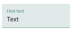
정상적인 상태에서 작동하는 아래 코드를 사용해보십시오.
 <android.support.design.widget.TextInputLayout
     android:layout_width="match_parent"
     android:layout_height="wrap_content"
     android:theme="@style/TextLabel">

     <android.support.v7.widget.AppCompatEditText
         android:layout_width="match_parent"
         android:layout_height="wrap_content"
         android:hint="Hiiiii"
         android:id="@+id/edit_id"/>

 </android.support.design.widget.TextInputLayout>
스타일 폴더 텍스트 레이블 코드
 <style name="TextLabel" parent="TextAppearance.AppCompat">
    <!-- Hint color and label color in FALSE state -->
    <item name="android:textColorHint">@color/Color Name</item>
    <item name="android:textSize">20sp</item>
    <!-- Label color in TRUE state and bar color FALSE and TRUE State -->
    <item name="colorAccent">@color/Color Name</item>
    <item name="colorControlNormal">@color/Color Name</item>
    <item name="colorControlActivated">@color/Color Name</item>
 </style>
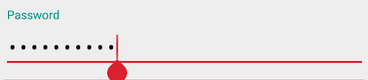
앱의 주요 테마로 설정하면 상태 만 강조 표시됩니다.
<item name="colorAccent">@color/Color Name</item>
최신 정보:
UnsupportedOperationException : api 16 이하에서 색상으로 변환 할 수 없음 : type = 0x2
해결책
최신 정보:
재료 구성 요소 라이브러리를 사용하고 있습니까
기본 테마에 아래 줄을 추가 할 수 있습니다
 <item name="colorPrimary">@color/your_color</item> // Activated State
 <item name="colorOnSurface">@color/your_color</item> // Normal State
또는 noraml 상태와 활성화 상태에서 다른 색상을 원하고 사용자 정의가 아래 코드를 따르고 싶습니까?
<style name="Widget.App.TextInputLayout" parent="Widget.MaterialComponents.TextInputLayout.OutlinedBox">
    <item name="materialThemeOverlay">@style/ThemeOverlay.App.TextInputLayout</item>
    <item name="shapeAppearance">@style/ShapeAppearance.App.SmallComponent</item> //Changes the Shape Apperance
    <!--<item name="hintTextColor">?attr/colorOnSurface</item>-->   //When you added this line it will applies only one color in normal and activate state i.e colorOnSurface color
</style>

<style name="ThemeOverlay.App.TextInputLayout" parent="">
    <item name="colorPrimary">@color/colorPrimaryDark</item>  //Activated color
    <item name="colorOnSurface">@color/colorPrimary</item>    //Normal color
    <item name="colorError">@color/colorPrimary</item>        //Error color

    //Text Appearance styles
    <item name="textAppearanceSubtitle1">@style/TextAppearance.App.Subtitle1</item>
    <item name="textAppearanceCaption">@style/TextAppearance.App.Caption</item>

    <!--Note: When setting a materialThemeOverlay on a custom TextInputLayout style, don’t forget to set editTextStyle to either a @style/Widget.MaterialComponents.TextInputEditText.* style or to a custom one that inherits from that.
    The TextInputLayout styles set materialThemeOverlay that overrides editTextStyle with the specific TextInputEditText style needed. Therefore, you don’t need to specify a style tag on the edit text.-->
    <item name="editTextStyle">@style/Widget.MaterialComponents.TextInputEditText.OutlinedBox</item>
</style>

<style name="TextAppearance.App.Subtitle1" parent="TextAppearance.MaterialComponents.Subtitle1">
    <item name="fontFamily">@font/your_font</item>
    <item name="android:fontFamily">@font/your_font</item>
</style>

<style name="TextAppearance.App.Caption" parent="TextAppearance.MaterialComponents.Caption">
    <item name="fontFamily">@font/your_font</item>
    <item name="android:fontFamily">@font/your_font</item>
</style>

<style name="ShapeAppearance.App.SmallComponent" parent="ShapeAppearance.MaterialComponents.SmallComponent">
    <item name="cornerFamily">cut</item>
    <item name="cornerSize">4dp</item>
</style>
기본 테마에 아래 줄을 추가하거나 XML에서 스타일을 textinputlayout으로 설정할 수 있습니다
<item name="textInputStyle">@style/Widget.App.TextInputLayout</item>