CSS / HTML : 입력 필드 주위에 빛나는 테두리 만들기


171

내 양식에 알맞은 입력을 만들고 싶고 TWITTER가 입력 주변에서 빛나는 테두리를 어떻게 수행하는지 알고 싶습니다.

트위터 테두리의 예 / 사진 :

여기에 이미지 설명을 입력하십시오

또한 둥근 모서리를 만드는 방법을 모르겠습니다.


7
: 여기에 방법을 가르치는 튜토리얼의 CSS 상자 - 그림자 효과 빛
타운

@Town 님의 링크가 제대로 작동하지 않습니다 : redirect loop.
JeroldHaas

답변:


415

여기 있습니다 :

.glowing-border {
    border: 2px solid #dadada;
    border-radius: 7px;
}

.glowing-border:focus { 
    outline: none;
    border-color: #9ecaed;
    box-shadow: 0 0 10px #9ecaed;
}

라이브 데모 : http://jsfiddle.net/simevidas/CXUpm/1/show/

(데모 코드를 보려면 URL에서 "show /"를 제거하십시오)

label { 
    display:block;
    margin:20px;
    width:420px;
    overflow:auto;
    font-family:sans-serif;
    font-size:20px;
    color:#444;
    text-shadow:0 0 2px #ddd;
    padding:20px 10px 10px 0;
}

input {
    float:right;
    width:200px;
    border:2px solid #dadada;
    border-radius:7px;
    font-size:20px;
    padding:5px;
    margin-top:-10px;    
}

input:focus { 
    outline:none;
    border-color:#9ecaed;
    box-shadow:0 0 10px #9ecaed;
}
<label> Aktuelles Passwort: <input type="password"> </label>
<label> Neues Passwort: <input type="password"> </label>


4
글로우에 애니메이션을 적용하려면 어떻게해야합니까?
3lvis

17
@NSElvis 예 : transition: box-shadow linear 1s jsfiddle.net/simevidas/6LyWe/1
Šime Vidas

아주 좋아요 한 가지, 텍스트 입력 필드에만 적용하려는 경우 선택기를 제한하고 싶을 것입니다 : input [type = text] : focus, input [type = password], input [type = textarea].
마이클 케네디

1
@MichaelKennedy 실제 응용 프로그램에서는 충분하지 않습니다. 표준 접근 방식은 클래스입니다 (예 :) .glowing-input { … }.
Šime Vidas

물론 요점은 라디오 버튼, 제출 버튼 등에 원하지 않는 것입니다.
마이클 케네디

30

어떻게 이런 일이 ... http://jsfiddle.net/UnsungHero97/Qwpq4/1207/

여기에 이미지 설명을 입력하십시오

CSS

input {
    border: 1px solid #4195fc; /* some kind of blue border */

    /* other CSS styles */

    /* round the corners */
    -webkit-border-radius: 4px;
       -moz-border-radius: 4px;
            border-radius: 4px;


    /* make it glow! */
    -webkit-box-shadow: 0px 0px 4px #4195fc;
       -moz-box-shadow: 0px 0px 4px #4195fc;
            box-shadow: 0px 0px 4px #4195fc; /* some variation of blue for the shadow */

}

1
이것은 내 및 완화되지 않는다
rubo77

1
그래서 무엇? 허용되는 답변은 편하지 않습니다. 원래 질문 (및 내 대답)은 2011 년에 게시되었으며 트위터의 빛나는 테두리가 점점 줄어들지 않을 것이라고 확신합니다. 또한이 질문은 용이성에 중점을 두지 않고 둥근 모서리로 테두리를 빛나게하는 방법에 중점을 둡니다. 난 당신이 쉽게 여유가 없기 때문에 당신이 저를 공세해야한다고 생각하지 않습니다
Hristo

6

일반 파란색 border, 중간 border-radiusbox-shadow위치가 있는 파란색을 사용하십시오 0 0.


3

SLak은 머리에 못을 박았지만 일반적으로 CSS3의 입력 변경 사항을 살펴볼 수 있습니다. 둥근 모서리와 상자 그림자는 CSS3의 새로운 기능이며 원하는 것을 정확하게 수행 할 수 있습니다. CSS3 / HTML5에 대한 개인적으로 가장 좋아하는 링크 중 하나는 http://diveintohtml5.ep.io/ 입니다.


2

이전 답변 중 두 가지를 결합했습니다 ( jsfiddle ).

input {
    /* round the corners */
    border-radius: 4px;
    -moz-border-radius: 4px;
    -webkit-border-radius: 4px;    
}

input:focus { 
    outline:none;
    border: 1px solid #4195fc; 
    /* create a BIG glow */
    box-shadow: 0px 0px 14px #4195fc; 
    -moz-box-shadow: 0px 0px 14px #4195fc;
    -webkit-box-shadow: 0px 0px 14px #4195fc;  
}​

2

덜 빛나는 버전으로 수정 된 버전.

input {
    /* round the corners */
    //background-color: transparent;
    border: 1px solid;
    height: 20px;
    width: 160px;
    color: #CCC;
    border-radius: 4px;
    -moz-border-radius: 4px;
    -webkit-border-radius: 4px;    
}

input:focus { 
    outline:none;
    border: 1px solid #4195fc; 
    /* create a BIG glow */
    box-shadow: 0px 0px 5px #4195fc; 
    -moz-box-shadow: 0px 0px 5px #4195fc;
    -webkit-box-shadow: 0px 0px 5px #4195fc;  
}

0
input[type="text"]{
   @include transition(all 0.30s ease-in-out);
  outline: none;
  padding: 3px 0px 3px 3px;
  margin: 5px 1px 3px 0px;
  border: 1px solid #DDDDDD;
}
input[type="text"]:focus{
  @include box-shadow(0 0 5px rgba(81, 203, 238, 1));
  -webkit-box-shadow: 0px 0px 5px #007eff;  
  -moz-box-shadow: 0px 0px 5px #007eff;  
  box-shadow: 0px 0px 5px #007eff;
}

0

아래는 Bootstrap이 사용하는 코드입니다. 색상은 약간 다르지만 개념은 동일합니다. 이것은 LESS를 사용하여 CSS를 컴파일하는 경우입니다.

// Form control focus state
//
// Generate a customized focus state and for any input with the specified color,
// which defaults to the `@input-focus-border` variable.
//
// We highly encourage you to not customize the default value, but instead use
// this to tweak colors on an as-needed basis. This aesthetic change is based on
// WebKit's default styles, but applicable to a wider range of browsers. Its
// usability and accessibility should be taken into account with any change.
//
// Example usage: change the default blue border and shadow to white for better
// contrast against a dark gray background.

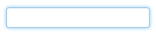
.form-control-focus(@color: @input-border-focus) {
  @color-rgba: rgba(red(@color), green(@color), blue(@color), .6);
  &:focus {
    border-color: @color;
    outline: 0;
    .box-shadow(~"inset 0 1px 1px rgba(0,0,0,.075), 0 0 8px @{color-rgba}");
  }
}

LESS를 사용하지 않는 경우 컴파일 된 버전은 다음과 같습니다.

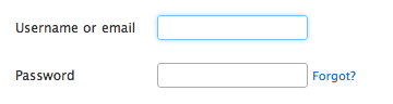
.form-control:focus {
    border-color: #66afe9;
    outline: 0;
    -webkit-box-shadow: inset 0 1px 1px rgba(0, 0, 0, 0.075), 0 0 8px rgba(102, 175, 233, 0.6);
    box-shadow: inset 0 1px 1px rgba(0, 0, 0, 0.075), 0 0 8px rgba(102, 175, 233, 0.6);
}

0

빛나는 입력 필드와 텍스트 영역이 생성됩니다.

textarea,textarea:focus,input,input:focus{
    transition: border-color 0.15s ease-in-out 0s, box-shadow 0.15s ease-in-out 0s;
    border: 1px solid #c4c4c4;
    border-radius: 4px;
    -moz-border-radius: 4px;
    -webkit-border-radius: 4px;
    box-shadow: 0px 0px 8px #d9d9d9;
    -moz-box-shadow: 0px 0px 8px #d9d9d9;
    -webkit-box-shadow: 0px 0px 8px #d9d9d9;
}

input:focus,textarea:focus { 
    outline: none;
    border: 1px solid #7bc1f7;
    box-shadow: 0px 0px 8px #7bc1f7;
    -moz-box-shadow: 0px 0px 8px #7bc1f7;
    -webkit-box-shadow: 0px 0px 8px #7bc1f7;
}

0

$('.form-fild input,.form-fild textarea').focus(function() {
    $(this).parent().addClass('open');
});

$('.form-fild input,.form-fild textarea').blur(function() {
    $(this).parent().removeClass('open');
});
.open {
  color:red;   
}
.form-fild {
	position: relative;
	margin: 30px 0;
}
.form-fild label {
	position: absolute;
	top: 5px;
	left: 10px;
	padding:5px;
}

.form-fild.open label {
	top: -25px;
	left: 10px;
	/*background: #ffffff;*/
}
.form-fild input[type="text"] {
	padding-left: 80px;
}
.form-fild textarea {
	padding-left: 80px;
}
.form-fild.open textarea, 
.form-fild.open input[type="text"] {
	padding-left: 10px;
}
textarea,
input[type="text"] {
	padding: 10px;
	width: 100%;
}
textarea,
input,
.form-fild.open label,
.form-fild label {
	-webkit-transition: all 0.2s ease-in-out;
       -moz-transition: all 0.2s ease-in-out;
         -o-transition: all 0.2s ease-in-out;
            transition: all 0.2s ease-in-out;
}
<script src="https://ajax.googleapis.com/ajax/libs/jquery/2.1.1/jquery.min.js"></script>
<div class="container">
	<div class="row">
    	<form>
        <div class="form-fild">
            <label>Name :</label>
            <input type="text">
        </div>
        <div class="form-fild">
            <label>Email :</label>
            <input type="text">
        </div>
        <div class="form-fild">
            <label>Number :</label>
            <input type="text">
        </div>
        <div class="form-fild">
            <label>Message :</label>
            <textarea cols="10" rows="5"></textarea>
        </div>
    </form>
    </div>
</div>


당사 사이트를 사용함과 동시에 당사의 쿠키 정책개인정보 보호정책을 읽고 이해하였음을 인정하는 것으로 간주합니다.
Licensed under cc by-sa 3.0 with attribution required.