Twitter 부트 스트랩 모달 박스의 기본 너비를 어떻게 변경할 수 있습니까?


373

나는 다음을 시도했다.

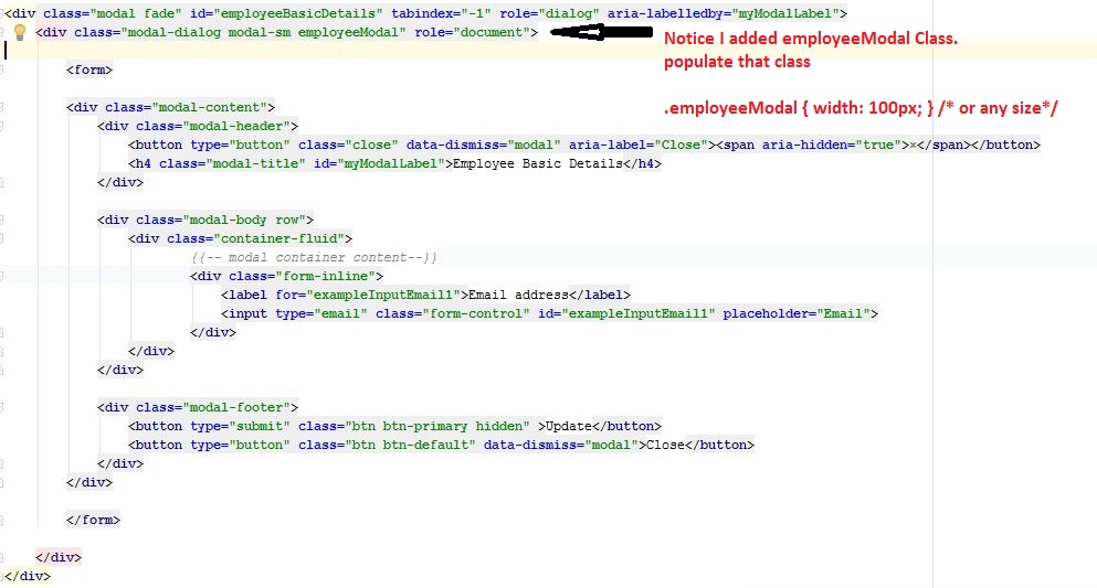
   <div class="modal hide fade modal-admin" id="testModal" style="display: none;">
        <div class="modal-header">
          <a data-dismiss="modal" class="close">×</a>
          <h3 id='dialog-heading'></h3>
        </div>
        <div class="modal-body">
            <div id="dialog-data"></div>
        </div>
        <div class="modal-footer">
          <a data-dismiss="modal" class="btn" >Close</a>
          <a class="btn btn-primary" id="btnSaveChanges">Save changes</a>
        </div>
    </div>

그리고이 자바 스크립트 :

    $('.modal-admin').css('width', '750px');
    $('.modal-admin').css('margin', '100px auto 100px auto');
    $('.modal-admin').modal('show')

결과는 내가 기대 한 것이 아닙니다. 왼쪽 상단 모달은 화면 중앙에 위치합니다.

누구든지 나를 도울 수 있습니까? 다른 사람이 이것을 시도했습니다. 나는 그것이 원치 않는 일이 아니라고 가정합니다.


부트 스트랩 플러그인에는 많은 옵션이없는 것으로 보입니다. 부트 스트랩 CSS 파일에서 클래스를 찾고 CSS를 통해 설정되어 있는지 확인하면 덮어 쓰거나 적어도 어떤 요소에 대한 더 나은 단서가 있어야합니다.
GillesC

3
응답 성이 매우 좋은 Nick N의 답변을보십시오! stackoverflow.com/a/16090509/539484
OnTheFly

답변:


373

최신 정보:

에서 bootstrap 3당신은 모달-대화 상자를 변경해야합니다. 따라서이 경우 클래스 modal-adminmodal-dialog서있는 곳에 추가 할 수 있습니다 .

원래 답변 (Bootstrap <3)

JS / jQuery를 사용하여 변경하려는 이유가 있습니까?

CSS만으로 쉽게 할 수 있으므로 문서에서 스타일을 지정할 필요가 없습니다. 자신의 사용자 정의 CSS 파일에서 다음을 추가하십시오.

body .modal {
    /* new custom width */
    width: 560px;
    /* must be half of the width, minus scrollbar on the left (30px) */
    margin-left: -280px;
}

귀하의 경우 :

body .modal-admin {
    /* new custom width */
    width: 750px;
    /* must be half of the width, minus scrollbar on the left (30px) */
    margin-left: -375px;
}

선택기 앞에 본문을 두는 이유는 기본값보다 우선 순위가 높습니다. 이 방법으로 사용자 정의 CSS 파일에 파일을 추가 할 수 있으며 Bootstrap을 업데이트하지 않아도됩니다.


2
@NickN 덕분에 더 나은 답변을 얻으려면 아래로 스크롤하십시오!
OnTheFly

1
@FloatingRock 반응 형으로 만들 수 있습니다. 내 대답을보십시오.
Nick N.

1
@NickN. 살인자! 감사합니다 닉
FloatingRock

47
부트 스트랩 3이 더 쉬워졌습니다. .modal .modal-dialog { width: 800px; }왼쪽 위치가 자동으로 계산됩니다.
Gavin

1
실제로, 이것은 나를 위해 작동하지 않습니다. 이 솔루션은 @ZimSystem의 코멘트를 통해 트릭을 수행했습니다.
tonjo

270

CSS만으로 반응하게하려면 다음을 사용하십시오.

.modal.large {
    width: 80%; /* respsonsive width */
    margin-left:-40%; /* width/2) */ 
}

참고 1 : .large수업을 사용했습니다 . 일반적 으로이 작업을 수행 할 수도 있습니다.modal

참고 2 : Bootstrap 3에서 음수 여백은 더 이상 필요하지 않을 수 있습니다 (개인적으로 확인하지 않음).

/*Bootstrap 3*/
.modal.large {
     width: 80%;
}

참고 3 : 부트 스트랩 3 및 4에는 modal-lg클래스가 있습니다. 따라서 이것으로 충분할 수 있지만, 반응 형으로 만들려면 여전히 Bootstrap 3에 제공된 수정 프로그램이 필요합니다.

일부 응용 프로그램 fixed모달이 사용되는 경우 시도 할 수 있습니다 width:80%; left:10%;(수식 : 왼쪽 = 100-너비 / 2)


이것은 매우 좁은 화면에서 모달이 화면에서 절반 떨어져있는 것처럼 보입니다.
cofiem

5
Cofiem, 미디어 쿼리를 사용하여 문제 해결
Nick N.

1
@NickN. 내 미디어 쿼리로 해결되지 않았습니다. 예를 추가 할 수 있습니까? 무시, 나는 그것을 얻었다. 나는 최소 너비 대신 최대 너비를 가졌습니다. @media (min-width: 400px) { body .modal-lrg{ width: 80%; /* respsonsive width */ margin-left:-40%; /* width/2) */ } }
HPWD

부트 스트랩에 이미 내장 된 열을 사용하는 것처럼 % 만 사용하면 충분한 제어가 이루어지지 않습니다.
Alex

@Alex 더 많은 제어 기능을 제공한다고 생각합니다. 기존 열을 어떻게 사용 하시겠습니까?
Nick N.

107

Bootstrap 3을 사용하는 경우 허용 된 답변에 표시된 것과 같이 모달 div가 아닌 모달 대화 상자 div를 변경해야합니다. 또한 Bootstrap 3의 반응성을 유지하려면 미디어 쿼리를 사용하여 재정의 CSS를 작성하는 것이 중요합니다. 따라서 작은 장치에서는 모달이 전체 너비가되도록합니다.

다른 너비로 실험하려면 이 JSFiddle 을 참조하십시오 .

HTML

<div class="modal fade">
    <div class="modal-dialog custom-class">
        <div class="modal-content">
            <div class="modal-header">
                <button type="button" class="close" data-dismiss="modal" aria-hidden="true">&times;</button>
                <h3 class="modal-header-text">Text</h3>
            </div>
            <div class="modal-body">
                This is some text.
            </div>
            <div class="modal-footer">
                This is some text.
            </div>
        </div><!-- /.modal-content -->
    </div><!-- /.modal-dialog -->
</div><!-- /.modal -->

CSS

@media screen and (min-width: 768px) {
    .custom-class {
        width: 70%; /* either % (e.g. 60%) or px (400px) */
    }
}

3
부트 스트랩 3을 수정하십시오. 여백을 조정하지 않고 작동합니다! thx
SQueek

1
필요하지 않기 때문에 답변에서 id 속성을 제거했습니다.
arcdegree

작동하지만 mlunoe 또는 Dave가 응답 할 때 응답하지 않습니다.
ksiomelo

80

상대 디자인을 깨뜨리지 않는 것을 원한다면 다음을 시도하십시오.

body .modal {
  width: 90%; /* desired relative width */
  left: 5%; /* (100%-width)/2 */
  /* place center */
  margin-left:auto;
  margin-right:auto; 
}

@Marco Johannesen이 말했듯이 선택기 앞의 "본문"은 기본값보다 우선 순위가 높습니다.


4
난 그냥 주위 margin-left:auto; margin-right:auto;auto모든 대신 사용 하는 것이 좋습니다
cwd

어떤 경우에는 top: 30%내부 내용에 따라 백분율 이 필요할 수 있습니다 .
bool.dev

6
이것은 .modal.fade.in 규칙을 생략하면 잘 작동합니다.이 규칙은 모달을 Bootstrap V2.2.2의 맨 아래로 완전히 이동시킵니다.
ramiro

1
이것은 단지 페이지 ...에서 CSS 파일로드의 코드를 드롭 ... 각-UI 모달 예와 함께 일 angular-ui.github.io/bootstrap/#/modal 에서 ... 실행 예를 plnkr.co / edit / GYmc9s? p = 미리보기
Marcello de Sales

1
위대한이 솔루션은 인터넷 탐색기 8,9,10의 2.3.2 부트 스트랩과 MAIN에서 잘 작동합니다! 왼쪽 여백이있는 솔루션 : -40 %는 인터넷 탐색기에서 올바르지 않습니다!
Cioxideru

41

Bootstrap 3+에서 모달 대화 상자의 크기를 변경하는 가장 적절한 방법은 size 속성을 사용하는 것입니다. 아래는 예제이며, 클래스를 modal-sm따라 modal-dialog작은 모달을 나타냅니다. sm작은 값 , md중간 값 및 lg큰 값 을 포함 할 수 있습니다 .

<div class="modal fade" id="ww_vergeten" tabindex="-1" role="dialog" aria-labelledby="modal_title" aria-hidden="true">
  <div class="modal-dialog modal-sm"> <!-- property to determine size -->
    <div class="modal-content">
      <div class="modal-header">
        <button type="button" class="close" data-dismiss="modal" aria-hidden="true">&times;</button>
        <h4 class="modal-title" id="modal_title">Some modal</h4>
      </div>
      <div class="modal-body">

        <!-- modal content -->

      </div>
      <div class="modal-footer">
        <button type="button" class="btn btn-primary" id="some_button" data-loading-text="Loading...">Send</button>
      </div>
    </div>
  </div>
</div>

내 대답에 추가 :)
Tum

3
이것이 최고의 대답이 아니어야합니까? 최고 답변이 사용자 정의를 도울 수 있다고 생각하지만 대부분의 사용 사례는 Bootstrap의 내장 클래스에 의해 충족되어야합니다.
WebSpanner

Bootstrap 3.x를 사용하고 있으며 modal-md수업 이없는 것 같습니다 .
James Poulose

34

내용은 Bootstrap 3여기를 수행하는 방법이다.

modal-wideHTML 마크 업에 스타일을 추가합니다 ( Bootstrap 3 docs의 예제에 따라 ).

<div class="modal fade modal-wide" id="myModal" tabindex="-1" role="dialog" aria-labelledby="myModalLabel" aria-hidden="true">
  <div class="modal-dialog">
    <div class="modal-content">
      <div class="modal-header">
        <button type="button" class="close" data-dismiss="modal" aria-hidden="true">&times;</button>
        <h4 id="myModalLabel" class="modal-title">Modal title</h4>
      </div>
      <div class="modal-body">
        <p>One fine body&hellip;</p>
      </div>
      <div class="modal-footer">
        <button type="button" class="btn btn-default" data-dismiss="modal">Close</button>
        <button type="button" class="btn btn-primary">Save changes</button>
      </div>
    </div><!-- /.modal-content -->
  </div><!-- /.modal-dialog -->
</div><!-- /.modal -->

다음 CSS를 추가하십시오.

.modal-wide .modal-dialog {
  width: 80%; /* or whatever you wish */
}

오버라이드 (override) 할 필요가 없습니다 margin-leftBootstrap 3이 지금 중앙에 갈 수는.


3
혼동을 피하기 위해 modal-wide클래스 를 추가 할 기술적 이유 가 없습니다. 즉, 부트 스트랩 "내부"클래스가 아닙니다. 당신은 간단하게 할 수 있습니다#myModal .modal-dialog { width: 80%; }
Gavin

1
네. 그러나 스타일로 사용하면 더 재사용 할 수 있습니다.
Dave Sag

2
네 이해합니다. 부트 스트랩 클래스와 커스텀 클래스의 차이점을 찾기가 어려울 때가 있기 때문에 메모하고 싶었습니다.
Gavin

20

에서 부트 스트랩 3 당신이 필요로하는 모든이입니다

<style>
    .modal .modal-dialog { width: 80%; }
</style>

위의 답변의 대부분은 나를 위해 작동하지 않았습니다!


모달 높이를 변경하는 방법을 알고 있습니까? 답변 주셔서 감사합니다, 그것은 매력처럼 작동합니다 :)
FrenkyB

17

페이지 에서 해결책을 찾았습니다

$('#feedback-modal').modal({
    backdrop: true,
    keyboard: true
}).css({
    width: 'auto',
    'margin-left': function () {
        return -($(this).width() / 2);
    }
});

15

부트 스트랩 v3에는 모달을 더 크게 만드는 간단한 방법이 있습니다. modal-dialog 옆에 modal- lg 클래스를 추가하십시오 .

<!-- My Modal Popup -->
<div id="MyWidePopup" class="modal fade" role="dialog">
    <div class="modal-dialog modal-lg"> <---------------------RIGHT HERE!!
        <!-- Modal content-->
        <div class="modal-content">

왜 다운 투표?! 그것은 절대적으로 깨끗하게 나에게 멋진 대화 상자를 주었다! 그리고 "적절한"부트 스트랩 클래스 만 사용하십시오!
Dave

일부 HTML 요소를 다시 살펴보십시오. 테스트하기 위해 가능한 가장 간단한 구조를 사용하십시오.
Dave

13

부트 스트랩 3 : 소형 및 초소형 장치의 응답 기능을 유지하기 위해 다음을 수행했습니다.

@media (min-width: 768px) {
.modal-dialog-wide
{ width: 750px;/* your width */ }
}

맞습니다. 이것은 나를 위해 작동합니다. 반응 형 레이아웃을 위해 width 속성을 XX %로 변경하는 것을 잊지 마십시오. Btw, 내 경우의 버전은 3.0.3입니다.
Jerry Chen

7

이것이 내가 한 일입니다. custom.css 에서이 줄을 추가했으며 그게 전부였습니다.

.modal-lg {
    width: 600px!important;
    margin: 0 auto;
}

분명히, 당신은 너비의 크기를 변경할 수 있습니다.


7

Bootstrap> 3이면 모달에 스타일을 추가하십시오.

<div class="modal-dialog" style="width:80%;">
  <div class="modal-content">
  </div>
</div>

6

나에게 더 잘 맞는이 솔루션을 찾았습니다. 이것을 사용할 수 있습니다 :

$('.modal').css({
  'width': function () { 
    return ($(document).width() * .9) + 'px';  
  },
  'margin-left': function () { 
    return -($(this).width() / 2); 
  }
});

또는 요구 사항에 따라

$('.modal').css({
  width: 'auto',
  'margin-left': function () {
     return -($(this).width() / 2);
  }
});

내가 찾은 게시물을 참조하십시오 : https://github.com/twitter/bootstrap/issues/675


5

FYI Bootstrap 3은 왼쪽 속성을 자동으로 처리합니다. 따라서이 CSS를 추가하면 너비가 변경되고 중앙에 유지됩니다.

.modal .modal-dialog { width: 800px; }

B3를 위해 일했습니다! 고마워요!
Bagata

4

반응 형 디자인을 유지하고 원하는 너비를 설정하십시오.

.modal-content {
  margin-left: auto;
  margin-right: auto;
  max-width: 360px;
}

간단하게 유지하십시오.


4

수업을 변경 model-dialog하면 예상 결과를 얻을 수 있습니다. 이 작은 트릭은 저에게 효과적입니다. 이 문제를 해결하는 데 도움이되기를 바랍니다.

.modal-dialog {
    width: 70%;
}

3

Bootstrap 3을 사용하면 CSS를 통해 모달 대화 상자에 주어진 백분율 값만 있으면됩니다.

CSS

#alertModal .modal-dialog{
     width: 20%;
}

1
그래, occam의 면도기는 이것에 간다. 3.0 테스트는 잘 작동
구이 드 Guinetik에게

3

Bootstrap 3을 사용하여 유동적 인 너비와 높이를 만들기 위해 CSS와 jQuery를이 페이지의 힌트와 함께 사용했습니다.

먼저 일부 CSS는 내용 영역의 너비와 선택적 스크롤 막대를 처리합니다.

.modal.modal-wide .modal-dialog {
  width: 90%;
}
.modal-wide .modal-body {
  overflow-y: auto;
}

그런 다음 필요한 경우 콘텐츠 영역의 높이를 조정하는 일부 jQuery

$(".modal-wide").on("show.bs.modal", function() {
  var height = $(window).height() - 200;
  $(this).find(".modal-body").css("max-height", height);
});

http://scottpdawson.com/development/creating-a-variable-width-modal-dialog-using-bootstrap-3/의 전체 작성 및 코드


3

CSS가 포함 된 Bootstrap 3 에서는 간단히 다음을 사용할 수 있습니다.

body .modal-dialog {
    /* percentage of page width */
    width: 40%;
}

이렇게하면 페이지 디자인이 깨지지 않습니다. .modal-dialog대신 페이지 .modal음영을 적용 하기 때문에 사용하기 때문 입니다.


2

다음과 같은 것을 시도하십시오 ( http://jsfiddle.net/periklis/hEThw/1/ 여기에서 라이브 jsfiddle 예제 참조 )

<a class="btn" onclick = "$('#myModal').modal('show');$('#myModal').css('width', '100px').css('margin-left','auto').css('margin-right','auto');" ref="#myModal" >Launch Modal</a>
<div class="modal" id="myModal" style = "display:none">
  <div class="modal-header">
    <a class="close" data-dismiss="modal">×</a>
    <h3>Modal header</h3>
  </div>
  <div class="modal-body">
    <p>One fine body…</p>
  </div>
  <div class="modal-footer">
    <a href="#" class="btn">Close</a>
    <a href="#" class="btn btn-primary">Save changes</a>
  </div>
</div>​

2

모달을 반응 형으로 만들기 위해 백분율을 사용하는 대신 이미 부트 스트랩에 내장 된 열 및 기타 반응 형 요소를 사용하여 더 많은 제어가 가능하다는 것을 알았습니다.


모달을 반응 형 / 열의 크기에 상관없이 만들려면 :

1) .container 클래스를 사용하여 모달 대화 상자 div 주위에 여분의 div를 추가하십시오.

<div class="container">
    <div class="modal-dialog">
    </div>
</div>


2) 작은 CSS를 추가하여 모달을 전체 너비로 만듭니다.

.modal-dialog {
    width: 100% }


3) 다른 모달이있는 경우 추가 클래스를 추가하십시오.

<div class="container">
    <div class="modal-dialog modal-responsive">
    </div>
</div>

.modal-responsive.modal-dialog {
    width: 100% }


4) 다양한 크기의 모달을 원한다면 행 / 열에 추가하십시오-

<div class="container">
  <div class="row">
    <div class="col-md-4">
      <div class="modal-dialog modal-responsive">
       ...
      </div>
    </div>
  </div>
</div>

2

CSS 파일에 다음을 추가하십시오.

.popover{
         width:auto !important; 
         max-width:445px !important; 
         min-width:200px !important;
       }

2

아래 스크립트 사용 :

.modal {
  --widthOfModal: 98%;
  width: var(--widthOfModal) !important;
  margin-left: calc(calc(var(--widthOfModal) / 2) * (-1)) !important;
  height: 92%;

  overflow-y: scroll;
}

데모 :

GIF 데모


2

Bootstrap 4.1에서 해결했습니다.

이전에 게시 된 솔루션의 혼합

.modal-lg {
  max-width: 90% !important; /* desired relative width */
  margin-left:auto !important;
  margin-right:auto !important;
}


1

다음을 사용하여 예상 결과를 달성했습니다.

.modal-dialog {
    width: 41% !important;
}

1

부트 스트랩 3.xx

   <!-- Modal -->
<div class="modal fade" id="employeeBasicDetails" tabindex="-1" role="dialog" aria-labelledby="myModalLabel">
    <div class="modal-dialog modal-sm employeeModal" role="document">

        <form>

        <div class="modal-content">
            <div class="modal-header">
                <button type="button" class="close" data-dismiss="modal" aria-label="Close"><span aria-hidden="true">&times;</span></button>
                <h4 class="modal-title" id="myModalLabel">Modal Title</h4>
            </div>

            <div class="modal-body row">
                Modal Body...
            </div>

            <div class="modal-footer"> 
                <button type="button" class="btn btn-default" data-dismiss="modal">Close</button>
            </div>
        </div>

        </form>

    </div>
</div>

두 번째 div에 .employeeModal 클래스를 추가했습니다. 그런 다음 해당 클래스의 스타일을 지정하십시오.

.employeeModal{
        width: 700px;
    }

코드 스 니펫의 스크린 샷


0

나는 이런 식으로 사용했고 그것은 나에게 완벽하게 작동합니다.

$("#my-modal")
.modal("toggle")
.css({'width': '80%', 'margin-left':'auto', 'margin-right':'auto', 'left':'10%'});

0

부트 스트랩 2에 대한 덜 기반 솔루션 (JS 없음)

.modal-width(@modalWidth) {
    width: @modalWidth;
    margin-left: -@modalWidth/2;

    @media (max-width: @modalWidth) {
        position: fixed;
        top:   20px;
        left:  20px;
        right: 20px;
        width: auto;
        margin: 0;
        &.fade  { top: -100px; }
        &.fade.in { top: 20px; }
    }
}

그런 다음 모달 너비를 지정하려는 경우 :

#myModal {
    .modal-width(700px);
}

0

나는 SCSS와 완전히 반응하는 모달을 사용했습니다.

.modal-dialog.large {
    @media (min-width: $screen-sm-min) { width:500px; }
    @media (min-width: $screen-md-min) { width:700px; }
    @media (min-width: $screen-lg-min) { width:850px; }
} 

0
you can use any prefix or postfix name for modal. but you need to make sure that's should use everywhere with same prefix/postfix name.    

body .modal-nk {
        /* new custom width */
        width: 560px;
        /* must be half of the width, minus scrollbar on the left (30px) */
        margin-left: -280px;
    }

또는

body .nk-modal {
            /* new custom width */
            width: 560px;
            /* must be half of the width, minus scrollbar on the left (30px) */
            margin-left: -280px;
        }
당사 사이트를 사용함과 동시에 당사의 쿠키 정책개인정보 보호정책을 읽고 이해하였음을 인정하는 것으로 간주합니다.
Licensed under cc by-sa 3.0 with attribution required.