다른 색상의 표준 Android 버튼


735

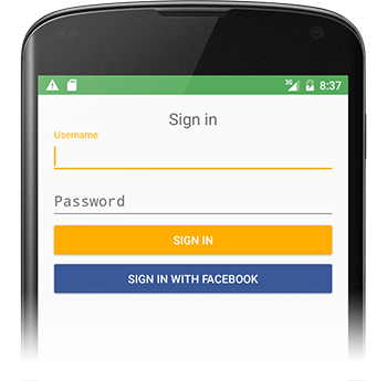
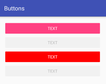
고객의 브랜드에 더 잘 맞도록 표준 Android 버튼의 색상을 약간 변경하고 싶습니다.

지금까지 내가 찾은 가장 좋은 방법은 Button의 드로어 블을 다음에있는 드로어 블로 변경하는 것 입니다 res/drawable/red_button.xml.

<?xml version="1.0" encoding="utf-8"?>    
<selector xmlns:android="http://schemas.android.com/apk/res/android">
    <item android:state_pressed="true" android:drawable="@drawable/red_button_pressed" />
    <item android:state_focused="true" android:drawable="@drawable/red_button_focus" />
    <item android:drawable="@drawable/red_button_rest" />
</selector>

그러나 그렇게하려면 실제로 사용자 정의하려는 각 버튼에 대해 세 개의 다른 드로어 블을 만들어야합니다 (하나는 정지 상태, 하나는 초점이 맞았을 때, 하나는 눌렀을 때). 그것은 내가 필요한 것보다 더 복잡하고 건조하지 않은 것 같습니다.

내가 정말로하고 싶은 것은 버튼에 일종의 색상 변환을 적용하는 것입니다. 내가하는 것보다 버튼의 색상을 변경하는 더 쉬운 방법이 있습니까?


답변:


723

나는 이것이 하나의 파일에서 상당히 쉽게 수행 될 수 있음을 발견했다. 다음 코드와 같은 파일을 이름이 지정된 파일 에 넣고 버튼보기에서 custom_button.xml설정 background="@drawable/custom_button"하십시오.

<?xml version="1.0" encoding="utf-8"?>
<selector
    xmlns:android="http://schemas.android.com/apk/res/android">

    <item android:state_pressed="true" >
        <shape>
            <gradient
                android:startColor="@color/yellow1"
                android:endColor="@color/yellow2"
                android:angle="270" />
            <stroke
                android:width="3dp"
                android:color="@color/grey05" />
            <corners
                android:radius="3dp" />
            <padding
                android:left="10dp"
                android:top="10dp"
                android:right="10dp"
                android:bottom="10dp" />
        </shape>
    </item>

    <item android:state_focused="true" >
        <shape>
            <gradient
                android:endColor="@color/orange4"
                android:startColor="@color/orange5"
                android:angle="270" />
            <stroke
                android:width="3dp"
                android:color="@color/grey05" />
            <corners
                android:radius="3dp" />
            <padding
                android:left="10dp"
                android:top="10dp"
                android:right="10dp"
                android:bottom="10dp" />
        </shape>
    </item>

    <item>        
        <shape>
            <gradient
                android:endColor="@color/blue2"
                android:startColor="@color/blue25"
                android:angle="270" />
            <stroke
                android:width="3dp"
                android:color="@color/grey05" />
            <corners
                android:radius="3dp" />
            <padding
                android:left="10dp"
                android:top="10dp"
                android:right="10dp"
                android:bottom="10dp" />
        </shape>
    </item>
</selector>

42
배경색에 적합합니다. 같은 방식으로 텍스트 색을 설정할 수 있습니까?
Rachel

8
이것은 나 "Error: No resource found that matches the given name (at 'color' with value '@color/yellow1')" 에게이 색상을 기본 색상으로 제공합니까? 이 작업을 수행하려면 res / values ​​/ color.xml이 필요합니다.
Harry Wood

8
@HarryWood 당신은 res / values ​​/ colors.xml에 그 색상을 정의해야합니다. 또는 테스트 목적으로 "# ff0000", "# 00ff00"으로 대체하십시오. @ cfarm54 해당 파일은 res / drawable / custom_button.xml 폴더 @emmby에 배치됩니다. 코드 스 니펫에 감사드립니다!
espinchi

17
훌륭한 포인터, 감사합니다! 또한 이것을 시도하는 다른 사람들에게는 선택기의 항목 순서가 중요합니다. 상태 필터가없는 <item>을 파일에 먼저 넣으면 나머지가 무시됩니다.
mikerowehl

9
이 작업을 수행하려면 custom_button.xml을 res / "drawable"폴더에 넣고 다음 내용으로 res / values ​​/ colors.xml 파일을 작성하십시오. stackoverflow.com/questions/3738886/…- 두 파일 중 하나에서 색상 이름 변경 작동하도록
sami

308

Tomasz의 답변에 따라 PorterDuff 다중 모드를 사용하여 전체 버튼의 음영을 프로그래밍 방식으로 설정할 수도 있습니다. 색조뿐 아니라 버튼 색상이 변경됩니다.

표준 회색 음영 버튼으로 시작하는 경우 :

button.getBackground().setColorFilter(0xFFFF0000, PorterDuff.Mode.MULTIPLY);

빨간색 음영 버튼이 표시됩니다.

button.getBackground().setColorFilter(0xFF00FF00, PorterDuff.Mode.MULTIPLY);

녹색 음영 버튼 등을 제공합니다. 첫 번째 값은 16 진 형식의 색상입니다.

현재 버튼 색상 값에 색상 값을 곱하여 작동합니다. 이 모드로 더 많은 것을 할 수 있다고 확신합니다.


2
와우, 방금 시도해 보았고 완전히 환상적입니다. 감사합니다! 어떻게 든 XML을 통해 그것을 달성 할 수있는 방법이 있는지 알고 있습니까?
emmby

4
여러분, HTC Desire에서 확인하십시오! 표준 버튼이 다릅니다. 이 코드를 사용하는 버튼은 "40dp"와 같은 특정 layout_width를 설정하면 멋지게 보입니다. "wrap_content"는 괜찮습니다.
OneWorld

5
이 솔루션은 HTC Sense UI에서 잘 작동하지 않습니다.
emmby

19
이클립스는 가능한 수정으로 표시하지 않습니다import android.graphics.PorterDuff;
누군가 어딘가에

2
ICS에서 작동하지 않는 문제가있는 사람이 있습니까? 에뮬레이터 나 전화로는 작동하지 않는 것 같습니다.
Stev_k

149

마이크, 컬러 필터에 관심이있을 것입니다.

예를 들면 :

button.getBackground().setColorFilter(new LightingColorFilter(0xFFFFFFFF, 0xFFAA0000));

원하는 색상을 얻으려면 이것을 시도하십시오.


setColorFilter 메소드에서 null을 전달하십시오. 그것을 시도하지 않았지만 작동해야합니다.
Tomasz

6
@Pacerier 설정 해제 : button.getBackground (). clearColorFilter ();
Stan Kurdziel

3
Color 클래스를 사용하여 색상을 선택하는 것이 좋습니다. developer.android.com/reference/android/graphics/Color.html
Mugen

어두운 테마에 적합합니다! 다른 상위 답변 (setColorFilter (0xFFFF0000, PorterDuff.Mode.MULTIPLY))이 밝은 테마에 더 적합하다고 가정합니다.
java.is.for.desktop

85

이것은 API 15 부터 완벽하게 작동하는 내 솔루션입니다 . 이 솔루션은 material과 같은 모든 기본 버튼 클릭 효과를 유지합니다 RippleEffect. 더 낮은 API에서 테스트하지는 않았지만 작동합니다.

당신이해야 할 일은 :

1) 스타일 만 변경 colorAccent:

<style name="Facebook.Button" parent="ThemeOverlay.AppCompat">
    <item name="colorAccent">@color/com_facebook_blue</item>
</style>

나머지 스타일을 유지하려면 ThemeOverlay.AppCompat또는 메인 AppTheme을 부모로 사용하는 것이 좋습니다 .

2) button위젯에 다음 두 줄을 추가하십시오 .

style="@style/Widget.AppCompat.Button.Colored"
android:theme="@style/Facebook.Button"

때로는 새로운 colorAccent것이 Android Studio Preview에 표시되지 않지만 휴대 전화에서 앱을 시작하면 색상이 변경됩니다.


샘플 버튼 위젯

<Button
    android:id="@+id/sign_in_with_facebook"
    style="@style/Widget.AppCompat.Button.Colored"
    android:layout_width="match_parent"
    android:layout_height="wrap_content"
    android:layout_gravity="center"
    android:text="@string/sign_in_facebook"
    android:textColor="@android:color/white"
    android:theme="@style/Facebook.Button" />

사용자 정의 색상의 샘플 버튼


1
이 라인은 무엇을합니까? "style ="@ style / Widget.AppCompat.Button.Colored ""
Charles Li

2
이것은 스타일과 테마의 차이점을 이해하는 데 도움이되었습니다. 감사합니다.
rpattabi

2
허용 된 답변은 정확하지만 너무 낡았습니다. 이것은 간단하고 최신 답변입니다.
正宗 白 布鞋

이 답변의 문제는 설정 colorAccent이 버튼의 배경 이상에 영향을 미친다는 것입니다.
Blcknx

@Blcknx 예를 들어?
RediOne1

61

이제 appcompat-v7의 AppCompatButtonbackgroundTint속성 과 함께 사용할 수도 있습니다 .

<android.support.v7.widget.AppCompatButton
    xmlns:app="http://schemas.android.com/apk/res-auto"
    android:layout_width="match_parent"
    android:layout_height="wrap_content"
    app:backgroundTint="#ffaa00"/>

4
"android :"네임 스페이스를 사용하여 작동하지 않았습니다. 그러나 대신 "app :"네임 스페이스를 사용했을 때 작동했습니다.
David Velasquez

@DavidVelasquez 그것은 안드로이드 동안 나에게도 효과적이었습니다. 도와 주셔서 감사합니다!
Avinash Prabhakar

이것은 가장 간단한 해결책이며 허용되는 답변이어야합니다. android : backgroundTint 사용하면 효과가 있습니다.
Ramashish Baranwal

1
AppCompat를 사용 app:backgroundTint하는 android:backgroundTint경우 대신에 있어야합니다 .
Hafez Divandari

23

나는 @conjugatedirection과 @Tomasz의 이전 답변에서 컬러 필터 제안을 좋아합니다. 그러나 지금까지 제공된 코드가 예상대로 쉽게 적용되지 않는다는 것을 알았습니다.

먼저, 컬러 필터를 적용하고 지우는 위치 에 대해서는 언급하지 않았습니다 . 이것을 할 수있는 다른 좋은 장소가있을 수 있지만, 나를 위해 떠오른 것은 OnTouchListener 입니다.

원래 질문을 읽었을 때 이상적인 솔루션은 이미지가 포함되지 않은 솔루션입니다. @emmby의 custom_button.xml을 사용하여 허용되는 대답은 목표 인 경우 컬러 필터보다 적합합니다. 필자의 경우 버튼의 모양을 UI 디자이너의 png 이미지로 시작합니다. 버튼 배경을이 이미지로 설정하면 기본 하이라이트 피드백이 완전히 손실됩니다. 이 코드는 해당 동작을 프로그래밍 방식의 어두운 효과로 대체합니다.

button.setOnTouchListener(new OnTouchListener() {
    @Override
    public boolean onTouch(View v, MotionEvent event) {
        switch (event.getAction()) {
            case MotionEvent.ACTION_DOWN:
                // 0x6D6D6D sets how much to darken - tweak as desired
                setColorFilter(v, 0x6D6D6D);
                break;
            // remove the filter when moving off the button
            // the same way a selector implementation would 
            case MotionEvent.ACTION_MOVE:
                Rect r = new Rect();
                v.getLocalVisibleRect(r);
                if (!r.contains((int) event.getX(), (int) event.getY())) {
                    setColorFilter(v, null);
                }
                break;
            case MotionEvent.ACTION_OUTSIDE:
            case MotionEvent.ACTION_CANCEL:
            case MotionEvent.ACTION_UP:
                setColorFilter(v, null);
                break;
        }
        return false;
    }

    private void setColorFilter(View v, Integer filter) {
        if (filter == null) v.getBackground().clearColorFilter();
        else {
            // To lighten instead of darken, try this:
            // LightingColorFilter lighten = new LightingColorFilter(0xFFFFFF, filter);
            LightingColorFilter darken = new LightingColorFilter(filter, 0x000000);
            v.getBackground().setColorFilter(darken);
        }
        // required on Android 2.3.7 for filter change to take effect (but not on 4.0.4)
        v.getBackground().invalidateSelf();
    }
});

나는 이것을 여러 버튼에 적용하기위한 별도의 클래스로 추출했습니다-아이디어를 얻기 위해 익명의 내부 클래스로 표시됩니다.


그것은 훌륭한 해결책이었습니다! 당신은 기본적으로 iOS에서 얻을으로 대부분 같은 :-)처럼 디자이너 무엇 인 영향
크리스 Nordvik

나는 같은 배경에서 같은 화면에서 2 버튼으로 이것을 시도했으며 효과는 onTouch 버튼 모두에 적용됩니다.
Goofy

16

XML을 사용하여 색상 버튼을 만드는 경우 별도의 파일에서 포커스 및 눌린 상태를 지정하여 코드를 좀 더 깔끔하게 만들고 재사용 할 수 있습니다. 내 녹색 버튼은 다음과 같습니다.

<?xml version="1.0" encoding="utf-8"?>
<selector xmlns:android="http://schemas.android.com/apk/res/android">

    <item android:state_focused="true" android:drawable="@drawable/button_focused"/>
    <item android:state_pressed="true" android:drawable="@drawable/button_pressed"/>

    <item>
        <shape>
            <gradient android:startColor="#ff00ff00" android:endColor="#bb00ff00" android:angle="270" />
            <stroke android:width="1dp" android:color="#bb00ff00" />
            <corners android:radius="3dp" />
            <padding android:left="10dp" android:top="10dp" android:right="10dp" android:bottom="10dp" />
        </shape>
    </item>

</selector>

1
좋은. 집중되고 눌려진 상태를 어떻게 버튼에 대한 표준 안드로이드 정의로 다시 나타낼 수 있습니까?
larham1

표준 Android 버튼이 9 패치 비트 맵으로 구현되어 있지 않으므로 확실하지 않습니다.
haemish

12

모든 Android 버전에서 작동하는 가장 짧은 솔루션 :

<Button
     app:backgroundTint="@color/my_color"

노트 / 요구 사항 :

  • 사용하는 app:네임 스페이스와 하지android: 네임 스페이스를!
  • appcompat 버전> 24.2.0

    종속성 {compile 'com.android.support:appcompat-v7:25.3.1'}

설명 : 여기에 이미지 설명을 입력하십시오


1
흥미롭게도 저에게는 효과 app:backgroundTint="@color/my_color"가 없었습니다. android:backgroundTint="@color/my_color"그래도 완벽하게 작동했습니다.
Igor

이것은 나를 위해 가장 짧고 가장 깨끗한 솔루션이며 그게 전부입니다.
Marty

11

이 방법을 사용하고 있습니다

style.xml

<!-- Base application theme. -->
<style name="AppTheme" parent="Theme.AppCompat.Light.NoActionBar">
    <item name="android:colorPrimaryDark">#413152</item>
    <item name="android:colorPrimary">#534364</item>
    <item name="android:colorAccent">#534364</item>
    <item name="android:buttonStyle">@style/MyButtonStyle</item>
</style>

<style name="MyButtonStyle" parent="Widget.AppCompat.Button.Colored">
    <item name="android:colorButtonNormal">#534364</item>
    <item name="android:textColor">#ffffff</item>
</style>

위에서 볼 수 있듯이 버튼에 사용자 정의 스타일을 사용하고 있습니다. 버튼 색상은 강조 색상에 해당합니다. android:backgroundGoogle이 제공하는 파급 효과를 잃지 않기 때문에이 설정보다 설정이 훨씬 좋습니다 .


8

훨씬 쉬운 방법이 있습니다 : android-holo-colors.com

모든 홀로 어 드로어 블 (버튼, 스피너 등)의 색상을 쉽게 변경할 수 있습니다. 색상을 선택한 다음 모든 해상도의 드로어 블이 포함 된 zip 파일을 다운로드하십시오.


8

이런 식으로 사용하십시오 :

buttonOBJ.getBackground().setColorFilter(Color.parseColor("#YOUR_HEX_COLOR_CODE"), PorterDuff.Mode.MULTIPLY);

4

에서 <Button>사용 android:background="#33b5e5". 또는 더 나은android:background="@color/navig_button"


3

DroidUX 구성 요소 라이브러리는이 ColorButton당신도 앱을 허용하는 경우이 기능을 사용하여 버튼의 색상 / 테마를 설정하도록 할 수 있도록, 그 색 XML 정의를 통해 프로그래밍 방식 런타임에 모두 쉽게 변경할 수 있습니다 위젯을.


3

이 온라인 도구를 사용하여 버튼 http://angrytools.com/android/button/ 을 사용자 android:background="@drawable/custom_btn"정의하고 레이아웃에서 사용자 정의 된 단추를 정의하는 데 사용할 수도 있습니다 .


2

버튼 테마를 이것으로 설정할 수 있습니다

<style name="AppTheme.ButtonBlue" parent="Widget.AppCompat.Button.Colored">
 <item name="colorButtonNormal">@color/HEXColor</item>
 <item name="android:textColor">@color/HEXColor</item>
</style>

1

쉬운 방법은 반지름, 그라디언트, 눌린 색상, 일반 색상 등 원하는 모든 속성을 허용하는 사용자 정의 Button 클래스를 정의한 다음 XML을 사용하여 배경을 설정하는 대신 XML 레이아웃에서 사용하는 것입니다. 샘플은 여기

반경, 선택한 색상 등과 같은 속성이 동일한 버튼이 많은 경우 매우 유용합니다. 상속 된 버튼을 사용자 지정하여 이러한 추가 속성을 처리 할 수 ​​있습니다.

결과 (배경 선택기가 사용되지 않았습니다).

일반 버튼

일반 이미지

누른 버튼

여기에 이미지 설명을 입력하십시오


0

내가 잘 작동하는 다른 스타일의 버튼을 수행하는 방법은 Button 객체를 서브 클래스 화하고 색상 필터를 적용하는 것입니다. 또한 버튼에 알파를 적용하여 활성화 및 비활성화 상태를 처리합니다.

import android.annotation.TargetApi;
import android.content.Context;
import android.graphics.Color;
import android.graphics.ColorFilter;
import android.graphics.LightingColorFilter;
import android.graphics.drawable.Drawable;
import android.graphics.drawable.LayerDrawable;
import android.os.Build;
import android.util.AttributeSet;
import android.widget.Button;

public class DimmableButton extends Button {

    public DimmableButton(Context context) {
        super(context);
    }

    public DimmableButton(Context context, AttributeSet attrs) {
        super(context, attrs);
    }

    public DimmableButton(Context context, AttributeSet attrs, int defStyle) {
        super(context, attrs, defStyle);
    }

    @SuppressWarnings("deprecation")
    @Override
    public void setBackgroundDrawable(Drawable d) {
        // Replace the original background drawable (e.g. image) with a LayerDrawable that
        // contains the original drawable.
        DimmableButtonBackgroundDrawable layer = new DimmableButtonBackgroundDrawable(d);
        super.setBackgroundDrawable(layer);
    }

    @TargetApi(Build.VERSION_CODES.JELLY_BEAN)
    @Override
    public void setBackground(Drawable d) {
        // Replace the original background drawable (e.g. image) with a LayerDrawable that
        // contains the original drawable.
        DimmableButtonBackgroundDrawable layer = new DimmableButtonBackgroundDrawable(d);
        super.setBackground(layer);
    }

    /**
     * The stateful LayerDrawable used by this button.
     */
    protected class DimmableButtonBackgroundDrawable extends LayerDrawable {

        // The color filter to apply when the button is pressed
        protected ColorFilter _pressedFilter = new LightingColorFilter(Color.LTGRAY, 1);
        // Alpha value when the button is disabled
        protected int _disabledAlpha = 100;
        // Alpha value when the button is enabled
        protected int _fullAlpha = 255;

        public DimmableButtonBackgroundDrawable(Drawable d) {
            super(new Drawable[] { d });
        }

        @Override
        protected boolean onStateChange(int[] states) {
            boolean enabled = false;
            boolean pressed = false;

            for (int state : states) {
                if (state == android.R.attr.state_enabled)
                    enabled = true;
                else if (state == android.R.attr.state_pressed)
                    pressed = true;
            }

            mutate();
            if (enabled && pressed) {
                setColorFilter(_pressedFilter);
            } else if (!enabled) {
                setColorFilter(null);
                setAlpha(_disabledAlpha);
            } else {
                setColorFilter(null);
                setAlpha(_fullAlpha);
            }

            invalidateSelf();

            return super.onStateChange(states);
        }

        @Override
        public boolean isStateful() {
            return true;
        }
    }

}

0

values ​​\ styles.xml

<style name="AppTheme" parent="Theme.AppCompat.Light.DarkActionBar">
    <item name="colorPrimary">@color/colorPrimary</item>
    <item name="colorPrimaryDark">@color/colorPrimaryDark</item>
    <item name="colorAccent">@color/colorAccent</item>
</style>

<style name="RedAccentButton" parent="ThemeOverlay.AppCompat.Light">
    <item name="colorAccent">#ff0000</item>
</style>

그때:

<Button
    style="@style/Widget.AppCompat.Button.Colored"
    android:layout_width="match_parent"
    android:layout_height="wrap_content"
    android:text="text" />

<Button
    style="@style/Widget.AppCompat.Button.Colored"
    android:layout_width="match_parent"
    android:layout_height="wrap_content"
    android:enabled="false"
    android:text="text" />

<Button
    style="@style/Widget.AppCompat.Button.Colored"
    android:layout_width="match_parent"
    android:layout_height="wrap_content"
    android:text="text"
    android:theme="@style/RedAccentButton" />

<Button
    style="@style/Widget.AppCompat.Button.Colored"
    android:layout_width="match_parent"
    android:layout_height="wrap_content"
    android:enabled="false"
    android:text="text"
    android:theme="@style/RedAccentButton" />

결과


0

재료 설계 지침에 따라 아래 코드와 같은 스타일을 사용해야합니다.

<style name="MyButton" parent="Theme.AppCompat.Light>
    <item name="colorControlHighlight">#F36F21</item>
    <item name="colorControlHighlight">#FF8D00</item>
</style>

레이아웃 에서이 속성을 버튼에 추가하십시오.

    android:theme="@style/MyButton"

0

간단합니다. 프로젝트에이 종속성을 추가하고 1로 단추를 만듭니다. 모든 모양 2. 모든 색 3. 모든 테두리 4. 재료 효과 사용

https://github.com/manojbhadane/QButton

<com.manojbhadane.QButton
       android:layout_width="match_parent"
       android:layout_height="wrap_content"
       android:text="OK"
       app:qb_backgroundColor="@color/green"
       app:qb_radius="100"
       app:qb_strokeColor="@color/darkGreen"
       app:qb_strokeWidth="5" />
당사 사이트를 사용함과 동시에 당사의 쿠키 정책개인정보 보호정책을 읽고 이해하였음을 인정하는 것으로 간주합니다.
Licensed under cc by-sa 3.0 with attribution required.