Android-스타일링 검색 바


229

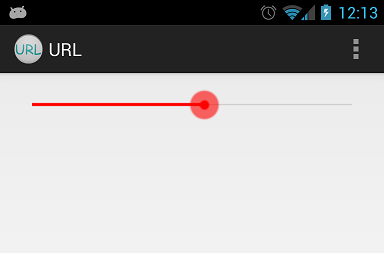
아래 이미지와 같은 탐색 막대의 스타일을 지정하고 싶었습니다.

여기에 이미지 설명을 입력하십시오

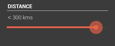
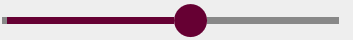
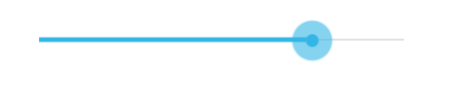
기본 탐색 막대를 사용하면 다음과 같은 결과가 나타납니다.

여기에 이미지 설명을 입력하십시오

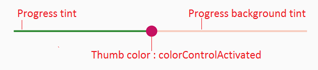
그래서 필요한 것은 색만 바꾸는 것입니다. 추가 스타일이 필요하지 않습니다. 이 작업을 수행하는 직접적인 방법이 있습니까, 아니면 사용자 지정 드로어 블을 만들어야합니까?

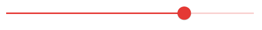
커스텀 하나를 만들려고했지만 위와 같이 정확한 것을 얻을 수 없었습니다. 사용자 정의 드로어 블을 사용한 후 얻는 것은 다음과 같습니다.

여기에 이미지 설명을 입력하십시오

사용자 정의 항목을 작성 해야하는 경우 진행률 선의 너비와 모양을 줄이는 방법을 제안하십시오.

내 맞춤형 구현 :

background_fill.xml :

<?xml version="1.0" encoding="UTF-8"?>
<shape xmlns:android="http://schemas.android.com/apk/res/android" >

    <gradient
        android:angle="90"
        android:centerColor="#FF555555"
        android:endColor="#FF555555"
        android:startColor="#FF555555" />

    <corners android:radius="1dp" />

    <stroke
        android:width="1dp"
        android:color="#50999999" />
    <stroke
        android:width="1dp"
        android:color="#70555555" />

</shape>

progress_fill.xml

<?xml version="1.0" encoding="UTF-8"?>
<shape xmlns:android="http://schemas.android.com/apk/res/android" >

    <gradient
        android:angle="90"
        android:centerColor="#FFB80000"
        android:endColor="#FFFF4400"
        android:startColor="#FF470000" />

    <corners android:radius="1dp" />

    <stroke
        android:width="1dp"
        android:color="#50999999" />
    <stroke
        android:width="1dp"
        android:color="#70555555" />

</shape>

progress.xml

<?xml version="1.0" encoding="utf-8"?>
<layer-list xmlns:android="http://schemas.android.com/apk/res/android" >

    <item
        android:id="@android:id/background"
        android:drawable="@drawable/background_fill"/>
    <item android:id="@android:id/progress">
        <clip android:drawable="@drawable/progress_fill" />
    </item>

</layer-list>

thumb.xml

<?xml version="1.0" encoding="UTF-8"?>
<shape xmlns:android="http://schemas.android.com/apk/res/android"
    android:shape="oval" >

    <gradient
        android:angle="270"
        android:endColor="#E5492A"
        android:startColor="#E5492A" />

    <size
        android:height="20dp"
        android:width="20dp" />

</shape>

탐색 바 :

<SeekBar
        android:id="@+id/seekBarDistance"
        android:layout_width="match_parent"
        android:layout_height="wrap_content"
        android:layout_alignParentLeft="true"
        android:layout_alignParentTop="true"
        android:layout_marginTop="88dp"
        android:progressDrawable="@drawable/progress"
        android:thumb="@drawable/thumb" >
    </SeekBar>

40
작동하는 탐색 막대 스타일 변경 예제 XD를 보여 주셔서 감사합니다. (인터넷에는 많지 않습니다).
Helin Wang

답변:


297

Android 소스 코드에서 드로어 블 및 XML을 추출하고 색상을 빨간색으로 변경합니다. 다음은 mdpi 드로어 블에서이 작업을 완료 한 방법의 예입니다.

사용자 정의 red_scrubber_control.xml(재조정 / 드로어 블에 추가) :

<selector xmlns:android="http://schemas.android.com/apk/res/android">

    <item android:drawable="@drawable/red_scrubber_control_disabled_holo" android:state_enabled="false"/>
    <item android:drawable="@drawable/red_scrubber_control_pressed_holo" android:state_pressed="true"/>
    <item android:drawable="@drawable/red_scrubber_control_focused_holo" android:state_selected="true"/>
    <item android:drawable="@drawable/red_scrubber_control_normal_holo"/>
</selector>

커스텀: red_scrubber_progress.xml

<layer-list xmlns:android="http://schemas.android.com/apk/res/android" >

    <item
        android:id="@android:id/background"
        android:drawable="@drawable/red_scrubber_track_holo_light"/>
    <item android:id="@android:id/secondaryProgress">
        <scale
            android:drawable="@drawable/red_scrubber_secondary_holo"
            android:scaleWidth="100%" />
    </item>
    <item android:id="@android:id/progress">
        <scale
            android:drawable="@drawable/red_scrubber_primary_holo"
            android:scaleWidth="100%" />
    </item>

</layer-list>

그런 다음 Android 소스 코드에서 필요한 드로어 블을 복사하십시오. 이 링크에서 가져 왔습니다.

이 드로어 블을 각 hdpi, mdpi, xhdpi에 복사하는 것이 좋습니다. 예를 들어 mdpi 만 사용합니다.

그런 다음 Photoshop을 사용하여 파란색에서 빨간색으로 색상을 변경하십시오.

red_scrubber_control_disabled_holo.png : red_scrubber_control_disabled_holo

red_scrubber_control_focused_holo.png : red_scrubber_control_focused_holo

red_scrubber_control_normal_holo.png : red_scrubber_control_normal_holo

red_scrubber_control_pressed_holo.png : red_scrubber_control_pressed_holo

red_scrubber_primary_holo.9.png : red_scrubber_primary_holo.9

red_scrubber_secondary_holo.9.png : red_scrubber_secondary_holo.9

red_scrubber_track_holo_light.9.png : red_scrubber_track_holo_light.9

SeekBar를 레이아웃에 추가하십시오.

<SeekBar
    android:id="@+id/seekBar1"
    android:layout_width="match_parent"
    android:layout_height="wrap_content"
    android:progressDrawable="@drawable/red_scrubber_progress"
    android:thumb="@drawable/red_scrubber_control" />

결과:

여기에 이미지 설명을 입력하십시오


앤드류, 큰 답변 주셔서 감사합니다. 이것에 문제가 있습니다. red_scrubber_control엄지 손가락으로 드로어 블을 사용하면 충돌이 발생합니다. 선택기의 모든 드로어 블이 동일하면 제대로 작동하지만 그 중 하나를 변경하면 Resources$NotFoundException: File .../red_scrubber_control.xml from drawaable resource ID...어떤 생각이 있습니까?
karl

2
으악. 그것이 stackoverflow.com/questions/6669296/… 과 관련이있는 것으로 나타났습니다 . 내가 추가하려는 새로운 이미지는 실수로 2KB 대신 37MB였습니다.
karl

어쨌든 @dimen화면을 기준으로 엄지 손가락의 크기를 설정하는 데 사용할 수 있습니까?
Si8

1
@ SiKni8 값 폴더의 일반, 큰, xlarge, sw 또는 w 매개 변수를 기반으로 다른 화면 크기에 대해 다른 차원을 정의 할 수 있습니다. 그런 다음 레이아웃, 스타일 또는 테마에서이 차원을 사용하십시오. 이 링크
Andrew

1
Android Holo Colors 생성기에 대한 링크에 감사드립니다. 매우 도움이됩니다.
나무

66

내 대답은 Andras Balázs Lajtha에서 영감을 얻어 XML 파일없이 작동 할 수 있습니다.

seekBar.getProgressDrawable().setColorFilter(Color.RED, PorterDuff.Mode.SRC_IN);
seekBar.getThumb().setColorFilter(Color.RED, PorterDuff.Mode.SRC_IN);

진행률 대화 상자 색상이 변경되었지만 엄지 손가락 색상은 변경되지 않았습니다. 왜 그렇습니까?
Yonatan Nir

7
코드에서이 작업을 수행 할 필요가없고 레이어 목록 및 드로어 블 등을 생성하지 않으려는 경우 android:progressTint="@color/my_color" android:thumbTint="@color/another_color"
탐색 막대

59

정확히 같은 막대를 원하지만 빨간색으로 표시하려면 프로그래밍 방식으로 PorterDuff 컬러 필터를 추가 할 수 있습니다. ProgressBar 기본 클래스 의 메서드를 통해 색상을 지정할 각 드로어 블을 얻을 수 있습니다 . 그런 다음 컬러 필터 를 설정 하십시오.

mySeekBar.getProgressDrawable().setColorFilter(new PorterDuffColorFilter(srcColor, PorterDuff.Mode.MULTIPLY));

원하는 색상 조정을 포터 더프 필터를 통해 수행 할 수없는 경우 고유 한 색상 필터를 지정할 수 있습니다 .


3
하지 않도록 한 이후 SDK, proly (21),하지만 당신은 동일한 아이콘에 단지 다른 색상을 원하는 경우, 단지 colors.xml에서 "colorAccent"색상을 추가하고 그것을 사용합니다
tibbi

57

다른 탐색 막대 사용자 정의를위한 Android 탐색 막대 사용자 정의 재질 스타일 http://www.zoftino.com/android-seekbar-and-custom-seekbar-examples

<style name="MySeekBar" parent="Widget.AppCompat.SeekBar">
    <item name="android:progressBackgroundTint">#f4511e</item>
    <item name="android:progressTint">#388e3c</item>
    <item name="android:colorControlActivated">#c51162</item>
</style>

탐색 막대 사용자 정의 재료 스타일


2
안드로이드를위한 훌륭한 솔루션> 21
saltandpepper

4
이것이 colorControlActivated엄지를위한 올바른 매개 변수입니까? 이어야합니다 thumbTint.
Peter Knut

API 21 이하의 솔루션은 무엇입니까?
파이살 셰이크

42

색상 속성을 색상으로 바꾸면됩니다.

background.xml

<shape xmlns:android="http://schemas.android.com/apk/res/android"
    android:shape="line">

    <stroke android:width="1dp" android:color="#D9D9D9"/>
    <corners android:radius="1dp" />

</shape>

progress.xml

<shape xmlns:android="http://schemas.android.com/apk/res/android"
     android:shape="line">

    <stroke android:width="1dp" android:color="#2EA5DE"/>
    <corners android:radius="1dp" />

</shape>

style.xml

<layer-list xmlns:android="http://schemas.android.com/apk/res/android" >

    <item
        android:id="@android:id/background"
        android:drawable="@drawable/seekbar_background"/>
    <item android:id="@android:id/progress">
        <clip android:drawable="@drawable/seekbar_progress" />
    </item>

</layer-list>

thumb.xml

<shape xmlns:android="http://schemas.android.com/apk/res/android"
    android:shape="oval">

    <size android:height="30dp" android:width="30dp"/>
    <stroke android:width="18dp" android:color="#882EA5DE"/>
    <solid android:color="#2EA5DE" />
    <corners android:radius="1dp" />

</shape>

1
검색 바에서 파일을 어떻게 사용합니까?
mungaih pk

@RahulRastogi이 파일들을 어떻게 사용 했습니까? 이 답변이 작동하는 방식에 대한 0 설명으로 매우 인기가있는 것은 어리석은 일입니다.
Selali Adobor

1
@AssortedTrailmix 나는 오래 전에 그것을했다. android : thumb = "@ drawable / thumb"와 같은 속성을 설정하고 android : progressDrawable 속성에서 위에서 언급 한 레이어 목록 드로어 블 파일을 설정하십시오. 당신은 시도 할 수 있습니다 : mindfiremobile.wordpress.com/2014/05/20/...을
라훌 Rastogi에게

37

Google은 SDK 21에서이를 쉽게 만들었습니다. 이제 엄지 색조 색상을 지정하는 속성이 있습니다.

android:thumbTint
android:thumbTintMode
android:progressTint

http://developer.android.com/reference/android/widget/AbsSeekBar.html#attr_android:thumbTint http://developer.android.com/reference/android/widget/AbsSeekBar.html#attr_android:thumbTintMode


7
progressTint도 마찬가지입니다.
afollestad

1
색조 목록은 API 21부터 Android의 모든 UI 요소에 적용되며 colorAccent가 적용되는 방식입니다.
afollestad

16

모든 답변은 더 이상 사용되지 않습니다.

2019 년에 그것은 당신을 변경하여 원하는 색상으로 검색 막대 스타일을 쉽게 ProgressBar이에

<SeekBar
            android:id="@+id/seekBar"
            android:layout_width="match_parent"
            android:layout_height="wrap_content"
            android:progressTint="#36970f"
            android:thumbTint="#36970f"
            />

프로그래밍 방식으로 탐색 막대 색상 스타일 지정 다음 코드를 시도하십시오.

        seekBar.getProgressDrawable().setColorFilter(Color.RED, PorterDuff.Mode.SRC_IN);
        seekBar.getThumb().setColorFilter(Color.RED, PorterDuff.Mode.SRC_IN);

더 이상 사용되지 않는 이유는 무엇입니까?
CoolMind

도서관이 바뀌었기 때문에
Giannis Mpountouridis

@Ahamadullah Saikat ( stackoverflow.com/a/50074961/2914140 ) 또는 lvguowei.me/post/customize-android-seekbar-color 의 답변을 볼 수 있습니다 . 라이브러리를 사용하지 않으며 오래된 API에서도 SeekBar 색상을 설정합니다.
CoolMind

11

- (앤드류) 위에서 언급 한,이 사이트와 슈퍼 쉬운 사용자 정의 검색 막대입니다 만드는 등 http://android-holo-colors.com/

SeekBar를 활성화하고 색상을 선택하고 모든 리소스를 받고 프로젝트에 복사하십시오. 그런 다음 xml로 적용하십시오.

  android:thumb="@drawable/apptheme_scrubber_control_selector_holo_light"
  android:progressDrawable="@drawable/apptheme_scrubber_progress_horizontal_holo_light"

10

산출:

여기에 이미지 설명을 입력하십시오

레이아웃 파일에서 :

        <android.support.v7.widget.AppCompatSeekBar
            android:id="@+id/seekBar_bn"
            android:layout_width="match_parent"
            android:layout_height="wrap_content"
            android:gravity="center"
            android:max="25"
            android:minHeight="10dp"
            android:progress="10"
            android:progressDrawable="@drawable/progress"
            android:thumb="@drawable/custom_thumb" />

drawable / progress.xml

<?xml version="1.0" encoding="utf-8"?>
<layer-list xmlns:android="http://schemas.android.com/apk/res/android" >

    <item
        android:id="@android:id/background"
        android:drawable="@drawable/background_fill"/>
    <item android:id="@android:id/progress">
        <clip android:drawable="@drawable/progress_fill" />
    </item>

</layer-list>

drawable / background_fill.xml

<?xml version="1.0" encoding="utf-8"?>
<layer-list xmlns:android="http://schemas.android.com/apk/res/android">
    <item
        android:bottom="6dp"
        android:left="-6dp"
        android:right="-6dp"
        android:top="6dp">

        <shape android:shape="rectangle">
            <solid android:color="#888888" />
            <stroke
                android:width="5dp"
                android:color="@android:color/transparent" />
        </shape>
    </item>
</layer-list>

drawable / progress_fill.xml

<?xml version="1.0" encoding="utf-8"?>
<layer-list xmlns:android="http://schemas.android.com/apk/res/android">
    <item
        android:bottom="6dp"
        android:left="-6dp"
        android:right="-6dp"
        android:top="6dp">

        <shape android:shape="rectangle">
            <solid android:color="@color/myPrimaryColor" />
            <stroke
                android:width="5dp"
                android:color="@android:color/transparent" />
        </shape>
    </item>
</layer-list>

drawable / custom_thumb.xml

<?xml version="1.0" encoding="utf-8"?>
<layer-list xmlns:android="http://schemas.android.com/apk/res/android">
    <item>
        <shape android:shape="oval">
            <solid android:color="@color/myPrimaryColor"/>
            <size
                android:width="22dp"
                android:height="22dp"/>
        </shape>
    </item>
</layer-list>

colors.xml

<color name="myPrimaryColor">#660033</color>

1
AppCompat Seekbar가 있음을 몰랐습니다
Pierre


9
<SeekBar
android:id="@+id/seekBar1"
android:layout_width="match_parent"
android:layout_height="wrap_content"
android:layout_gravity="center"
android:progressTint="@color/red"
android:thumbTint="@color/red" />

선택한 답변과 동일하게 작동합니다. 드로어 블 파일 등을 만들 필요가 없습니다. (5.0 이상)


5

기본적으로 안드로이드는 슬라이더의 진행 색상을

`<item name="colorAccent">`

styles.xml의 값 . 그런 다음 사용자 정의 슬라이더 썸 이미지를 설정하려면 SeekBar xml 레이아웃의 블록 에서이 코드를 사용하십시오 .

android:thumb="@drawable/slider"

5
LayerDrawable progressDrawable = (LayerDrawable) mSeekBar.getProgressDrawable();

// progress bar line *progress* color
Drawable processDrawable = progressDrawable.findDrawableByLayerId(android.R.id.progress);

// progress bar line *background* color
Drawable backgroundDrawable = progressDrawable.findDrawableByLayerId(android.R.id.background);

// progress bar line *secondaryProgress* color
Drawable secondaryProgressDrawable = progressDrawable.findDrawableByLayerId(android.R.id.secondaryProgress);
processDrawable.setColorFilter(Color.RED, PorterDuff.Mode.SRC_IN);

// progress bar line all color
mSeekBar.getProgressDrawable().setColorFilter(Color.BLUE, PorterDuff.Mode.SRC_IN);

// progress circle color
mSeekBar.getThumb().setColorFilter(Color.GREEN, PorterDuff.Mode.SRC_IN);

4

API <21 (및> = 21)의 경우 @Ahamadullah Saikat 또는 https://www.lvguowei.me/post/customize-android-seekbar-color/ 의 답변을 사용할 수 있습니다 .

여기에 이미지 설명을 입력하십시오

<SeekBar
    android:id="@+id/seekBar"
    android:layout_width="match_parent"
    android:layout_height="wrap_content"
    android:maxHeight="3dp"
    android:minHeight="3dp"
    android:progress="50"
    android:progressDrawable="@drawable/seek_bar_ruler"
    android:thumb="@drawable/seek_bar_slider"
    />

drawable / seek_bar_ruler.xml :

<?xml version="1.0" encoding="utf-8"?>
<layer-list xmlns:android="http://schemas.android.com/apk/res/android">
    <item android:id="@android:id/background">
        <shape android:shape="rectangle">
            <solid
                android:color="#94A3B3" />
            <corners android:radius="2dp" />
        </shape>
    </item>
    <item android:id="@android:id/progress">
        <clip>
            <shape android:shape="rectangle">
                <solid
                    android:color="#18244D" />
                <corners android:radius="2dp" />
            </shape>
        </clip>
    </item>
</layer-list>

drawable / seek_bar_slider.xml :

<?xml version="1.0" encoding="utf-8"?>
<shape xmlns:android="http://schemas.android.com/apk/res/android"
    android:shape="oval"
    >

    <solid android:color="#FFFFFF" />
    <stroke
        android:width="4dp"
        android:color="#18244D"
        />
    <size
        android:width="25dp"
        android:height="25dp"
        />
</shape>

3

android Sdk에서 제공하는 기본 SeekBar를 사용하는 경우 해당 색상을 변경하는 간단한 방법입니다. /res/values/colors.xml 안의 color.xml로 이동하여 colorAccent를 변경하십시오.

<resources>
    <color name="colorPrimary">#212121</color>
    <color name="colorPrimaryDark">#1e1d1d</color>
     <!-- change below line -->
    <color name="colorAccent">#FF4081</color>
</resources>

2

나는 background_fill.xml

<?xml version="1.0" encoding="UTF-8"?>
  <shape xmlns:android="http://schemas.android.com/apk/res/android"
android:shape="line" >
<size android:height="1dp" />
<gradient
    android:angle="0"
    android:centerColor="#616161"
    android:endColor="#616161"
    android:startColor="#616161" />
<corners android:radius="0dp" />
<stroke
    android:width="1dp"
    android:color="#616161" />
<stroke
    android:width="1dp"
    android:color="#616161" />
</shape>

그리고 progress_fill.xml

<?xml version="1.0" encoding="UTF-8"?>
<shape xmlns:android="http://schemas.android.com/apk/res/android"
android:shape="line" >
<size android:height="1dp" />
<gradient
    android:angle="0"
    android:centerColor="#fafafa"
    android:endColor="#fafafa"
    android:startColor="#fafafa" />
<corners android:radius="1dp" />
<stroke
    android:width="1dp"
    android:color="#cccccc" />
<stroke
    android:width="1dp"
    android:color="#cccccc" />
 </shape>

배경 및 진행 1dp높이 를 만들 수 있습니다.


2

탐색 막대 색상을 변경하는 간단한 방법 ...

 <ProgressBar
            android:id="@+id/progress"
            android:layout_width="wrap_content"
            android:layout_height="wrap_content"
            android:layout_gravity="center"
            android:theme="@style/Progress_color"/>

스타일 : Progress_color

 <style name="Progress_color">
    <item name="colorAccent">@color/white</item> <!-- Whatever color you want-->
</style>

자바 클래스 변경 ProgressDrawable ()

seek_bar.getProgressDrawable().setColorFilter(getResources().getColor(R.color.white), PorterDuff.Mode.MULTIPLY);

1

Android 리소스를 보면 탐색 막대가 실제로 이미지를 사용합니다.

10px, 가운데 5px 선이 보이려면 상단과 하단에 투명한 드로어 블을 만들어야합니다.

첨부 된 이미지를 참조하십시오. NinePatch로 변환해야합니다.

여기에 이미지 설명을 입력하십시오


같은 게시물을 제안 해 주시겠습니까?
suresh cheemalamudi

내가 찾은 좋은 링크 중 하나 -mokasocial.com/2011/02/…
Sagar Waghmare

일요일 G Akinsete의 해결책은 작동합니다, NinePatch를 사용할 필요가 없습니다
Helin Wang

0

데이터 바인딩을 사용하는 사람들의 경우 :

  1. 모든 클래스에 다음 정적 메소드를 추가하십시오.

    @BindingAdapter("app:thumbTintCompat")
    public static void setThumbTint(SeekBar seekBar, @ColorInt int color) {
        seekBar.getThumb().setColorFilter(color, PorterDuff.Mode.SRC_IN);
    }
  2. app:thumbTintCompatSeekBar에 속성 추가

    <SeekBar
           android:id="@+id/seek_bar"
           style="@style/Widget.AppCompat.SeekBar"
           android:layout_width="wrap_content"
           android:layout_height="wrap_content"
           app:thumbTintCompat="@{@android:color/white}"
    />

그게 다야. 이제 app:thumbTintCompat어떤 와도 사용할 수 있습니다 SeekBar. 같은 방식으로 진행 색조를 구성 할 수 있습니다.

참고 : 이 방법은 롤리팝 이전 장치와도 호환됩니다.


0

@ arnav-rao의 답변에 대한 작은 수정 :

엄지 손가락이 올바르게 색칠되도록하려면 다음을 사용하십시오.

<style name="MySeekBar" parent="Widget.AppCompat.SeekBar">
    <item name="android:progressBackgroundTint">@color/colorBgTint</item>
    <item name="android:progressTint">@color/colorProgressTint</item>
    <item name="android:thumbTint">@color/colorThumbTint</item>
</style>

여기 android : thumbTint는 실제로 "thumb"을 색칠합니다


0

이 튜토리얼을 확인하세요

https://www.lvguowei.me/post/customize-android-seekbar-color/

간단한 :

<SeekBar
                android:id="@+id/seekBar"
                android:layout_width="match_parent"
                android:layout_height="wrap_content"
                android:max="100"
                android:maxHeight="3dp"
                android:minHeight="3dp"
                android:progressDrawable="@drawable/seekbar_style"
                android:thumbTint="@color/positive_color"/>

그런 다음 스타일 파일 :

<?xml version="1.0" encoding="utf-8"?>
<layer-list xmlns:android="http://schemas.android.com/apk/res/android" >
    <item android:id="@android:id/background">
        <shape android:shape="rectangle" >
            <solid
                android:color="@color/positive_color" />
        </shape>
    </item>
    <item android:id="@android:id/progress">
        <clip>
            <shape android:shape="rectangle" >
                <solid
                    android:color="@color/positive_color" />
            </shape>
        </clip>
    </item>
</layer-list>

0

탐색 바에 대한 스타일을 만들고 테마에 스타일을 추가하여 하위 스타일이 여전히 오버 스타일을 허용하면서 전체 테마에 적용 할 수 있기를 원했습니다. 여기 내가 한 일이 있습니다.

<!-- Blue App Theme -->
    <style name="AppTheme.Blue" parent="BaseTheme.Blue">        
        <item name="android:seekBarStyle">@style/SeekbarStyle.Blue</item>
        <item name="seekBarStyle">@style/SeekbarStyle.Blue</item> <!--This is essential for some devices, e.g. Samsung-->
</style>

<!-- Slider Styles -->
<style name="SeekbarStyle.Blue" parent="Widget.AppCompat.SeekBar">
        <item name="android:progressBackgroundTint">@color/material_blue_a700_pct_30</item>
        <item name="android:thumbTint">@color/material_blue_a700</item>
        <item name="android:thumbTintMode">src_in</item>
        <item name="android:progressTint">@color/material_blue_a700</item>
</style>

<style name="SeekbarStyle.Green" parent="Widget.AppCompat.SeekBar">
        <item name="android:progressBackgroundTint">@color/material_green_a700_pct_30</item>
        <item name="android:thumbTint">@color/material_green_a700</item>
        <item name="android:thumbTintMode">src_in</item>
        <item name="android:progressTint">@color/material_green_a700</item>
</style>

위의 내용은 Samsung을 포함한 모든 기기 21+에서 테마 탐색 막대 스타일을 파란색으로 설정합니다 (android : seekBarStyle 외에도 seekBarStyle이 적용되어야합니다. 왜 그런지 직접 알지 못합니다). 모든 탐색 막대가 테마 스타일을 유지하고 녹색 탐색 막대 스타일을 일부 위젯에만 적용하려면 원하는 위젯에 다음을 추가하십시오.

<SeekBar
            android:layout_width="match_parent"
            android:layout_height="wrap_content"
            android:theme="@style/AppTheme.Green"/>

0

Material Component Library 버전 1.2.0에서는 새로운 Slider컴포넌트를 사용할 수 있습니다 .

 <com.google.android.material.slider.Slider
       android:valueFrom="0"
       android:valueTo="300"
       android:value="200"
       android:theme="@style/slider_red"
       />

다음과 같은 방법으로 기본 색상을 무시할 수 있습니다.

  <style name="slider_red">
    <item name="colorPrimary">#......</item>
  </style>

여기에 이미지 설명을 입력하십시오

그렇지 않으면 레이아웃에서이 속성을 사용하여 색상 또는 색상 선택기를 정의 할 수 있습니다.

   <com.google.android.material.slider.Slider
       app:activeTrackColor="@color/...."
       app:inactiveTrackColor="@color/...."
       app:thumbColor="@color/...."
       />

또는 사용자 정의 스타일을 사용할 수 있습니다.

 <style name="customSlider" parent="Widget.MaterialComponents.Slider">
    <item name="activeTrackColor">@color/....</item>
    <item name="inactiveTrackColor">@color/....</item>
    <item name="thumbColor">@color/....</item>
  </style>

공식 문서는 아직 계획되어 있다고 진술하고 있습니다. 다른 대안이 있습니까?
tejaspatel

@tejaspatel 정답에는 공식 구성 요소 의 링크 가 있습니다. 첫 번째 버전은 1.2.0-alpha01로 출시되었습니다.
Gabriele Mariotti

-1

이 방법으로 만들 수도 있습니다.

<SeekBar
    android:id="@+id/redSeekBar"
    android:layout_width="match_parent"
    android:layout_height="wrap_content"
    android:progressDrawable="@color/red"
    android:maxHeight="3dip"/>

그것이 도움이되기를 바랍니다!


1
난 당신이 드로어 블을 찾고있는 곳에서 색상을 사용할 수 있다고 생각하지 않습니다
Lancelot
당사 사이트를 사용함과 동시에 당사의 쿠키 정책개인정보 보호정책을 읽고 이해하였음을 인정하는 것으로 간주합니다.
Licensed under cc by-sa 3.0 with attribution required.