두 개의 나란한 div를 같은 높이로 유지하려면 어떻게합니까?


441

두 개의 div가 나란히 있습니다. 높이를 동일하게 유지하고 그 중 하나의 크기가 조정되면 동일하게 유지하고 싶습니다. 나는 이것을 알아낼 수 없다. 아이디어?

혼란스러운 질문을 명확히하기 위해 두 상자가 항상 같은 크기가되도록하고 싶습니다. 따라서 텍스트가 배치되어서 하나가 커지면 다른 하나는 높이와 일치하도록 커야합니다.

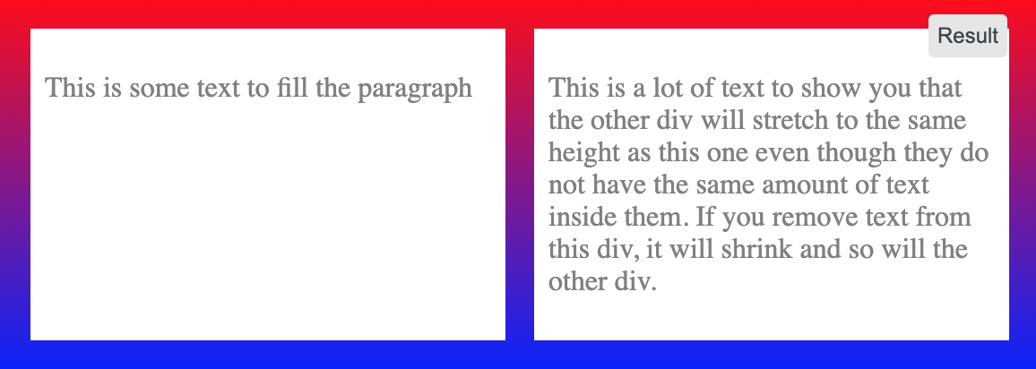
<div style="overflow: hidden">
    <div style="border:1px solid #cccccc; float:left; padding-bottom:1000px; margin-bottom:-1000px">
        Some content!<br/>
        Some content!<br/>
        Some content!<br/>
        Some content!<br/>
        Some content!<br/>
    </div>
    <div style="border:1px solid #cccccc; float:left; padding-bottom:1000px; margin-bottom:-1000px">
        Some content!
    </div>
</div>


그들 중 하나가 커지면 다른 것보다 같은 높이 크기를 유지하기를 원합니까?
Wai Wong

해결책은 아니지만 편집 가능한 환경에있는 예제는 여기에서 찾을 수 있습니다. jsfiddle.net/PCJUQ
MvanGeest

자바 스크립트 사용 : stackoverflow.com/questions/3275850/…
C. Hare

답변:


592

플렉스 박스

flexbox를 사용하면 단일 선언입니다.

.row {
  display: flex; /* equal height of the children */
}

.col {
  flex: 1; /* additionally, equal width */
  
  padding: 1em;
  border: solid;
}
<div class="row">
  <div class="col">Lorem ipsum dolor sit amet, consectetur adipisicing elit.</div>
  <div class="col">Lorem ipsum dolor sit amet, consectetur adipisicing elit. Ad omnis quae expedita ipsum nobis praesentium velit animi minus amet perspiciatis laboriosam similique debitis iste ratione nemo ea at corporis aliquam.</div>
</div>

이전 브라우저에는 접두사가 필요할 수 있습니다 ( 브라우저 지원 참조) .


17
flexbox는 매력처럼 작동했습니다. 반응 형 디자인을 개발 중이고 두 번째 div를 더 작은 화면에서 내려 가려면 .row를 표시하도록 설정해야합니다. block; 미디어 쿼리에서.
Nick Zulu

7
@NickZulu이 경우에 당신이 설정해야한다고 생각합니다 flex-direction: column: jsfiddle.net/sdsgW/1
Pavlo

1
@Eckstein 두 솔루션 모두 필요하지 않습니다. 데모를보십시오.
Pavlo

3
높이를 추가 할 때까지 이것은 작동하지 않았습니다 .100 %; 어린이 칼럼에
Jacob Raccuia

1
하나의 특정 자식 div가 다른 자식의 높이를 결정할 수 있습니까? 따라서 다른 하위 div의 내용이 변경되면 해당 특정 div의 높이를 변경할 수 없습니다.
Narek Malkhasyan

149

이것은 많은 사람들이 겪는 일반적인 문제이지만 운 좋게도 Ed Eliot의 블로그 와 같은 일부 똑똑한 생각 은 솔루션을 온라인에 게시했습니다.

기본적으로 당신이하는 일은 div를 사용하여 키가 아닌 생각에 "브라우저를 속임수" 를 추가하여 div / 열을 매우 크게 만드는 것 입니다. Ed Eliot는 그의 블로그에서 많은 예제를 포함하여 더 잘 설명합니다.padding-bottom: 100%margin-bottom: -100%

.container {
    overflow: hidden;
}
.column {
    float: left;
    margin: 20px;
    background-color: grey;
    padding-bottom: 100%;
    margin-bottom: -100%;
}
<div class="container">

    <div class="column">
        Some content!<br>
        Some content!<br>
        Some content!<br>
        Some content!<br>
        Some content!<br>
    </div>

    <div class="column">
        Something
    </div>

</div>


1
하나의 True Layout에 대한 설명은 약간 나빴지 만 첫 번째 링크를 확인한 후 그가 사용한 예제 중 하나에서 제대로 구현했습니다. 그러나 열의 아래쪽 테두리를 나타 내기 위해 이미지를 사용해야하기 때문에 실제로는 좋지 않으며 브라우저 간 지원에는 모호합니다. 그러나 그것은 작동하고 자바 스크립트에 의존하지 않으므로 올바른 것으로 표시 할 것입니다. 감사!
NibblyPig

이것은 오래된 IE 브라우저에서 작동하지 않는 것 같습니다 (불행히도 여전히 IE6를 지원해야합니다). 이것을 호환 가능하게 만드는 방법이 있습니까?
strongriley

1
@strongriley Checkout Ed Eliot의 블로그 : ejeliot.com/blog/61 IE6에서 작동합니다. 다른 곳에서 문제가 발생했을 수 있습니까?
mqchen

1
창이 너무 좁고 div가 서로 아래에 있으면 중단됩니다.
WhyNotHugo

1
예를 들어 속성이 100 %로 설정된 padding: 7px 10px경우 실제로 표 셀에 표시하려는 셀 패딩을 어떻게 정의 padding-bottom합니까? (PS overflow:hidden는 나에게 필요했습니다 row)
user1063287

55

이것은 CSS가 실제로 솔루션을 가지고 있지 않은 영역입니다. <table>태그 를 사용 하거나 CSS display:table*값을 사용하여 위조하는 것 입니다. "높이를 유지하는 요소는 동일 높이"뿐입니다.

<div style="display: table-row;">

    <div style="border:1px solid #cccccc; display: table-cell;">
        Some content!<br/>
        Some content!<br/>
        Some content!<br/>
        Some content!<br/>
        Some content!<br/>
    </div>

    <div style="border:1px solid #cccccc;  display: table-cell;">
        Some content!
    </div>

</div>

모든 버전의 Firefox, Chrome 및 Safari, Opera 버전 8 이상, IE 8 버전에서 작동합니다.


5
이 솔루션은 IE6 / IE7을 지원해야하는 사람들에게는 제공되지 않지만 가장 깨끗하다고 ​​생각합니다.
twsaef 2016 년

2
이 답변은 완벽합니다! 단지 작은 알림 : 일부 고객은 "table-row"대신 "table"을 요구할 수 있습니다.
tiborka

@ user2025810 : 아, 감사합니다. table대신 어떤 클라이언트가 필요한지 알고 table-row있습니까?
Paul D. Waite 1

@ user2025810 : yikes, 내가 테스트 한 적이 없다고 말할 수는 없습니다 :) 알고 있지만 반갑습니다. (PDF에 중점을 두면서 브라우저에서 잘 구현되지 않은 CSS 2.1의 인쇄 관련 기능 중 일부를 지원한다고 생각합니다.)
Paul D. Waite

7
이 솔루션을 사용 하면 부모 요소 width를 추가하지 않으면 div에 백분율 을 사용하는 것을 잊어 버릴 수 있습니다 display: table.
Alex G

42

jQuery 사용

jQuery를 사용하면 매우 간단한 한 줄 스크립트로 할 수 있습니다.

// HTML
<div id="columnOne">
</div>

<div id="columnTwo">
</div>

// Javascript
$("#columnTwo").height($("#columnOne").height());

CSS 사용

좀 더 흥미 롭습니다. 이 기술을 가짜 열 이라고 합니다. 실제 높이를 동일하게 설정하지는 않지만 그래픽 요소를 동일한 높이로 보이 도록 조작합니다 .


JavaScript를 사용하는 것이 매우 좋은 방법이라고 생각합니다. 문제는-사용하지 않으면 분리됩니다. 나는 어쨌든 이것을 사용하고 내가 할 수있는 최상의 우발 사태를 만들 것이라고 생각한다 .--) 감사합니다!
nicorellius

13
이것은 columnOne의 높이가 항상 columnTwo보다 크다는 것을 의미합니다.
Sébastien Richer

1
열을 적용하기 전에 열의 높이를 비교해야합니다. js 가이 문제에 가장 적합한 방법이라고 생각합니다. 거의 모든 브라우저에서 js를 사용할 수 있습니다. 그렇지 않으면 웹 사이트와 다른 많은 웹 사이트에서 벗어날 수 있습니다.
SalmanShariati

6
페이지가 처음로드 될 때만 작동합니다. 창 크기가 조정되어 div 크기가 조정되면 동기화 상태가 유지되지 않습니다.
ikariw

16

아무도 (아주 오래되었지만 신뢰할 수있는) 절대 열 기술을 언급하지 않은 것에 놀랐습니다 : http://24ways.org/2008/absolute-columns/

제 생각에 그것은 Faux Columns와 One True Layout의 기술보다 훨씬 뛰어납니다.

일반적인 아이디어는 가진 요소가 position: absolute;가장 가까운 부모 요소에 대해 위치한다는 것 position: relative;입니다. 그런 다음 a top: 0px;bottom: 0px;(또는 실제로 필요한 픽셀 / 백분율)을 모두 지정하여 열을 늘려 100 % 높이로 채 웁니다 . 예를 들면 다음과 같습니다.

<!DOCTYPE html>
<html>
  <head>
    <style>
      #container
      {
        position: relative;
      }

      #left-column
      {
        width: 50%;
        background-color: pink;
      }

      #right-column
      {
        position: absolute;
        top: 0px;
        right: 0px;
        bottom: 0px;
        width: 50%;
        background-color: teal;
      }
    </style>
  </head>
  <body>
    <div id="container">
      <div id="left-column">
        <ul>
          <li>Foo</li>
          <li>Bar</li>
          <li>Baz</li>
        </ul>
      </div>
      <div id="right-column">
        Lorem ipsum
      </div>
    </div>
  </body>
</html>

1
오른쪽 열에 왼쪽보다 많은 행이 있으면 내용이 오버플로됩니다.
David

11

Jquery의 Equal Heights 플러그인을 사용하면이 플러그인을 사용하여 모든 div를 다른 것과 정확히 동일한 높이로 만들 수 있습니다. 그들 중 하나가 자라면 다른 하나도 자랍니다.

여기 구현 예제

Usage: $(object).equalHeights([minHeight], [maxHeight]);

Example 1: $(".cols").equalHeights(); 
           Sets all columns to the same height.

Example 2: $(".cols").equalHeights(400); 
           Sets all cols to at least 400px tall.

Example 3: $(".cols").equalHeights(100,300); 
           Cols are at least 100 but no more than 300 pixels tall. Elements with too much content will gain a scrollbar.

여기 링크가 있습니다

http://www.cssnewbie.com/equalheights-jquery-plugin/


8

가짜 열을 사용할 수 있습니다 .

기본적으로 포함 된 DIV의 배경 이미지를 사용하여 두 개의 동일한 높이 DIV를 시뮬레이션합니다. 이 기술을 사용하면 그림자, 둥근 모서리, 사용자 정의 테두리 또는 기타 펑키 패턴을 컨테이너에 추가 할 수도 있습니다.

고정 너비 상자에서만 작동합니다.

모든 브라우저에서 잘 테스트되고 올바르게 작동합니다.


7

이 답변을 검색하는 동안이 스레드를 발견했습니다. 방금 작은 jQuery 함수를 만들었습니다. 매력처럼 작동하기를 바랍니다.

자바 스크립트

var maxHeight = 0;
$('.inner').each(function() {
    maxHeight = Math.max(maxHeight, $(this).height());
});
$('.lhs_content .inner, .rhs_content .inner').css({height:maxHeight + 'px'});

HTML

<div class="lhs_content">
    <div class="inner">
        Content in here
    </div>
</div>
<div class="rhs_content">
    <div class="inner">
        More content in here
    </div>
</div>

1
패딩과 테두리를 포함하기 위해 outerHeight를 사용했습니다. 이것이 내가 생각하는 가장 깨끗한 솔루션입니다.
Sébastien Richer

내가 찾고있는 완벽한 솔루션. 행에 몇 개의 열이있는 경우 다른 솔루션이 유용하지만이 방법은 복잡한 html 컨텐츠에 적합합니다. 작은 추가 : 반응 형 페이지에서 문서 크기를 조정할 때 고정으로 인해 컨텐츠 높이가 변경되지 않습니다. 그래서 나는 $ ( '. inner'). css ({height : "initial"}); '각 기능'이전에 높이를 기본값으로 설정하십시오.
bafsar

5

CSS 그리드 방식

이 작업을 수행하는 현대적인 방법 ( <div class="row"></div>두 항목마다 -wrapper 를 선언하지 않아도 됨 )은 CSS 격자를 사용하는 것입니다. 또한 항목 행 / 열 사이의 간격을 쉽게 제어 할 수 있습니다.

.grid-container {
  display: grid;
  grid-template-columns: repeat(2, 1fr); /* or simply "1fr 1fr;" */
  grid-row-gap: 10px; 
  grid-column-gap: 10px;
}

.grid-item {
  background-color: #f8f8f8;
  box-shadow: 0 0 3px #666;
  text-align: center;
}

.grid-item img {
  max-width: 100%;
}
<div class="grid-container">
  <div class="grid-item">1 <br />1.1<br />1.1.1</div>
  <div class="grid-item">2</div>
  <div class="grid-item">3
    <img src="https://lorempixel.com/420/320/abstract/1/Sample" alt="" />
    3.1
  </div>
  <div class="grid-item">4</div>
  <div class="grid-item">5 <br />1.1<br />1.1.1</div>
  <div class="grid-item">6<img src="https://lorempixel.com/400/300/abstract/" alt="" />
    6.1</div>
  <div class="grid-item">7</div>
  <div class="grid-item">8</div>
  <div class="grid-item">9 <br />1.1<br />1.1.1</div>
  <div class="grid-item">10</div>
  <div class="grid-item">11
    <img src="https://lorempixel.com/420/320/abstract/1/Sample" alt="" />
    11.1
  </div>
  <div class="grid-item">12</div>
</div>


4

이 질문은 6 년 전에 요청되었지만 요즘 flexbox 레이아웃 으로 간단한 답변을 제공 할 가치가 있습니다.

아버지에게 다음 CSS를 추가 <div>하면 작동합니다.

display: -webkit-flex;
display: flex;
flex-direction: row;
align-items: stretch;

처음 두 줄은 flexbox로 표시 될 것이라고 선언합니다. 그리고 flex-direction: row브라우저에 자식이 열로 표시 될 것임을 알려줍니다. 그리고 align-items: stretch모든 어린이 요소가 그중 하나가 높아질 때와 동일한 높이로 확장되어야한다는 요구 사항을 충족시킬 것입니다.


1
@TylerH 그러나 ask는 그의 질문을 편집 I'd like both boxes to always be the same size, so if one grows because text is placed into it, the other one should grow to match the height.하고 허용 된 답변에 언급되지 않은 것을 추가했습니다 ... 방금 완료했습니다. 아마도 내가 받아 들인 대답에 댓글을 달았을 것입니까?
Hegwin

1
이미 간단한 CSS 선언으로 덮여 있기 때문에 명시 적으로 언급되지 않았습니다. 답변의 스 니펫을 전체 화면으로 열고 브라우저 창의 크기를 조정하여보십시오. 그들은 서로 같은 크기를 유지합니다.
TylerH

1
수락 된 답변이 flexbox를 사용 하더라도이 방법은 다릅니다. align-items : stretch는 매우 특정한 상황에서 문제를 해결하기위한 길을 열어주었습니다.
BenoitLussier 2018 년

아닌가 align-items: stretch;플렉스의 기본은?
madav

3

CSS Flexbox와 최소 높이를 사용하면 나를 위해 일했습니다.

여기에 이미지 설명을 입력하십시오

내부에 두 개의 div가있는 컨테이너가 있고 그 두 div의 높이가 동일하다고 가정하십시오.

컨테이너에 ' display : flex '및 ' align-items : stretch '를 설정합니다

그런 다음 자식 div에 ' 최소 높이 '를 100 %로 지정하십시오.

아래 코드를 참조하십시오

.container {
  width: 100%;
  background: linear-gradient(red,blue);
  padding: 1em;
  /* important */
  display: flex;
  /* important */
  align-items: stretch;
  justify-content: space-around;
}

.child {
  width: 100%;
  background: white;
  color: grey;
  margin: 0 .5em;
  padding: .5em;
  /* important */
  min-height: 100%;
}
<div class="container">
  
  <div class="child"><p>This is some text to fill the paragraph</p></div>
  <div class="child"><p>This is a lot of text to show you that the other div will stretch to the same height as this one even though they do not have the same amount of text inside them. If you remove text from this div, it will shrink and so will the other div.</p></div>
  
</div>


2

divs 중 하나가 마스터 가 아니며 두 높이의 높이를 지시 하지 않으면 다음 과 div같습니다.

깡깡이

아니오 무슨 문제가 div오른쪽에 확장거나 뭉개 버려 및 오버 플로우의 높이에 맞게 div왼쪽에.

양자 모두 div 컨테이너의 직계 자식이어야하며 컨테이너 내에서 너비를 지정해야합니다.

관련 CSS :

.container {
    background-color: gray;
    display: table;
    width: 70%;
    position:relative;
}

.container .left{
    background-color: tomato;
    width: 35%;
}

.container .right{
    position:absolute;
    top:0px;
    left:35%;
    background-color: orange;
    width: 65%;
    height:100%;
    overflow-y: auto;
}

2

나는 이것을 달성하기 위해 의사 요소를 사용하고 싶다. 컨텐츠의 배경으로 사용하여 공간을 채울 수 있습니다.

이러한 접근 방식을 사용하면 열, 경계 등 사이에 여백을 설정할 수 있습니다.

.wrapper{
  position: relative;
  width: 200px;
}
.wrapper:before,
.wrapper:after{
  content: "";
  display: block;
  height: 100%;
  width: 40%;
  border: 2px solid blue;
  position: absolute;
  top: 0;
}
.wrapper:before{
  left: 0;
  background-color: red;
}
.wrapper:after{
  right: 0;
  background-color: green;
}

.div1, .div2{
  width: 40%;
  display: inline-block;
  position: relative;
  z-index: 1;
}
.div1{
  margin-right: 20%;
}
<div class="wrapper">
  <div class="div1">Content Content Content Content Content Content Content Content Content
  </div><div class="div2">Other</div>
</div>


1

바이올린

HTML

<div class="container">

    <div class="left-column">

    </div>

    <div class="right-column">
        <h1>Hello Kitty!</h1>
        <p>Lorem ipsum dolor sit amet, consectetur adipisicing elit. Laudantium cum accusamus ab nostrum sit laborum eligendi, totam nam aperiam harum officia commodi tempora dolorum. Incidunt earum explicabo deleniti architecto illo!</p>
        <p>Lorem ipsum dolor sit amet, consectetur adipisicing elit. Laudantium cum accusamus ab nostrum sit laborum eligendi, totam nam aperiam harum officia commodi tempora dolorum. Incidunt earum explicabo deleniti architecto illo!</p>
    </div>

</div>

CSS

.container {
    float: left;
    width: 100%;
    background-color: black;
    position: relative;
    left: 0;
}

.container:before,
.container:after {
    content: " ";
    display: table;
}

.container:after {
    clear: both;
}

.left-column {
    float: left;
    width: 30%;
    height: 100%;
    position: absolute;
    background: wheat;
}

.right-column {
    float: right;
    width: 70%;
    position: relative;
    padding: 0;
    margin: 0;
    background: rebeccapurple;            
}

1

위에서 언급 한 거의 모든 방법을 시도했지만 flexbox 솔루션은 Safari에서 올바르게 작동하지 않으며 그리드 레이아웃 방법은 이전 버전의 IE에서는 올바르게 작동하지 않습니다.

이 솔루션은 모든 화면에 적합하며 브라우저 간 호환됩니다.

.container {margin:15px auto;}
.container ul {margin:0 10px;}
.container li {width:30%; display: table-cell; background-color:#f6f7f7;box-shadow: 0 2px 5px 0 rgba(0, 0, 0, 0.25);}

@media (max-width: 767px){
    .container li { display: inline-block; width:100%; min-height:auto!important;}
}

위의 방법은 셀 높이와 동일하며 모바일 또는 태블릿과 같은 작은 화면의 경우 @media위에서 언급 한 방법을 사용할 수 있습니다 .


0

jQuery를 사용하여이를 쉽게 수행 할 수 있습니다.

CSS

.left, .right {border:1px solid #cccccc;}

jQuery

$(document).ready(function() {
    var leftHeight = $('.left').height();
    $('.right').css({'height':leftHeight});
});

HTML

   <div class="left">
    <p>Lorem ipsum dolor sit amet, consectetur adipiscing elit. Morbi malesuada, lacus eu dapibus tempus, ante odio aliquet risus, ac ornare orci velit in sapien. Duis suscipit sapien vel nunc scelerisque in pretium velit mattis. Cras vitae odio sed eros mollis malesuada et eu nunc.</p>
   </div>
   <div class="right">
    <p>Lorem ipsum dolor sit amet.</p>
   </div>

jQuery 를 포함해야합니다


1
<div>동적 콘텐츠가 모두있는 경우에는 작동하지 않습니다 . 내가 말하는 이유 <div class="right">는 다른 문제가 발생하는 더 많은 내용 이 있는지 입니다.
Surya

0

나는 오랜 시간을 알고 있지만 어쨌든 내 솔루션을 공유합니다. 이것은 jQuery 트릭입니다.

--- HTML

<div class="custom-column">
    <div class="column-left">
        asd
        asd<br/>
        asd<br/>
    </div>
    <div class="column-right">
        asd
    </div>
</div>

<div class="custom-column">
    <div class="column-left">
        asd
    </div>
    <div class="column-right">
        asd
        asd<br/>
        asd<br/>
    </div>
</div>

---- CSS

<style>
.custom-column { margin-bottom:10px; }
.custom-column:after { clear:both; content:""; display:block; width:100%; }
    .column-left { float:left; width:25%; background:#CCC; }
    .column-right { float:right; width:75%; background:#EEE; }
</style>

--- 쿼리

<script src="js/jquery.min.js"></script>
<script>
$(document).ready(function(){
    $balancer = function() {
        $('.custom-column').each(function(){
            if($('.column-left',this).height()>$('.column-right',this).height()){
                $('.column-right',this).height($('.column-left',this).height())
            } else {
                $('.column-left',this).height($('.column-right',this).height())
            }

        });

    }
    $balancer();
    $(window).load($balancer());
    $(window).resize($balancer());

});
</script>

-1

이것은 요소의 offset.top을 확인하여 동일한 행의 모든 ​​요소에 동일한 높이를 설정하는 jQuery 플러그인입니다. 따라서 jQuery 배열에 둘 이상의 행 (다른 오프셋 .top)의 요소가 포함되어 있으면 각 행의 높이가 최대 인 요소를 기준으로 각 행의 높이가 분리됩니다.

jQuery.fn.setEqualHeight = function(){

var $elements = [], max_height = [];

jQuery(this).css( 'min-height', 0 );

// GROUP ELEMENTS WHICH ARE ON THE SAME ROW
this.each(function(index, el){ 

    var offset_top = jQuery(el).offset().top;
    var el_height = jQuery(el).css('height');

    if( typeof $elements[offset_top] == "undefined" ){
        $elements[offset_top] = jQuery();
        max_height[offset_top] = 0;
    }

    $elements[offset_top] = $elements[offset_top].add( jQuery(el) );

    if( parseInt(el_height) > parseInt(max_height[offset_top]) )
        max_height[offset_top] = el_height;

});

// CHANGE ELEMENTS HEIGHT
for( var offset_top in $elements ){

    if( jQuery($elements[offset_top]).length > 1 )
        jQuery($elements[offset_top]).css( 'min-height', max_height[offset_top] );

}

};


-2
    var numexcute = 0;
    var interval;
    $(document).bind('click', function () {

        interval = setInterval(function () {
            if (numexcute >= 20) {
                clearInterval(interval);
                numexcute = 0;
            }
            $('#leftpane').css('height', 'auto');
            $('#rightpane').css('height', 'auto');
            if ($('#leftpane').height() < $('#rightpane').height())
                $('#leftpane').height($('#rightpane').height());
            if ($('#leftpane').height() > $('#rightpane').height())

                $('#rightpane').height($('#leftpane').height());
            numexcute++;
        }, 10);

    });

1
답변에 해설을 제공하십시오.
sgnsajgon

-2

jquery가 요즘 모든 웹 응용 프로그램의 일부이므로 jquery를 사용 하여이 작은 함수를 만들었습니다.

function fEqualizeHeight(sSelector) {
    var sObjects = $(sSelector);

    var iCount = sObjects.length;

    var iHeights = [];

    if (iCount > 0) {
        $(sObjects).each(function () {
            var sHeight = $(this).css('height');
            var iHeight = parseInt(sHeight.replace(/px/i,''));
            iHeights.push(iHeight);
        });

        iHeights.sort(function (a, b) {
            return a - b
        });

        var iMaxHeight = iHeights.pop();

        $(sSelector).each(function () {
            $(this).css({
                'height': iMaxHeight + 'px'
            });
        });
    }
}

페이지 준비 이벤트에서이 함수를 호출 할 수 있습니다.

$(document).ready(function(){
   fEqualizeHeight('.columns');
});

나는 이것이 당신을 위해 작동하기를 바랍니다.


-3

나는 최근에 이것을 만났고 솔루션을 정말로 좋아하지 않았으므로 실험을 시도했다.

.mydivclass {inline-block; vertical-align: middle; width: 33%;}


-4
<div>

<div style="border:1px solid #cccccc; float:left; min-height:200px;">

Some content!<br/>
Some content!<br/>
Some content!<br/>
Some content!<br/>
Some content!<br/>

</div>

<div style="border:1px solid #cccccc; float:left; min-height:200px;">

Some content!

</div>

</div>

여기서 내가 한 것은 높이를 최소 높이로 변경하고 고정 값을 부여하는 것입니다. 그들 중 하나가 크기를 조정하면 다른 하나는 같은 높이를 유지합니다. 이것이 당신이 원하는 것인지 확실하지 않습니다


OP는 div의 높이가 항상 같기를 원했습니다.
Simon Forsberg
당사 사이트를 사용함과 동시에 당사의 쿠키 정책개인정보 보호정책을 읽고 이해하였음을 인정하는 것으로 간주합니다.
Licensed under cc by-sa 3.0 with attribution required.