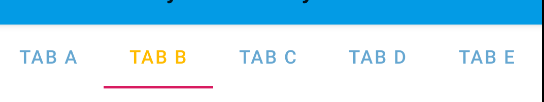
Android 디자인 라이브러리의 새 TabLayout을 사용하고 있습니다. 나는 사용하여 텍스트 색상 상태 목록을 설정했습니다.tabLayout.setTabTextColors(colorstatelist)
styles.xml을 사용하여 어떻게 동일한 결과를 얻을 수 있습니까?
Android 디자인 라이브러리의 새 TabLayout을 사용하고 있습니다. 나는 사용하여 텍스트 색상 상태 목록을 설정했습니다.tabLayout.setTabTextColors(colorstatelist)
styles.xml을 사용하여 어떻게 동일한 결과를 얻을 수 있습니까?
답변:
<android.support.design.widget.TabLayout
        android:layout_width="match_parent"
        android:layout_height="wrap_content"
        app:tabMode="fixed"
        app:tabGravity="fill"
        app:tabTextColor="@color/your_unselected_text_color"
        app:tabSelectedTextColor="@color/your_selected_text_color"/>
또한 추가 스타일링을위한 tabIndicatorColor 또는 tabIndicatorHeight와 같은 속성이 있습니다.
tabLayout.setTabTextColors(
    getResources().getColor(R.color.your_unselected_text_color),
    getResources().getColor(R.color.your_selected_text_color)
);
이 오래된 방법은 API 23부터 더 이상 사용되지 않으므로 대안은 다음과 같습니다.
tabLayout.setTabTextColors(
    ContextCompat.getColor(context, R.color.your_unselected_text_color),
    ContextCompat.getColor(context, R.color.your_selected_text_color)
);
다음은 텍스트 스타일 및 선택한 텍스트 색상을 재정의하는 스 니펫 코드입니다.
<style name="MyCustomTabLayout" parent="Widget.Design.TabLayout">
    <item name="tabTextAppearance">@style/MyCustomTabText</item>
    <item name="tabSelectedTextColor">@color/tab_text_act</item>
</style>

<style name="MyCustomTabText" parent="TextAppearance.AppCompat.Button">
    <item name="android:textSize">14sp</item>
    <item name="android:textColor">@color/tab_text</item>
</style>
그리고 여기에 레이아웃 용 스 니펫 코드가 있습니다.
<android.support.design.widget.TabLayout
            android:layout_width="match_parent"
            android:layout_height="wrap_content"
            style="@style/MyCustomTabLayout" />
android:textAppearance스타일 을 무시하면 됩니다. TabLayout은 textAppearance를 사용하기 때문입니다. 다음은 스타일의 작은 스 니펫 코드입니다.
<!-- Base application theme. -->
<style name="AppTheme" parent="Theme.AppCompat.Light.DarkActionBar">
    <!-- Below will reference with our custom style -->
    <item name="android:textAppearance">@style/my_tab_text</item>
</style>

<style name="my_tab_text" parent="Base.TextAppearance.AppCompat">
    <item name="android:textColor">@android:color/holo_blue_dark</item>
</style>
그리고 당신은 당신의 Apptheme에서 참조 할 해달라고하면 직접 조각 아래 사용 TabLayout에 지정할 수 있습니다.
 <android.support.design.widget.TabLayout
            android:layout_width="match_parent"
            android:layout_height="wrap_content"
            app:tabTextAppearance="@style/my_tab_text"
            app:tabIndicatorHeight="48dp"/>
사용자 정의 탭의 경우 다음을 재정의해야합니다. 1) app : tabTextColor // for_unselected_text "
        <android.support.design.widget.TabLayout
            android:id="@+id/tabs"
            style="@style/MyCustomTabLayout"
            android:layout_width="match_parent"
            android:layout_height="56dp"
            android:background="?attr/colorPrimary"
            android:scrollbarSize="24sp"
            android:visibility="gone"
            app:tabTextColor="@color/white_40_percent"
            app:tabMode="scrollable" />
2) tabSelectedTextColor // 선택된 탭 색상 3) tabIndicatorColor // 탭 표시 색상
   <style name="MyCustomTabLayout" parent="Widget.Design.TabLayout">
    <item name="android:textColorPrimary">@color/white</item>
    <item name="tabSelectedTextColor">@color/white</item>
    <item name="tabTextAppearance">@style/TabTextStyle</item>
    <item name="tabIndicatorColor">?attr/colorAccent</item>
    <item name="tabIndicatorHeight">4dp</item>
    <item name="android:tabStripEnabled">true</item>
    <item name="android:padding">0dp</item>
  </style>


<style name="TabTextStyle">
    <item name="android:fontFamily">@string/font_fontFamily_medium</item>
    <item name="android:textStyle">bold</item>
    <item name="android:textAllCaps">true</item>
    <item name="android:textColor">@color/tab_text_color</item>
    <item name="android:textSize">16sp</item>
</style>
tab_text_color.xml
 <?xml version="1.0" encoding="utf-8"?>
 <selector xmlns:android="http://schemas.android.com/apk/res/android">
  <item android:color="@color/white_40_percent"android:state_selected="false"/>
  <item android:color="@color/white_100_percent"android:state_selected="true"/>
 </selector>
재료 구성 요소 라이브러리에TabLayout 제공된을 사용하여 다음을 수행 할 수 있습니다.
  <com.google.android.material.tabs.TabLayout
      style="@style/My_Tablayout"
      ..>
스타일 tabTextColor에서 선택기와 함께 사용하십시오 .
<!-- TabLayout -->
<style name="My_Tablayout" parent="Widget.MaterialComponents.TabLayout" >
    <item name="tabTextColor">@color/tab_layout_selector</item>
</style>


<selector xmlns:android="http://schemas.android.com/apk/res/android">
  <item android:color="?attr/colorPrimary" android:state_selected="true"/>
  <item android:alpha="0.60" android:color="?attr/colorOnSurface"/>
</selector>
app:tabTextColor레이아웃에서 사용 : <com.google.android.material.tabs.TabLayout
app:tabTextColor="@color/tab_layout_selector"
..>
쉽고 완벽한 방법 :
XML 파일에서 ::
<android.support.design.widget.TabLayout
        android:layout_width="match_parent"
        android:layout_height="wrap_content"
        app:tabTextAppearance="@style/TabText"/>
값 스타일 파일 :
참고 : "cairo_semibold"는 외부 글꼴이므로 사용자의 글꼴로 바꿀 수 있습니다.
<style name="TabText" parent="TextAppearance.Design.Tab">
    <item name="android:textColor">#1f57ff</item>
    <item name="android:textSize">14sp</item>
    <item name="android:fontFamily">@font/cairo_semibold</item>
</style>
가장 좋거나 짧고 간단한 방법은 사용자 정의 앱 바를 다음과 같이 만드는 것입니다.
 <?xml version="1.0" encoding="utf-8"?>
    <android.support.v7.widget.Toolbar xmlns:android="http://schemas.android.com/apk/res/android"
    android:layout_width="match_parent"
    android:layout_height="?android:attr/actionBarSize"
    xmlns:app="http://schemas.android.com/apk/res-auto"
    android:background="@color/colorAccent"
    app:theme="@style/myCustomAppBarTheme"
    app:popupTheme="@style/ThemeOverlay.AppCompat.Dark"><RelativeLayout
        android:layout_width="match_parent"
        android:layout_height="match_parent">

        <ImageButton
            android:id="@+id/btn_back"
            android:layout_width="wrap_content"
            android:layout_height="wrap_content"
            android:layout_alignParentLeft="true"
            android:background="@android:color/transparent"
            android:src="@mipmap/ic_launcher" />

        <TextView
            android:id="@+id/txt_title"
            android:layout_width="wrap_content"
            android:layout_height="wrap_content"
            android:layout_centerVertical="true"
            android:layout_marginLeft="16dp"
            android:layout_marginStart="16dp"
            android:layout_toEndOf="@+id/btn_back"
            android:layout_toRightOf="@+id/btn_back"
            android:text="Title"
            android:textColor="@android:color/white"
            android:textSize="20sp"
            android:textStyle="bold" />

    </RelativeLayout>
    </android.support.v7.widget.Toolbar>
XML 속성
<com.google.android.material.tabs.TabLayout
                    android:id="@+id/tab_layout"
                    android:layout_width="match_parent"
                    android:layout_height="wrap_content"
                    app:tabIndicatorColor="@color/white"
                    app:tabBackground="@color/colorAccent"
                    app:tabSelectedTextColor="@color/white"
                    app:tabTextColor="@color/white"
                    app:tabMode="scrollable" />
Kotlin에서 프로그래밍 방식으로
(tab_layout as TabLayout).setBackgroundColor(ContextCompat.getColor(mContext, R.color.colorPrimary))
(tab_layout as TabLayout).setSelectedTabIndicatorColor(ContextCompat.getColor(mContext, R.color.white))
(tab_layout as TabLayout).setTabTextColors(ContextCompat.getColor(mContext, R.color.white),
                ContextCompat.getColor(mContext, R.color.white))