RecyclerView 항목에 잔물결 효과 추가


105

RecyclerView 항목에 Ripple Effect를 추가하려고합니다. 온라인으로 봤지만 필요한 것을 찾을 수 없습니다. 사용자 지정 효과 여야한다고 가정합니다. RecyclerView 자체에 android : background 속성을 시도하고 "? android : selectableItemBackground"로 설정했지만 작동하지 않았습니다. :

    <android.support.v7.widget.RecyclerView
    android:layout_width="match_parent"
    android:layout_height="match_parent"
    android:focusable="true"
    android:clickable="true"
    android:background="?android:selectableItemBackground"
    android:id="@+id/recyclerView"
    android:layout_below="@+id/tool_bar"/>

이것은 효과를 추가하려는 RecyclerView입니다.

여기에 이미지 설명 입력


1
이 질문 의 중복 아닌 것으로 다시 여는 중 입니다. 솔루션이 유사 할 수 있지만 CardView이 질문 에 a가있는 경우이보다 일반적인 질문과 관련이없는 특정 측면 이 있습니다.
Suragch

@Suragch는 :)의 차이를 알아 차리지 주셔서 감사합니다
게오르기 Koemdzhiev에게

답변:


222

나는 알아 냈다. 내가해야 할 일은이 속성을 추가하는 것뿐입니다.

android:background="?android:attr/selectableItemBackground"

내 RecyclerView 어댑터가 다음과 같이 팽창하는 레이아웃의 루트 요소에

<RelativeLayout xmlns:android="http://schemas.android.com/apk/res/android"
    xmlns:tools="http://schemas.android.com/tools"
    android:layout_width="match_parent"
    android:layout_height="wrap_content"
    android:paddingTop="8dp"
    android:paddingBottom="8dp"
    android:background="?android:attr/selectableItemBackground"
    tools:background="@drawable/bg_gradient">

    <TextView
        android:layout_width="wrap_content"
        android:layout_height="wrap_content"
        android:textSize="17sp"
        android:layout_marginLeft="15dp"
        android:layout_marginStart="15dp"
        android:id="@+id/shoppingListItem"
        android:hint="@string/enter_item_hint"
        android:layout_centerVertical="true"
        android:layout_alignParentLeft="true"
        android:layout_alignParentStart="true"/>

    <CheckBox
        android:layout_width="wrap_content"
        android:layout_height="wrap_content"
        android:text="@string/shopping_list_item_checkbox_label"
        android:id="@+id/shoppingListCheckBox"
        android:layout_centerVertical="true"
        android:layout_marginRight="15dp"
        android:layout_alignParentRight="true"
        android:layout_alignParentEnd="true"
        android:checked="false"/>

</RelativeLayout>

결과:

여기에 이미지 설명 입력

여전히 잔물결 효과를 볼 수없는 경우 이러한 선을 레이아웃의 루트 요소에도 추가하십시오.

android:clickable="true"
android:focusable="true"

3
루트 요소가 CardView이면 어떻게됩니까?
Nabin

6
@SpiderMan 상대 또는 선형 레이아웃 안에 코드를 작성한 다음 카드 레이아웃 안에 배치해야합니다.
SanVed

7
@pronoobsanved, 이것은 나를 도왔습니다! 여전히 문제에 직면 한 사람들을 위해 CardView는 단일 레이아웃을 자식으로 사용합니다. 사실과 배경으로 포커스 그 아이, 세트 클릭하십시오 ATTR / selectedableItemBackground로?
Vamsi Challa

42
CardView에 대한 @NabinKhadka 대신 전경으로 예를 설정android:foreground="?android:attr/selectableItemBackground"
론 라리 베르테

6
나는 옵션을 추가했다 android:clickable="true"이 일하는 것도
호아킨 Iurchuk

69

이미 답변했듯이 가장 간단한 해결책은 다음 중 하나를 RecyclerView행의 배경 으로 추가하는 것입니다 .

  • android:background="?android:attr/selectableItemBackground"
  • android:background="?attr/selectableItemBackground"

그러나이 방법에 문제 가 있거나 색상을 더 세밀하게 제어하려는 경우 다음을 수행 할 수 있습니다.

커스텀 파급 효과

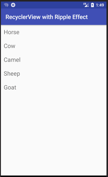
이 답변은 이 간단한 Android RecyclerView 예제로 시작됩니다 . 다음 이미지와 같습니다.

잔물결 효과 예제 GIF

API 21 이전 기기에 대한 선택기 추가

API 21 (Android 5.0 Lollipop) 이전에는 RecyclerView항목을 클릭하면 배경색이 변경되었습니다 (파급 효과 없음). 그것이 우리가 할 일이기도합니다. 여전히 이러한 장치를 사용하는 사용자가있는 경우 해당 동작에 익숙하므로 너무 걱정하지 않아도됩니다. (물론 파급 효과를 원한다면 사용자 정의 라이브러리를 사용할 수 있습니다 .)

res/drawable폴더를 마우스 오른쪽 버튼으로 클릭 하고 새로 만들기> 드로어 블 리소스 파일을 선택 합니다 . 그것을 부르십시오 custom_ripple. 확인을 클릭하고 다음 코드를 붙여 넣습니다.

custom_ripple.xml

<?xml version="1.0" encoding="utf-8"?>
<selector xmlns:android="http://schemas.android.com/apk/res/android">
    <item android:state_pressed="true">
        <shape android:shape="rectangle">
            <solid android:color="@color/colorAccent" />
        </shape>
    </item>
    <item>
        <shape android:shape="rectangle">
            <solid android:color="@android:color/transparent" />
        </shape>
    </item>
</selector>

내가 사용 colorAccent이 이미했기 때문에 눌림 상태에 대한 강조 색상으로,하지만 당신은 당신이 원하는 색상을 정의 할 수 있습니다.

API 21+ 장치에 대한 파급 효과 추가

res/drawable폴더를 마우스 오른쪽 버튼으로 클릭 하고 새로 만들기> 드로어 블 리소스 파일을 선택 합니다 . custom_ripple다시 전화 하십시오. 하지만 이번에는 확인을 클릭하지 마십시오. 로부터 가능한 예선 목록 선택 버전을 , 다음을 클릭 >> 버튼 및 쓰기 21을위한 플랫폼 API 레벨을 . 이제 확인을 클릭하고 다음 코드를 붙여 넣으십시오.

v21 / custom_ripple.xml

<?xml version="1.0" encoding="utf-8"?>
<ripple xmlns:android="http://schemas.android.com/apk/res/android"
    android:color="@color/colorAccent">

    <item
        android:id="@android:id/mask"
        android:drawable="@android:color/white" />
</ripple>

역시 colorAccent잔물결 색상은 사용 가능했기 때문에 사용했지만 원하는 색상을 사용할 수 있습니다. 마스크는 잔물결 효과를 행 레이아웃으로 제한합니다. 마스크 색상 은별로 중요하지 않아서 불투명 한 흰색을 사용했습니다.

배경으로 설정

RecyclerView 항목의 루트 레이아웃에서 배경을 우리가 만든 사용자 지정 잔물결로 설정합니다.

android:background="@drawable/custom_ripple"

시작했던 예제 프로젝트 에서는 다음과 같습니다.

<?xml version="1.0" encoding="utf-8"?>
<LinearLayout
    xmlns:android="http://schemas.android.com/apk/res/android"
    android:layout_width="match_parent"
    android:layout_height="wrap_content"
    android:orientation="horizontal"
    android:background="@drawable/custom_ripple"
    android:padding="10dp">

    <TextView
        android:id="@+id/tvAnimalName"
        android:layout_width="wrap_content"
        android:layout_height="wrap_content"
        android:textSize="20sp"/>

</LinearLayout>

끝마친

그게 다야. 이제 프로젝트를 실행할 수 있습니다. 이 답변 과 도움을 주신 YouTube 비디오 에 감사드립니다 .


기본 배경색을 원하면 'android : id = "@ android : id / mask'줄을 제거한 다음 드로어 블의 색상을 원하는대로 설정하십시오
Jordan Hochstetler

26

놓친 작은 세부 사항이 하나 있다고 생각합니다.

추가 후에도 여전히 물결 효과가 나타나지 않으면 android:background="?android:attr/selectableItemBackground"레이아웃의 루트에 다음 줄을 추가해 보십시오.

android:clickable="true"
android:focusable="true"

이렇게하면보기를 클릭 할 수 있고 위에서 언급 한 배경 속성으로 잔물결 효과를 사용할 수 있습니다.


5

어댑터 xml 루트 뷰에이 줄을 추가하십시오.

android:background="?attr/selectableItemBackground"
android:clickable="true"
android:focusable="true"

2

간단하고 사용자 지정 접근 방식은 여기에 설명 된대로보기 테마를 설정하는 입니다.

some_view.xml

<ImageView
   android:layout_width="wrap_content"
   android:layout_height="wrap_content"
   android:background="?attr/selectableItemBackgroundBorderless"
   android:focusable="true"
   android:src="@drawable/up_arrow"
   android:theme="@style/SomeButtonTheme"/>

some_style.xml

<style name="SomeButtonTheme" >
   <item name="colorControlHighlight">@color/someColor</item>
</style>

다른 사용자 정의 구현은 여기 에서 찾을 수 있습니다 .


1

버튼 스타일 사용

이것은 나를 위해 셀 수없이 효과적이었습니다.

레이아웃의 루트 요소에 테두리없는 버튼 스타일을 추가합니다. focusable또는 clickable속성이 필요하지 않으며 기본 스타일링이 모든 것을 캡슐화합니다.

<androidx.constraintlayout.widget.ConstraintLayout
    style="@android:style/Widget.Material.Button.Borderless"
    android:layout_width="match_parent"
    android:layout_height="wrap_content">

멋지지만 패딩 추가
ededed

@edede min-height, max-height, width ... XML 속성을 사용하여 취향에 맞게 조정할 수 있습니다.
Felix Favor Chinemerem
당사 사이트를 사용함과 동시에 당사의 쿠키 정책개인정보 보호정책을 읽고 이해하였음을 인정하는 것으로 간주합니다.
Licensed under cc by-sa 3.0 with attribution required.