버튼 배경색으로 내 버튼에 물결 효과를 추가 하시겠습니까?


125

버튼을 만들고 그 버튼에 파급 효과를 추가하고 싶습니다!

버튼 bg XML 파일을 만들었습니다 : (bg_btn.xml)

<shape xmlns:android="http://schemas.android.com/apk/res/android" android:shape="rectangle">
<gradient android:startColor="#FFFFFF" android:endColor="#00FF00" android:angle="270" />
<corners android:radius="3dp" />
<stroke android:width="5px" android:color="#000000" />
</shape>

그리고 이것은 내 파급 효과 파일입니다 : (ripple_bg.xml)

<ripple xmlns:android="http://schemas.android.com/apk/res/android"
    xmlns:tools="http://schemas.android.com/tools"
    android:color="#f816a463"
    tools:targetApi="lollipop">
    <item android:id="@android:id/mask">
        <shape android:shape="rectangle">
            <solid android:color="#f816a463" />
        </shape>
    </item>
</ripple>

그리고 이것은 리플 효과를 추가하려는 내 버튼입니다.

<Button
android:layout_width="wrap_content"
android:layout_height="wrap_content"
android:text="New Button"
android:id="@+id/button"
android:layout_centerHorizontal="true"
android:layout_marginTop="173dp"
android:textColor="#fff"
android:background="@drawable/ripple_bg"
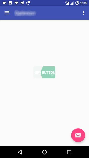
android:clickable="true" />

하지만 잔물결 효과를 추가 한 후 버튼 배경은 투명하고 버튼을 클릭 할 때만 다음과 같이 표시됩니다.

클릭하기 전에

클릭시

하지만 버튼 배경색과 잔물결 효과가 모두 필요합니다. Stack Overflow의 다른 블로그에서이 코드 중 일부를 찾았지만 여전히 작동하지 않습니다!


다음에 스크린 샷을 훨씬 작게 만드십시오 .. (업로드하기 전에 크기 조정)
user25

@ user25, l또는 m이미지 링크에 추가 할 수도 있습니다 . (내 편집 참조)
Suragch

답변:


154

그라데이션 배경, 모서리 반경 및 잔물결 효과를 모두 추가하려는 사용자를위한 또 다른 드로어 블 xml이 있습니다.

<?xml version="1.0" encoding="utf-8"?>
<ripple xmlns:android="http://schemas.android.com/apk/res/android"
    android:color="@color/colorPrimaryDark">
    <item android:id="@android:id/mask">
        <shape android:shape="rectangle">
            <solid android:color="@color/colorPrimaryDark" />
            <corners android:radius="@dimen/button_radius_large" />
        </shape>
    </item>

    <item android:id="@android:id/background">
        <shape android:shape="rectangle">
            <gradient
                android:angle="90"
                android:endColor="@color/colorPrimaryLight"
                android:startColor="@color/colorPrimary"
                android:type="linear" />
            <corners android:radius="@dimen/button_radius_large" />
        </shape>
    </item>
</ripple>

버튼의 배경에 이것을 추가하십시오.

<Button
    ...
    android:background="@drawable/button_background" />

추신 :이 답변은 안드로이드 API 21 이상에서 작동합니다.


4
@pei 어떻게이 정보를 얻었습니까? 이 작업을 수행하기 위해 ripple이라는 XML 요소가 있다는 것을 어떻게 알 수 있습니까?

1
머티리얼 디자인에 사용되는 개념 중 하나입니다. Android Studio의 드로어 블 xml에 새 루트 태그를 입력하기 시작하면을 포함하여 사용 가능한 모든 태그를 볼 수 있습니다 ripple.
Pei

1
마스크 아이템의 용도는 무엇입니까?
Prashant

10
이를 위해서는 API 레벨 21
M.kazem Akhgary

2
작동하지만 작동 방식은 설명되어 있지 않습니다. 항목의 ID와 관련이 있어야합니다. 참조되어야합니다.
oiyio

155

와 함께 배경이 이미있는 경우 "?attr/selectableItemBackground"보기의 android:foreground속성에을 추가하십시오 android:clickable="true".


항상 작동하는 것은 아니지만 수락 된 답변의 주석에 언급 된 것처럼 파급 효과에 배경을 추가 할 수 있습니다
Tyler

버튼에 사용자 정의 배경을 사용했기 때문에이 솔루션을 사용해야했습니다. 훌륭하게 작동했습니다.
bnayagrawal

@ROAR, 맞습니다.하지만 적어도 : "이것은 오류가 아닙니다. 응용 프로그램은 단순히 속성을 무시합니다. 그러나 속성이 응용 프로그램의 모양이나 기능에 중요한 경우에는 다른 방법을 찾아야합니다. 사용 가능한 속성 만 사용하여 동일한 결과를 얻을 수 있습니다. 그러면 새로운 속성을 활용할 수있는 API NN 이상에서 사용될 layout-vNN 폴더에 레이아웃 사본을 선택적으로 생성 할 수 있습니다. " 따라서 API 23 이상의 기기에서 잘 작동하며 아래에서는 무시됩니다 ( tools:ignore="UnusedAttribute).
JorgeAmVF

Android 지원 라이브러리가 없으면 ?android:attr/selectableItemBackground( android:attr대신 attr)
Weekend

1
android:foreground속성이 23 미만의 API 레벨에는 영향을주지 않습니다.
Vadim Kotov

67

Android 버튼에 잔물결 효과 / 애니메이션 추가

버튼 배경 속성을 android : background = "? attr / selectableItemBackground"로 바꾸면 코드가 다음과 같이 보입니다.

      <Button
        android:layout_width="match_parent"
        android:layout_height="wrap_content"
        android:background="?attr/selectableItemBackground"
        android:text="New Button" />

Android 버튼에 잔물결 효과 / 애니메이션을 추가하는 또 다른 방법

이 방법을 사용하면 물결 효과 색상을 사용자 지정할 수 있습니다. 먼저 드로어 블 리소스 디렉터리에 xml 파일을 만들어야합니다. ripple_effect.xml 파일을 만들고 다음 코드를 추가합니다. res / drawable / ripple_effect.xml

<?xml version="1.0" encoding="utf-8"?>
<ripple xmlns:android="http://schemas.android.com/apk/res/android"
    xmlns:tools="http://schemas.android.com/tools"
    android:color="#f816a463"
    tools:targetApi="lollipop">
    <item android:id="@android:id/mask">
        <shape android:shape="rectangle">
            <solid android:color="#f816a463" />
        </shape>
    </item>
</ripple>

그리고 버튼의 배경을 드로어 블 리소스 파일 위에 설정합니다.

<Button
    android:layout_width="match_parent"
    android:layout_height="wrap_content"
    android:background="@drawable/ripple_effect"
    android:padding="16dp"
    android:text="New Button" />

1
저에게는 파급 효과가 나타나지 않았습니다. 그것은 버튼의 색상 스위치였습니다. / 내 안드로이드 버전은 5.1.1이므로 작동합니다. 도와 주 시겠어요? 나는 당신의 단계를 따라
UrviG

안드로이드 : 색상을하거나 파급 효과가보고 싶어 : 색상이 비만과 달라야합니다 안드로이드
SpyZip

2
배경을 원하면 잔물결에 다른 항목을 추가하기 만하면됩니다. <item android : drawable = "? attr / colorPrimary"/>
Tyler

36

Jigar Patel 의 솔루션 외에도 버튼의 투명한 배경을 피하기 위해 이것을 ripple.xml 에 추가 하십시오.

<item
    android:id="@android:id/background"
    android:drawable="@color/your-color" />

완전한 xml :

<ripple xmlns:android="http://schemas.android.com/apk/res/android"
    xmlns:tools="http://schemas.android.com/tools"
    android:color="@color/your-color"
    tools:targetApi="lollipop">
    <item android:id="@android:id/mask">
        <shape android:shape="rectangle">
            <solid android:color="@color/your-color" />
        </shape>
    </item>
    <item
        android:id="@android:id/background"
        android:drawable="@color/your-color" />
</ripple>

ripple.xml 을 버튼의 배경으로 사용하십시오.

android:background="@drawable/ripple"

2
우리는 <item android:id="@android:id/mask"> [...]. 타원형 마스크를 원하지 않는 한. 답변 해 주셔서 감사합니다!
Filipe Brito

<item android : id = "@ android : id / mask">이 <item android : id = "@ android : id / mask"> 어쨌거나 저는 그 속성이
있거나

공식 문서의 @SartherisStormhammer : 마스크 레이어가 설정된 경우 잔물결 효과가 나머지 하위 레이어의 합성 위에 그려지기 전에 해당 레이어에 대해 마스크됩니다. 마스크 레이어가 설정되지 않은 경우 잔물결 효과가 하위 레이어의 합성에 대해 마스크됩니다. 이 링크는 developer.android.com/reference/android/graphics/drawable/…입니다.
Sudheesh R

그건 그냥 그것을 만드는 @SudheeshR 더 혼란
Sartheris 폭풍 망치

@SartherisStormhammer 공식 문서에서 제 생각에는 꽤 분명합니다. 잔물결 효과는 자식 / 마스크 된 레이어 위에 그려집니다. 문서를 다시 읽으십시오. 요점을 알 수 있습니다.
Sudheesh R

33

버튼에 드로어 블의 배경이있을 때 전경 매개 변수에 물결 효과를 추가 할 수 있습니다. 아래 코드가 다른 배경을 가진 내 버튼에 대해 작동하는지 확인합니다.

    <Button
    android:layout_width="wrap_content"
    android:layout_height="40dp"
    android:gravity="center"
    android:layout_centerHorizontal="true"                                                             
    android:background="@drawable/shape_login_button"
    android:foreground="?attr/selectableItemBackgroundBorderless"
    android:clickable="true"
    android:text="@string/action_button_login"
     />

파급 효과를 위해 아래 매개 변수 추가

   android:foreground="?attr/selectableItemBackgroundBorderless"
   android:clickable="true"

참조는 아래 링크 https://jascode.wordpress.com/2017/11/11/how-to-add-ripple-effect-to-an-android-app/을 참조하십시오.


2
속성은 안드로이드 : 전경은 API 수준에 영향을주지 않습니다 23보다 낮은
알리 카키

1
이 접근 방식의 한 가지 단점은 내 버튼 배경이 타원형 임에도 불구하고 잔물결이 직사각형 가장자리까지 전파된다는 것입니다.
iCantC

14

AppCompat v7 +

접두사를 사용하지 않으면 ?android:앱이 충돌합니다.

선호도에 따라 "?android:attr/selectableItemBackground"또는을 사용해야합니다 "?android:attr/selectableItemBackgroundBorderless". 나는 선호한다 Borderless.

당신은에서 하나를 넣을 수 있습니다 android:background또는 android:foreground기존 속성을 유지합니다.

요소는이 있어야 android:clickable="true"하고 android:focusable="true"이 작업을 수행하려면 순서, 그러나 버튼과 같은 많은 요소는, 그 (것)들이 true기본적으로.

<Button
    ...
    android:background="@color/white"
    android:foreground="?android:attr/selectableItemBackgroundBorderless"
/>
<TextView
    ...
    android:background="?android:attr/selectableItemBackgroundBorderless"
    android:clickable="true"
    android:focusable="true"
/>

프로그래밍 방식 (Java)

TypedValue value = new TypedValue();
context.getTheme().resolveAttribute(android.R.attr.selectableItemBackground, value, true);
myView.setBackgroundResource(value.resourceId);
myView.setFocusable(true); // If needed for view type

프로그래밍 방식 (Kotlin)

val value = TypedValue()
context.theme.resolveAttribute(android.R.attr.selectableItemBackground, value, true)
myView.setBackgroundResource(value.resourceId)
myView.setFocusable(true) // If needed for view type

재사용 가능한 Kotlin 확장 기능

myView.ripple()

fun View.ripple(): View {
    val value = TypedValue()
    context.theme.resolveAttribute(android.R.attr.selectableItemBackground, value, true)
    setBackgroundResource(value.resourceId)
    isFocusable = true // Required for some view types
    return this
}

7

전경 및 클릭 가능한 속성을 추가하면 저에게 효과적이었습니다.

<Button
    ... 
    android:background="@color/your_color"
    android:foreground="?attr/selectableItemBackgroundBorderless"
    android:clickable="true" />

6

Sudheesh R 외에

모서리가있는 버튼 사각형 모양으로 Android 버튼에 파급 효과 / 애니메이션 추가

xml 파일 res / drawable / your_file_name.xml 생성

<?xml version="1.0" encoding="utf-8"?>
<ripple xmlns:android="http://schemas.android.com/apk/res/android"
    xmlns:tools="http://schemas.android.com/tools"
    android:color="@color/colorWhite"
    tools:targetApi="lollipop">
    <item android:id="@android:id/mask">
        <shape android:shape="rectangle">
            <solid android:color="@color/colorPrimaryDark" />
            <corners android:radius="50dp" />
        </shape>
    </item>

    <item android:id="@android:id/background">
        <shape android:shape="rectangle">
            <gradient
                android:angle="90"
                android:endColor="@color/colorAccent"
                android:startColor="@color/colorPrimary"
                android:type="linear" />
            <corners android:radius="50dp" />
        </shape>
    </item>
</ripple>

4

android : background를 사용하면 버튼의 스타일과 모양과 느낌의 대부분을 빈 색상으로 대체하게됩니다.

업데이트 : AppCompat 버전 23.0.0 릴리스에는 테마의 colorButtonNormal을 비활성화 된 색상으로 사용하고 colorAccent를 활성화 된 색상으로 사용하는 새로운 Widget.AppCompat.Button.A 색상 스타일이 있습니다.

이를 통해 버튼에 직접 적용 할 수 있습니다.

<Button
 ...
style="@style/Widget.AppCompat.Button.Colored" />

다음과 같은 배경으로 v21 디렉토리의 드로어 블을 사용할 수 있습니다.

<?xml version="1.0" encoding="utf-8"?>
<ripple xmlns:android="http://schemas.android.com/apk/res/android"
    android:color="?attr/colorControlHighlight">
<item android:drawable="?attr/colorPrimary"/>
</ripple>

이렇게하면 배경색이? attr / colorPrimary이고 기본? attr / colorControlHighlight (원할 경우 테마에서도 설정할 수 있음)를 사용하는 기본 잔물결 애니메이션이 있습니다.

참고 : v21 미만의 경우 사용자 지정 선택기를 만들어야합니다.

<?xml version="1.0" encoding="utf-8"?>
<selector xmlns:android="http://schemas.android.com/apk/res/android">
<item android:drawable="@color/primaryPressed"            android:state_pressed="true"/>
<item android:drawable="@color/primaryFocused" android:state_focused="true"/>
<item android:drawable="@color/primary"/>
</selector>

im using minSDK lvl 21
rakcode

더 V21 묘화 폴더, 자체 폴더 V21 폴더 만 하나 개의 폴더가 없다
rakcode

예,이 API도 사용했습니다. 내 앱을 클릭 한
후이

실제로 디버그 모드를 사용하여 휴대 전화에서 내 앱을 테스트하고 있으며 내 OS는 CyanogenMod13 (Android 6, Marshmellow)입니다.
rakcode

4

이 시도

<Button
            android:id="@+id/btn_location"
            android:layout_width="121dp"
            android:layout_height="38dp"
            android:layout_gravity="center"
            android:layout_marginBottom="24dp"
            android:layout_marginTop="24dp"
            android:foreground="?attr/selectableItemBackgroundBorderless"
            android:clickable="true"
            android:background="@drawable/btn_corner"
            android:gravity="center_vertical|center_horizontal"
            android:paddingLeft="13dp"
            android:paddingRight="13dp"
            android:text="Save"
            android:textColor="@color/color_white" />

4

간단한 방법은 여기에 설명 된대로보기 테마를 설정하는 입니다.

some_view.xml

<ImageView
   android:layout_width="wrap_content"
   android:layout_height="wrap_content"
   android:background="?attr/selectableItemBackgroundBorderless"
   android:focusable="true"
   android:src="@drawable/up_arrow"
   android:theme="@style/SomeButtonTheme"/>

some_style.xml

<style name="SomeButtonTheme" >
   <item name="colorControlHighlight">@color/someColor</item>
</style>

3

그냥 사용하십시오 :

android:backgroundTint="#f816a463"

대신에:

android:background="#f816a463"

당신 변경하는 것을 잊지 마세요 Button에를android.support.v7.widget.AppCompatButton


1
나쁜 점은 수평 화면을 100 % 채우는 버튼이 필요하다면 그렇지 않을 것입니다.
Filipe Brito

1

<ripple>태그 사용에 대한 대체 솔루션 (색상이 "기본값"이 아니기 때문에 개인적으로 선호하지 않음)은 다음과 같습니다.

버튼 배경을위한 드로어 블을 <item android:drawable="?attr/selectableItemBackground">만들고<layer-list>

그런 다음 (그리고 이것이 중요한 부분이라고 생각 backgroundResource(R.drawable.custom_button)합니다) 버튼 인스턴스에 프로그래밍 방식으로 설정 합니다.

활동 / 조각

Button btn_temp = view.findViewById(R.id.btn_temp);
btn_temp.setBackgroundResource(R.drawable.custom_button);

나열한 것

<Button
    android:id="@+id/btn_temp"
    android:layout_width="wrap_content"
    android:layout_height="wrap_content"
    android:background="@drawable/custom_button"
    android:text="Test" />

custom_button.xml

<?xml version="1.0" encoding="utf-8"?>
<layer-list xmlns:android="http://schemas.android.com/apk/res/android">
    <item>
        <shape android:shape="rectangle">
            <solid android:color="@android:color/white" />
            <corners android:radius="10dp" />
        </shape>
    </item>
    <item android:drawable="?attr/selectableItemBackground" />
</layer-list>

레이아웃 xml이 Button의 배경을 정의하는 동안 프로그래밍 방식으로 backgroundResource를 다시 설정해야하는 이유는 무엇입니까?
SunnyShiny9
당사 사이트를 사용함과 동시에 당사의 쿠키 정책개인정보 보호정책을 읽고 이해하였음을 인정하는 것으로 간주합니다.
Licensed under cc by-sa 3.0 with attribution required.