라디오 버튼의 색상은 어떻게 변경합니까?
답변:
라디오 버튼은 각 OS / 브라우저에 고유 한 기본 요소입니다. 당신은 이미지를 포함하는 사용자 정의 자바 스크립트 라이브러리를 사용자 정의 이미지를 구현하거나 사용하지 않으려면 색 / 스타일을 변경할 수있는 방법은 없다 (예를 들어, 이 - 캐시 링크 )
빠른 수정은를 사용하여 라디오 버튼 입력 스타일을 오버레이하는 :after것이지만, 사용자 정의 툴킷을 만드는 것이 더 나은 방법 일 것입니다.
    input[type='radio']:after {
        width: 15px;
        height: 15px;
        border-radius: 15px;
        top: -2px;
        left: -1px;
        position: relative;
        background-color: #d1d3d1;
        content: '';
        display: inline-block;
        visibility: visible;
        border: 2px solid white;
    }

    input[type='radio']:checked:after {
        width: 15px;
        height: 15px;
        border-radius: 15px;
        top: -2px;
        left: -1px;
        position: relative;
        background-color: #ffa500;
        content: '';
        display: inline-block;
        visibility: visible;
        border: 2px solid white;
    }
<input type='radio' name="gender"/>
<input type='radio' name="gender"/>Fred가 언급했듯이 색상, 크기 등과 관련하여 기본적으로 라디오 버튼의 스타일을 지정할 수있는 방법은 없습니다. 그러나 CSS Pseudo 요소를 사용하여 주어진 라디오 버튼의 사기꾼을 설정하고 스타일을 지정할 수 있습니다. JamieD가 말한 것, : after Pseudo 요소를 사용하는 방법에 대해 살펴보면 : before와 : after를 모두 사용하여 원하는 모양을 얻을 수 있습니다.
이 접근 방식의 이점 :
- 라디오 버튼의 스타일을 지정하고 콘텐츠에 대한 레이블도 포함합니다.
- 외부 테두리 색상 및 / 또는 체크 된 원을 원하는 색상으로 변경하십시오.
- 배경색 속성을 수정하거나 불투명도 속성을 선택적으로 사용하여 투명하게 보이도록합니다.
- 라디오 버튼의 크기를 조정합니다.
- 필요한 곳에 CSS 그림자 삽입과 같은 다양한 그림자 속성을 추가합니다.
- 이 간단한 CSS / HTML 트릭을 Bootstrap 3.3.6과 같은 다양한 Grid 시스템에 혼합하여 나머지 Bootstrap 구성 요소와 시각적으로 일치시킵니다.
아래의 짧은 데모에 대한 설명 :
- 각 라디오 버튼에 대해 상대적 인라인 블록 설정
- 기본 라디오 버튼 감각을 숨기면 직접 스타일을 지정할 수 없습니다.
- 레이블 스타일 지정 및 정렬
- 두 가지 작업을 수행하기 위해 : before Pseudo 요소에서 CSS 콘텐츠를 다시 빌드합니다. 라디오 버튼의 바깥 쪽 테두리 스타일을 지정하고 요소가 먼저 표시되도록 설정합니다 (라벨 콘텐츠 왼쪽). - 현재 의사 요소에 기본 단계를 배울 수 http://www.w3schools.com/css/css_pseudo_elements.asp
- 라디오 버튼이 선택되어 있으면 나중에 CSS 콘텐츠 (라디오 버튼의 스타일이 지정된 점)를 표시 할 레이블을 요청하십시오.
HTML
<div class="radio-item">
    <input type="radio" id="ritema" name="ritem" value="ropt1">
    <label for="ritema">Option 1</label>
</div>

<div class="radio-item">
    <input type="radio" id="ritemb" name="ritem" value="ropt2">
    <label for="ritemb">Option 2</label>
</div>
CSS
.radio-item {
  display: inline-block;
  position: relative;
  padding: 0 6px;
  margin: 10px 0 0;
}

.radio-item input[type='radio'] {
  display: none;
}

.radio-item label {
  color: #666;
  font-weight: normal;
}

.radio-item label:before {
  content: " ";
  display: inline-block;
  position: relative;
  top: 5px;
  margin: 0 5px 0 0;
  width: 20px;
  height: 20px;
  border-radius: 11px;
  border: 2px solid #004c97;
  background-color: transparent;
}

.radio-item input[type=radio]:checked + label:after {
  border-radius: 11px;
  width: 12px;
  height: 12px;
  position: absolute;
  top: 9px;
  left: 10px;
  content: " ";
  display: block;
  background: #004c97;
}
짧은 데모 작업에서 볼 수 있습니다
결론적으로 JavaScript, 이미지 또는 배터리가 필요하지 않습니다. 순수 CSS.
웹킷 기반 브라우저를 대상으로하는 경우 (Chrome 및 Safari, 아마도 알고있는 Chrome WebApp을 개발 중일 수 있습니다.), 다음을 사용할 수 있습니다.
input[type='radio'] {
   -webkit-appearance: none;
}
그런 다음 배경 이미지를 적용하는 것과 같이 단순한 HTML 요소처럼 스타일을 지정합니다.
input[type='radio']:active입력이 선택되었을 때 사용 하여 대체 그래픽을 제공합니다.
업데이트 : 2018 년부터 여러 브라우저 공급 업체를 지원하기 위해 다음을 추가 할 수 있습니다.
input[type="radio"] {
  -webkit-appearance: none;
  -moz-appearance: none;
  appearance: none;
}:active사용 :checked하는 대신를 사용 하여 '선택된'라디오 버튼 간의 스타일을 구분 해야 합니다.
두 가지 순수한 CSS 방법으로 사용자 정의 라디오 버튼을 얻을 수 있습니다.
CSS를 사용하여 표준 모양을 제거
appearance하고 사용자 정의 모양을 적용합니다. 불행히도 이것은 데스크톱 용 IE에서는 작동하지 않습니다 (그러나 Windows Phone 용 IE에서는 작동합니다). 데모:input[type="radio"] { /* remove standard background appearance */ -webkit-appearance: none; -moz-appearance: none; appearance: none; /* create custom radiobutton appearance */ display: inline-block; width: 25px; height: 25px; padding: 6px; /* background-color only for content */ background-clip: content-box; border: 2px solid #bbbbbb; background-color: #e7e6e7; border-radius: 50%; } /* appearance for checked radiobutton */ input[type="radio"]:checked { background-color: #93e026; } /* optional styles, I'm using this for centering radiobuttons */ .flex { display: flex; align-items: center; }<div class="flex"> <input type="radio" name="radio" id="radio1" /> <label for="radio1">RadioButton1</label> </div> <div class="flex"> <input type="radio" name="radio" id="radio2" /> <label for="radio2">RadioButton2</label> </div> <div class="flex"> <input type="radio" name="radio" id="radio3" /> <label for="radio3">RadioButton3</label> </div>라디오 버튼을 숨기고 사용자 정의 라디오 버튼 모양을
label의 의사 선택기로 설정합니다. 그건 그렇고 여기서 절대 위치가 필요하지 않습니다 (대부분의 데모에서 절대 위치를 봅니다). 데모:*, *:before, *:after { box-sizing: border-box; } input[type="radio"] { display: none; } input[type="radio"]+label:before { content: ""; /* create custom radiobutton appearance */ display: inline-block; width: 25px; height: 25px; padding: 6px; margin-right: 3px; /* background-color only for content */ background-clip: content-box; border: 2px solid #bbbbbb; background-color: #e7e6e7; border-radius: 50%; } /* appearance for checked radiobutton */ input[type="radio"]:checked + label:before { background-color: #93e026; } /* optional styles, I'm using this for centering radiobuttons */ label { display: flex; align-items: center; }<input type="radio" name="radio" id="radio1" /> <label for="radio1">RadioButton1</label> <input type="radio" name="radio" id="radio2" /> <label for="radio2">RadioButton2</label> <input type="radio" name="radio" id="radio3" /> <label for="radio3">RadioButton3</label>
CSS 트릭에 설명 된대로 체크 박스 해킹을 사용할 수 있습니다.
http://css-tricks.com/the-checkbox-hack/
라디오 버튼의 작동 예 :
http://codepen.io/Angelata/pen/Eypnq
input[type=radio]:checked ~ .check {}
input[type=radio]:checked ~ .check .inside{}
IE9 +, Firefox 3.5+, Safari 1.3+, Opera 6+, Chrome에서 작동합니다.
간단한 크로스 브라우저 사용자 정의 라디오 버튼 예제
.checkbox input{
    display: none;
}
.checkbox input:checked + label{
    color: #16B67F;
}
.checkbox input:checked + label i{
    background-image: url('http://kuzroman.com/images/jswiddler/radio-button.svg');
}
.checkbox label i{
    width: 15px;
    height: 15px;
    display: inline-block;
    background: #fff url('http://kuzroman.com/images/jswiddler/circle.svg') no-repeat 50%;
    background-size: 12px;
    position: relative;
    top: 1px;
    left: -2px;
}
<div class="checkbox">
<input type="radio" name="sort" value="popularity" id="sort1">
<label for="sort1">
<i></i>
<span>first</span>
</label>
<input type="radio" name="sort" value="price" id="sort2">
<label for="sort2">
<i></i>
<span>second</span>
</label>
</div>@ klewis '코드 샘플 의 또 다른 포크를 구축 하여 : before / : after 의사 요소와 숨겨진 라디오 입력 버튼을 사용하여 순수한 CSS와 그래디언트로 재생하는 것을 보여주었습니다.

HTML :
sample radio buttons:
<div style="background:lightgrey;">
    <span class="radio-item">
        <input type="radio" id="ritema" name="ritem" class="true" value="ropt1" checked="checked">
        <label for="ritema">True</label>
    </span>

    <span class="radio-item">
        <input type="radio" id="ritemb" name="ritem" class="false" value="ropt2">
        <label for="ritemb">False</label>
    </span>
</div>
:
CSS :
.radio-item input[type='radio'] {
    visibility: hidden;
    width: 20px;
    height: 20px;
    margin: 0 5px 0 5px;
    padding: 0;
}
    .radio-item input[type=radio]:before {
        position: relative;
        margin: 4px -25px -4px 0;
        display: inline-block;
        visibility: visible;
        width: 20px;
        height: 20px;
        border-radius: 10px;
        border: 2px inset rgba(150,150,150,0.75);
        background: radial-gradient(ellipse at top left, rgb(255,255,255) 0%, rgb(250,250,250) 5%, rgb(230,230,230) 95%, rgb(225,225,225) 100%);
        content: "";
    }
        .radio-item input[type=radio]:checked:after {
            position: relative;
            top: 0;
            left: 9px;
            display: inline-block;
            visibility: visible;
            border-radius: 6px;
            width: 12px;
            height: 12px;
            background: radial-gradient(ellipse at top left, rgb(245,255,200) 0%, rgb(225,250,100) 5%, rgb(75,175,0) 95%, rgb(25,100,0) 100%);
            content: "";
        }
            .radio-item input[type=radio].true:checked:after {
                background: radial-gradient(ellipse at top left, rgb(245,255,200) 0%, rgb(225,250,100) 5%, rgb(75,175,0) 95%, rgb(25,100,0) 100%);
            }
            .radio-item input[type=radio].false:checked:after {
                background: radial-gradient(ellipse at top left, rgb(255,225,200) 0%, rgb(250,200,150) 5%, rgb(200,25,0) 95%, rgb(100,25,0) 100%);
            }
.radio-item label {
    display: inline-block;
    height: 25px;
    line-height: 25px;
    margin: 0;
    padding: 0;
}전환과 함께이 CSS를 시도하십시오.
$DarkBrown: #292321;

$Orange: #CC3300;

div {
  margin:0 0 0.75em 0;
}

input[type="radio"] {
    display:none;
}
input[type="radio"] + label {
    color: $DarkBrown;
    font-family:Arial, sans-serif;
    font-size:14px;
}
input[type="radio"] + label span {
    display:inline-block;
    width:19px;
    height:19px;
    margin:-1px 4px 0 0;
    vertical-align:middle;
    cursor:pointer;
    -moz-border-radius:  50%;
    border-radius:  50%;
}

input[type="radio"] + label span {
     background-color:$DarkBrown;
}

input[type="radio"]:checked + label span{
     background-color:$Orange;
}

input[type="radio"] + label span,
input[type="radio"]:checked + label span {
  -webkit-transition:background-color 0.4s linear;
  -o-transition:background-color 0.4s linear;
  -moz-transition:background-color 0.4s linear;
  transition:background-color 0.4s linear;
}
HTML :
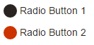
<div>
  <input type="radio" id="radio01" name="radio" />
  <label for="radio01"><span></span>Radio Button 1</label>
</div>

<div>
 <input type="radio" id="radio02" name="radio" />
 <label for="radio02"><span></span>Radio Button 2</label>
</div>다른 사람들이 말했듯이 모든 브라우저에서 이것을 달성하는 방법이 없으므로 크로스 브라우저에서 가장 좋은 방법은 자바 스크립트를 눈에 띄지 않게 사용하는 것입니다. 기본적으로 라디오 버튼을 링크로 바꿔야합니다 (CSS를 통해 완전히 사용자 정의 할 수 있음). 링크를 클릭 할 때마다 관련 라디오 박스에 바인딩되어 그의 상태와 다른 모든 상태를 전환합니다.
라디오 입력에 스팬 요소를 포함시킨 다음 라디오 입력이 확인 될 때 렌더링 할 색상을 선택할 수 있습니다. w3schools에서 가져온 아래 예제를 확인하십시오.
<!DOCTYPE html>
<html>
<style>
/* The container */
.container {
  display: block;
  position: relative;
  padding-left: 35px;
  margin-bottom: 12px;
  cursor: pointer;
  font-size: 22px;
  -webkit-user-select: none;
  -moz-user-select: none;
  -ms-user-select: none;
  user-select: none;
}

/* Hide the browser's default radio button */
.container input {
  position: absolute;
  opacity: 0;
  cursor: pointer;
}

/* Create a custom radio button */
.checkmark {
  position: absolute;
  top: 0;
  left: 0;
  height: 25px;
  width: 25px;
  background-color: #eee;
  border-radius: 50%;
}

/* On mouse-over, add a grey background color */
.container:hover input ~ .checkmark {
  background-color: #ccc;
}

/* When the radio button is checked, add a blue background */
.container input:checked ~ .checkmark {
  background-color: #00a80e;
}

/* Create the indicator (the dot/circle - hidden when not checked) */
.checkmark:after {
  content: "";
  position: absolute;
  display: none;
}

/* Show the indicator (dot/circle) when checked */
.container input:checked ~ .checkmark:after {
  display: block;
}

/* Style the indicator (dot/circle) */
.container .checkmark:after {
    top: 9px;
    left: 9px;
    width: 8px;
    height: 8px;
    border-radius: 50%;
    background: white;
}
</style>
<body>

<h1>Custom Radio Buttons</h1>
<label class="container">One
  <input type="radio" checked="checked" name="radio">
  <span class="checkmark"></span>
</label>
<label class="container">Two
  <input type="radio" name="radio">
  <span class="checkmark"></span>
</label>
<label class="container">Three
  <input type="radio" name="radio">
  <span class="checkmark"></span>
</label>
<label class="container">Four
  <input type="radio" name="radio">
  <span class="checkmark"></span>
</label>

</body>
아래 코드 세그먼트에서 배경색을 변경하면 트릭이됩니다.
/* When the radio button is checked, add a blue background */
.container input:checked ~ .checkmark {
  background-color: #00a80e;
}간단한 수정은 다음 CSS 속성을 사용하는 것입니다.
input[type=radio]:checked{
    background: \*colour*\;
    border-radius: 15px;
    border: 4px solid #dfdfdf;
}