Button에 모양과 선택기를 동시에 적용하는 방법은 무엇입니까?


83

다음과 같은 버튼 모양을 적용했습니다.

<?xml version="1.0" encoding="utf-8"?>

<shape xmlns:android="http://schemas.android.com/apk/res/android"
       android:shape="rectangle" >
    <gradient android:startColor="#DD000000" android:endColor="#DD2d2d2d"  android:angle="90"></gradient>
    <corners android:radius="15dip"></corners>

</shape>

이제 다음과 같은 선택기를 사용하고 싶습니다.

<selector xmlns:android="http://schemas.android.com/apk/res/android">
<item android:drawable="@drawable/active"
      android:state_pressed="true" />
<item android:drawable="@drawable/passive"/>

이 버튼도 마찬가지입니다. 가능할까요 ... ???

답변:


186

이 방법으로 사용 :

<?xml version="1.0" encoding="utf-8"?>
<selector xmlns:android="http://schemas.android.com/apk/res/android">

   <item android:state_pressed="true" >
       <shape>.......</shape>
   </item>
   ..........
   ..........
</selector>

8
예, 다음을 사용하여 작동했습니다. <selector xmlns : android = " schemas.android.com/apk/res/android "> <item android : state_pressed = "true"> <shape android : shape = "rectangle"> <corners android : radius = "15dip"> </ corners> <solid android : color = "# febd26"/> </ shape> </ item> <item> <shape android : shape = "rectangle"> <gradient android : startColor = "# DD000000"android : endColor = "# DD2d2d2d"android : angle = "90"> </ gradient> <corners android : radius = "15dip"> </ corners> </ shape> </ item> </ selector>
Khawar Raza 2011 년

7
@KhawarRaza 앞으로 더 쉽게 형식을 지정하고 찾을 수있는 질문에 이와 같은 정보를 입력하십시오 . 댓글은 시간이 지남에 따라 사라지는 경향이 있습니다.
Tim Post

제안한대로 항목 요소 내부에 모양 요소를 추가하려고 시도했지만 [ github.com/vinc3m1/RoundedImageView#usage]09-13 15:25:02.868: ERROR/AndroidRuntime(9129): FATAL EXCEPTION: main android.view.InflateException: Binary XML file line #13: Error inflating class <unknown>.android:background속성으로 선택기를 설정하는 데 도움이되지 않는 메시지가 표시되면서 오류가 발생합니다 . 누구든지 이것을 수행하는 방법에 대한 아이디어가 있습니까? RoundedImageView
toobsco42

이 기술을 사용하려고 할 때 오류 메시지가 계속 나타납니다. AZ_의 답변이 더 잘 작동했습니다.
Alan Nelson

@Alan Nelson, 내 대답은 해골이고 AZ_가 예를 들었습니다.
Hanry

26

요점 답변 상세

에서 색상 리소스 만들기

res / values ​​/ colors.xml

<?xml version="1.0" encoding="utf-8"?>
<resources>


    <item name="yellow" type="color">#F7B500</item>
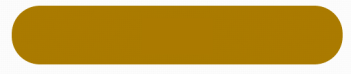
    <item name="yellow_dark" type="color">#AC7E00</item>

    <integer-array name="androidcolors">
        <item>@color/yellow</item>
        <item>@color/yellow_dark</item>
    </integer-array>

</resources>

드로어 블 만들기

res / drawable / bg_yellow_round.xml

<?xml version="1.0" encoding="utf-8"?>
<shape xmlns:android="http://schemas.android.com/apk/res/android"
    android:shape="rectangle" >

    <solid android:color="@color/yellow" />

    <stroke
        android:width="2dp"
        android:color="@color/yellow" />

    <corners
        android:bottomLeftRadius="20dp"
        android:bottomRightRadius="20dp"
        android:topLeftRadius="20dp"
        android:topRightRadius="20dp" />

</shape>

다른 드로어 블을 만들고 같은 위치에서 전환하고 이름을 지정합니다.

res / drawable / bg_yellow_dark_round.xml

<solid android:color="@color/yellow_dark" />

<stroke
    android:width="2dp"
    android:color="@color/yellow_dark" />

<corners
    android:bottomLeftRadius="20dp"
    android:bottomRightRadius="20dp"
    android:topLeftRadius="20dp"
    android:topRightRadius="20dp" />

이제 색상 상태 목록

res / color / btn_selector_yellow.xml

<?xml version="1.0" encoding="utf-8"?>
<selector xmlns:android="http://schemas.android.com/apk/res/android" android:exitFadeDuration="@android:integer/config_shortAnimTime">

    <item android:drawable="@color/yellow" android:state_focused="true" android:state_pressed="false"/>
    <item android:drawable="@drawable/bg_yellow_dark_round" android:state_pressed="true"/>
    <item android:drawable="@drawable/bg_yellow_round"/>

</selector>

이제 다음과 같이 버튼에 설정하십시오.

<Button
                android:id="@+id/button1"
                android:layout_width="248dp"
                android:layout_height="44dp"
                android:layout_gravity="center_horizontal"
                android:layout_marginBottom="10dp"
                android:layout_marginTop="20dp"
                android:background="@color/btn_selector_yellow"
                android:text="AZ_ is so cool" />

지금 이것은 전환을 할 것입니다 에서
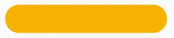
 연노랑

...에

진한 노란색.


이것은 효과가 있습니다. 파급 효과를 위해 구현할 수도 있습니까?
Hardik9850


아니면 그냥이 많습니다 볼 google.com/...
AZ_

11

shape.xml

<shape xmlns:android="http://schemas.android.com/apk/res/android">
    <solid android:color="@color/star_off"/>
    <corners android:radius="5dp"/>
    <padding android:left="0dp" android:top="0dp" android:right="0dp" android:bottom="0dp" />
</shape>

selector.xml

<selector xmlns:android="http://schemas.android.com/apk/res/android" android:exitFadeDuration="@android:integer/config_mediumAnimTime">

    <item android:drawable="@color/tab_focused" android:state_focused="true" android:state_pressed="false"/>
    <item android:drawable="@color/tab_pressed" android:state_pressed="true"/>
    <item android:drawable="@drawable/shape"/>

</selector>

1
대신 @ 드로어 블 / 사진 shape.xml의 사용 @ 드로어 블 / 사진 모양
Khizar 하야트

4

내부 선택기를 사용하는 모양을 만들 수도 있습니다. 모양이 다른 상태에서 색상이 변경되는 경우 훨씬 더 깨끗합니다.

color / color_selector.xml

<selector xmlns:android="http://schemas.android.com/apk/res/android">
    <item android:color="@color/blue_dark" android:state_pressed="true" />
    <item android:color="@color/blue_light" />
</selector>

drawable / shape.xml

<shape xmlns:android="http://schemas.android.com/apk/res/android">
    <solid android:color="@color/color_selector" />
    <corners android:bottomLeftRadius="6dip" android:bottomRightRadius="6dp" />
    <padding android:bottom="0dip" android:left="0dip" android:right="0dip" android:top="0dip" />
</shape>

나는 그것이 많은 청소기 동의하지만이 ..., 색상 선택기를 사용하지 않습니다 나를 위해 작동하지 않습니다
Gyome

@Gyome 작동 중입니다. 이 링크를 참조 stackoverflow.com/questions/1219312/android-selector-text-color
지 팡

3
나는 이것이 오래되었다는 것을 알고 있지만 기록을 위해이 방법은 Android 5.0 이상에서만 작동합니다.
lionscribe

4

너무 늦었다는 건 알지만 여기에 해결 된 예가 있습니다.

 <TextView
            android:id="@+id/txt_out_going_calls"
            android:layout_width="match_parent"
            android:layout_height="wrap_content"
            android:layout_margin="04dp"
            android:layout_weight="1"
            android:background="@drawable/header_text_view_selector"
            android:gravity="center"
            android:text="@string/outgoing_calls_tab_button_text"
            android:textColor="@color/home_text_color" />

그리고 나의 header_text_view_selector

<?xml version="1.0" encoding="utf-8"?>
<selector xmlns:android="http://schemas.android.com/apk/res/android">
    <item android:state_selected="true">

        <shape xmlns:android="http://schemas.android.com/apk/res/android">
            <solid android:color="@color/home_fragment_tab_color_selected"/>
            <corners android:radius="25dip" />
            <padding android:bottom="08dip" android:left="9dip" android:right="9dip" android:top="08dip" />
        </shape>
    </item>
    <item android:state_selected="false">

        <shape>
            <solid android:color="@color/home_fragment_tab_color_simple"/>
            <corners android:radius="25dip" />
            <padding android:bottom="08dip" android:left="9dip" android:right="9dip" android:top="08dip" />
        </shape>
    </item>
</selector>

그래서 기본적으로 textview선택기 로 반올림 을 만듭니다 . 여기 메신저 처리 state_selectednot_selected. 도움이되기를 바랍니다.


3

이것은 내 방식이며 작동합니다!

<item android:state_pressed="true">

    <shape android:shape="oval">


        <gradient android:centerX=".6"
            android:centerY=".40"
            android:endColor="@color/colorPrimary"
            android:gradientRadius="20"
            android:startColor="@color/colorPrimary"
            android:type="radial" />

        <stroke android:width="1dp"
            android:color="#FFFFFF" />

        <size android:width="55dp"
            android:height="55dp" />

    </shape>
</item>

<item android:state_focused="false">
    <shape android:shape="oval">


        <gradient android:centerX=".6"
            android:centerY=".40"
            android:endColor="@android:color/transparent"
            android:gradientRadius="20"
            android:startColor="@android:color/transparent"
            android:type="radial" />

        <stroke android:width="1dp"
            android:color="#FFFFFF" />

        <size android:width="55dp"
            android:height="55dp" />

    </shape>
</item>


0

이미지를 사용할 때 모양 이름을 사용하고 이미지를 사용할 때 선택기를 사용하십시오. 당신은 어떤 문제도 직면하지 않을 것입니다. 그게 당신이 요청한 것입니까?


2
당김 = "를 @ 드로어 블 / 사진 shape_xml"... 당신의 선택에 당신의보기에서 선택기를 사용 : 그것은 안드로이드 당김에 모양 XML을 넣고 통과
Vineet Shukla

1
코드 조각을 사용하여 더 나은 형식으로 예제를 작성하십시오.
로이 리

0

내 예는 state_pressed가있는 원 버튼입니다. 코드 벨로우즈 :

<?xml version="1.0" encoding="utf-8"?>
<selector xmlns:android="http://schemas.android.com/apk/res/android">


    <item android:state_pressed="true">
        <shape android:shape="oval">
            <solid android:color="@color/light_primary_color" />
        </shape>

    </item>
    <item>
        <shape android:shape="oval">
            <solid android:color="@color/accent_color" />
        </shape>
    </item>

</selector>

0

재사용 가능성을 높이기 위해 단일 속성에 상태를 설정할 수 있습니다. 모양을 복제하지 마십시오.

<selector
    xmlns:android="http://schemas.android.com/apk/res/android"
>
    <item>
        <shape android:shape="rectangle" >
            <corners android:radius="5dp"/>
            <solid
                android:state_enabled="false"
                android:color="@color/transparent"
            />
            <solid
                android:state_enabled="true"
                android:color="@color/background"
            />
            <stroke
                android:width="@dimen/dividerHeight"
                android:color="@color/dividerLight"
            />
        </shape>
    </item>
</selector>

이 방법을 사용하여 비활성화되면 프로그래밍 방식으로 배경을 설정할 수 있습니다.


이것은 작동하지 않는 것 같습니다. 선택자는 여러 항목 자식을 가져야하고 각 항목에 상태를 설정해야한다고 생각합니다.
bmaupin
당사 사이트를 사용함과 동시에 당사의 쿠키 정책개인정보 보호정책을 읽고 이해하였음을 인정하는 것으로 간주합니다.
Licensed under cc by-sa 3.0 with attribution required.