Android-버튼 테두리
답변:
1 단계 : 이름이 my_button_bg.xml 인 파일 작성
2 단계 :이 파일을 res / drawables.xml에 저장
3 단계 : 아래 코드 삽입
<?xml version="1.0" encoding="utf-8"?>
<shape xmlns:android="http://schemas.android.com/apk/res/android"
  android:shape="rectangle">
  <gradient android:startColor="#FFFFFF"
    android:endColor="#00FF00"
    android:angle="270" />
  <corners android:radius="3dp" />
  <stroke android:width="5px" android:color="#000000" />
</shape>
4 단계 : 다음과 같이 필요한 경우 "android : background ="@ drawable / my_button_bg "코드를 사용하십시오.
<Button
    android:layout_width="wrap_content"
    android:layout_height="wrap_content"
    android:text="Your Text"
    android:background="@drawable/my_button_bg"
/>• Android Official Solution
때문에 안드로이드 설계 지원 V28을 도입, 그것을 사용하여 경계 버튼을 쉽게 만들 수 있습니다 MaterialButton. 이 클래스는 생성자의 버튼에 업데이트 된 머티리얼 스타일을 제공합니다. 사용 app:strokeColor하고 app:strokeWidth다음과 같이 사용자 정의 테두리를 만들 수 있습니다.
1. 사용할 때 androidx:
build.gradle
dependencies {
    implementation 'androidx.appcompat:appcompat:1.1.0'
    implementation 'com.google.android.material:material:1.0.0'
}
• 경계 버튼 :
<com.google.android.material.button.MaterialButton
    style="@style/Widget.AppCompat.Button.Colored"
    android:layout_width="wrap_content"
    android:layout_height="wrap_content"
    android:text="MATERIAL BUTTON"
    android:textSize="15sp"
    app:strokeColor="@color/green"
    app:strokeWidth="2dp" />
• 채워지지 않은 경계 버튼 :
<com.google.android.material.button.MaterialButton
    style="@style/Widget.AppCompat.Button.Borderless"
    android:layout_width="wrap_content"
    android:layout_height="wrap_content"
    android:text="UNFILLED MATERIAL BUTTON"
    android:textColor="@color/green"
    android:textSize="15sp"
    app:backgroundTint="@android:color/transparent"
    app:cornerRadius="8dp"
    app:rippleColor="#33AAAAAA"
    app:strokeColor="@color/green"
    app:strokeWidth="2dp" />
2. 사용시 appcompat:
build.gradle
dependencies {
    implementation 'com.android.support:design:28.0.0'
}
style.xml
응용 프로그램 테마가에서 Theme.MaterialComponents대신 상속되는지 확인하십시오 Theme.AppCompat.
<style name="AppTheme" parent="Theme.MaterialComponents.Light.DarkActionBar">
    <!-- Customize your theme here. -->
</style>
• 경계 버튼 :
<android.support.design.button.MaterialButton
    android:layout_width="wrap_content"
    android:layout_height="wrap_content"
    android:text="MATERIAL BUTTON"
    android:textSize="15sp"
    app:strokeColor="@color/green"
    app:strokeWidth="2dp" />
• 채워지지 않은 경계 버튼 :
<android.support.design.button.MaterialButton
style="@style/Widget.AppCompat.Button.Borderless"
android:layout_width="wrap_content"
android:layout_height="wrap_content"
android:text="UNFILLED MATERIAL BUTTON"
android:textColor="@color/green"
android:textSize="15sp"
app:backgroundTint="@android:color/transparent"
app:cornerRadius="8dp"
app:rippleColor="#33AAAAAA"
app:strokeColor="@color/green"
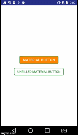
app:strokeWidth="2dp" />시각적 결과
style="@style/Widget.AppCompat.Button.Borderless"?
button_border.xml드로어 블 폴더에 파일을 작성 하십시오.
res / drawable / button_border.xml
<?xml version="1.0" encoding="utf-8"?>
<shape xmlns:android="http://schemas.android.com/apk/res/android"
    android:shape="rectangle" >

    <solid android:color="#FFDA8200" />

    <stroke
        android:width="3dp"
        android:color="#FFFF4917" />

</shape>
그리고 XML 활동 레이아웃에 버튼을 추가하고 배경을 설정하십시오 android:background="@drawable/button_border".
        <Button
                android:layout_width="wrap_content"
                android:layout_height="wrap_content"
                android:background="@drawable/button_border"
android:text="Button Border" />drawable / button_green.xml을 만듭니다.
<?xml version="1.0" encoding="utf-8"?>
<shape xmlns:android="http://schemas.android.com/apk/res/android"
  android:shape="rectangle">
  <gradient
    android:startColor="#003000"
    android:centerColor="#006000"
    android:endColor="#003000"
    android:angle="270" />
  <corners android:radius="5dp" />
  <stroke android:width="2px" android:color="#007000" />
</shape>
그리고 그것을 지적하십시오 @drawable/button_green:
<Button
        android:id="@+id/button1"
        android:layout_width="wrap_content"
        android:layout_height="wrap_content"
        android:layout_margin="10dp"
        android:background="@drawable/button_green"
android:text="Button" />도형 드로어 블 만들기에 대한 여기를 참조하십시오 http://developer.android.com/guide/topics/resources/drawable-resource.html#Shape
이 작업을 완료하면 버튼 세트의 XML에서 android:background="@drawable/your_button_border"
버튼에 투명한 배경이 필요하지 않은 경우 프레임 레이아웃을 사용하여 테두리의 환영을 만들 수 있습니다. 테두리의 두께를 변경하려면 FrameLayout의 "padding"속성을 조정하십시오.
<FrameLayout
        android:layout_width="wrap_content"
        android:layout_height="wrap_content"
        android:padding="1sp"
        android:background="#000000">
        <Button
            android:layout_width="wrap_content"
            android:layout_height="wrap_content"
            android:text="Your text goes here"
            android:background="@color/white"
            android:textColor="@color/black"
            android:padding="10sp"
            />
</FrameLayout>
셰이프 xml 파일에 동적으로 편집 가능한 테두리 색이 있는지 확실하지 않습니다. 그러나이 솔루션을 사용하면 FrameLayout 배경을 설정하여 테두리의 색상을 동적으로 변경할 수 있습니다.
XML 레이아웃에서 :
<Button
    android:id="@+id/cancelskill"
    android:layout_width="0dp"
    android:layout_height="wrap_content"
    android:layout_marginLeft="25dp"
    android:layout_weight="1"
    android:background="@drawable/button_border"
    android:padding="10dp"
    android:text="Cancel"
    android:textAllCaps="false"
    android:textColor="#ffffff"
    android:textSize="20dp" />
드로어 블 폴더에서 버튼의 테두리 스타일에 대한 파일을 만듭니다.
<shape xmlns:android="http://schemas.android.com/apk/res/android"
    android:shape="rectangle" >
    <stroke
        android:width="1dp"
        android:color="#f43f10" />
</shape>
그리고 당신의 활동에서 :
    GradientDrawable gd1 = new GradientDrawable();
    gd1.setColor(0xFFF43F10); // Changes this drawbale to use a single color instead of a gradient
    gd1.setCornerRadius(5);
    gd1.setStroke(1, 0xFFF43F10);

    cancelskill.setBackgroundDrawable(gd1);

    cancelskill.setOnClickListener(new View.OnClickListener() {

        @Override
        public void onClick(View v) {
            cancelskill.setBackgroundColor(Color.parseColor("#ffffff"));
            cancelskill.setTextColor(Color.parseColor("#f43f10"));

            GradientDrawable gd = new GradientDrawable();

            gd.setColor(0xFFFFFFFF); // Changes this drawbale to use a single color instead of a gradient
            gd.setCornerRadius(5);
            gd.setStroke(1, 0xFFF43F10);
            cancelskill.setBackgroundDrawable(gd);

            finish();
        }
});나는 1 년 늦게 알고 있지만 9 경로 이미지를 만들 수도 있습니다. 그러한 이미지를 만드는 데 도움이되는 Android SDK와 함께 제공되는 도구가 있습니다.이 링크를 참조하십시오 : http://developer.android.com/tools/help/draw9patch .html
추신 : 이미지는 무한대로 확장 될 수 있습니다